# 表格布局与居中布局
# 一、表格布局
很久以前是使用 html<table>标签给页面元素进行布局的,但由于不灵活、难以调试等缺点被其他布局方案所取代了。现在基本很少会用到表格布局,也只是用于兼容一些不支持 Flexbox 和 Grid 的浏览器,或者在一些小模块里使用它。
一个<table>标签之所以能够像表格那样展示,是由于 css 默认给<table>标签设置了一组 table 布局属性。当这些属性被应用于排列非<table>元素时,这种用法被称为“使用 CSS 表格”。
# 1.1 与表相关的 display 值
| 值 | 意义 |
|---|---|
| table | 指定元素为块级表 |
| inline-table | 指定元素为内联表 |
| table-row | 指定元素为表的某行 |
| table-row-group | 指定元素对一行或多行为表的行分组 |
| table-header-group | 指定元素为标题行(表头),位于所有行和行分组之前 |
| table-footer-group | 指定元素为页脚行,位于所有行和行分组之后 |
| table-column | 指定元素为表的某列,但不会被可视化呈现 |
| table-column-group | 指定元素对一列或多列为表的列分组,但不会被可视化呈现 |
| table-cell | 指定元素为表的单元格 |
| table-caption | 指定元素为表的标题,只有一个 |
给下面加上 css 的表相关的 display 值
<scores>
  <headers>
    <label>Team</label>
    <label>Score</label>
  </headers>
  <game sport="MLB" league="NL">
    <team>
      <name>Reds</name>
      <score>8</score>
    </team>
    <team>
      <name>Cubs</name>
      <score>5</score>
    </team>
  </game>
</scores>
2
3
4
5
6
7
8
9
10
11
12
13
14
15
16
scores {
  display: table;
}
headers {
  display: table-header-group;
}
game {
  display: table-row-group;
}
team {
  display: table-row;
}
label,
name,
score {
  display: table-cell;
}
2
3
4
5
6
7
8
9
10
11
12
13
14
15
16
17
# 1.2 匿名补全表格
在使用表布局时,元素的结构可能不是完整的表形式的,那么 css 会为表插入缺少的部件(匿名对象的方式)。
如果
table-cell元素的父元素不是table-row元素,则在table-cell元素与其父元素之间插入一个匿名table-row对象。插入的对象将包括table-cell元素的所有连续兄弟元素。<html> <head> <style type="text/css"> system { display: table; } name, moons { display: table-cell; } </style> </head> <body> <system ><!--会在system内匿名插入一个table-row,新行会包含name和moons--> <name>Mercury</name> <moons>0</moons> </system> </body> <html></html> </html>1
2
3
4
5
6
7
8
9
10
11
12
13
14
15
16
17
18
19
20
21如果
table-row元素的父元素不是table、inline-table或table-row-group元素,则在table-row元素与其父元素之间插入一个匿名table元素。插入的对象将包括table-row元素的所有连续兄弟元素。<html> <head> <style type="text/css"> docbody { display: block; } planet { display: table-row; } </style> </head> <body> <docbody ><!--docbody和planet之间匿名插入一个table--> <planet> <name>Mercury</name> <moons>0</moons> </planet> <planet> <name>Venus</name> <moons>0</moons> </planet> </docbody> </body> <html></html> </html>1
2
3
4
5
6
7
8
9
10
11
12
13
14
15
16
17
18
19
20
21
22
23
24
25
26如果
table-column元素的父元素不是table、inline-table或table-column-group元素,则在table-column元素与其父元素之间插入一个匿名table元素。例子与上面类似。如果
table-row-group、table-header-group、table-footer-group、table-column-group或table-caption元素的父元素不是table元素,则在元素与其父元素之间插入一个匿名table对象。例子与上面类似。如果
table或inline-table元素的子元素不是table-row-group、table-header-group、table-footer-group、table-row或table-caption元素,则在table元素及其子元素之间插入一个匿名table-row对象。<html> <head> <style type="text/css"> system { display: table; } planet { display: table-row; } name, moons { display: table-cell; } </style> </head> <body> <system> <planet> <name>Mercury</name> <moons>0</moons> </planet> <name>Venus</name ><!--name和moons外面匿名插入一个table-row--> <moons>0</moons> </system> </body> <html></html> </html>1
2
3
4
5
6
7
8
9
10
11
12
13
14
15
16
17
18
19
20
21
22
23
24
25
26
27
28如果
table-row-group、table-header-group或table-footer-group元素的子元素不是table-row元素,则在元素及其子元素之间插入一个匿名table-row对象。<html> <head> <style type="text/css"> system { display: table; } planet { display: table-row-group; } name, moons { display: table-cell; } </style> </head> <body> <system> <planet> <name>Mercury</name ><!--name和moons外面匿名插入一个table-row--> <moons>0</moons> </planet> <name>Venus</name ><!--name和moons外面匿名插入一个table-row--> <moons>0</moons> </system> </body> <html></html> </html>1
2
3
4
5
6
7
8
9
10
11
12
13
14
15
16
17
18
19
20
21
22
23
24
25
26
27
28
29如果
table-row元素的子元素不是table-cell元素,则在元素及其子元素之间插入一个匿名table-cell对象。这个匿名对象包含了所有非table-cell元素的子元素的连续兄弟元素。<html> <head> <style type="text/css"> system { display: table; } planet { display: table-row; } name, moons { display: table-cell; } </style> </head> <body> <system> <planet> <name>Mercury</name> <num>0</num ><!--num没有display值,外面匿名插入一个table-cell--> </planet> </system> </body> <html></html> </html>1
2
3
4
5
6
7
8
9
10
11
12
13
14
15
16
17
18
19
20
21
22
23
24
25
26
# 1.3 了解表分层
css 给表定义了六个单独的“层”:表——列组——列——行组——行——单元格
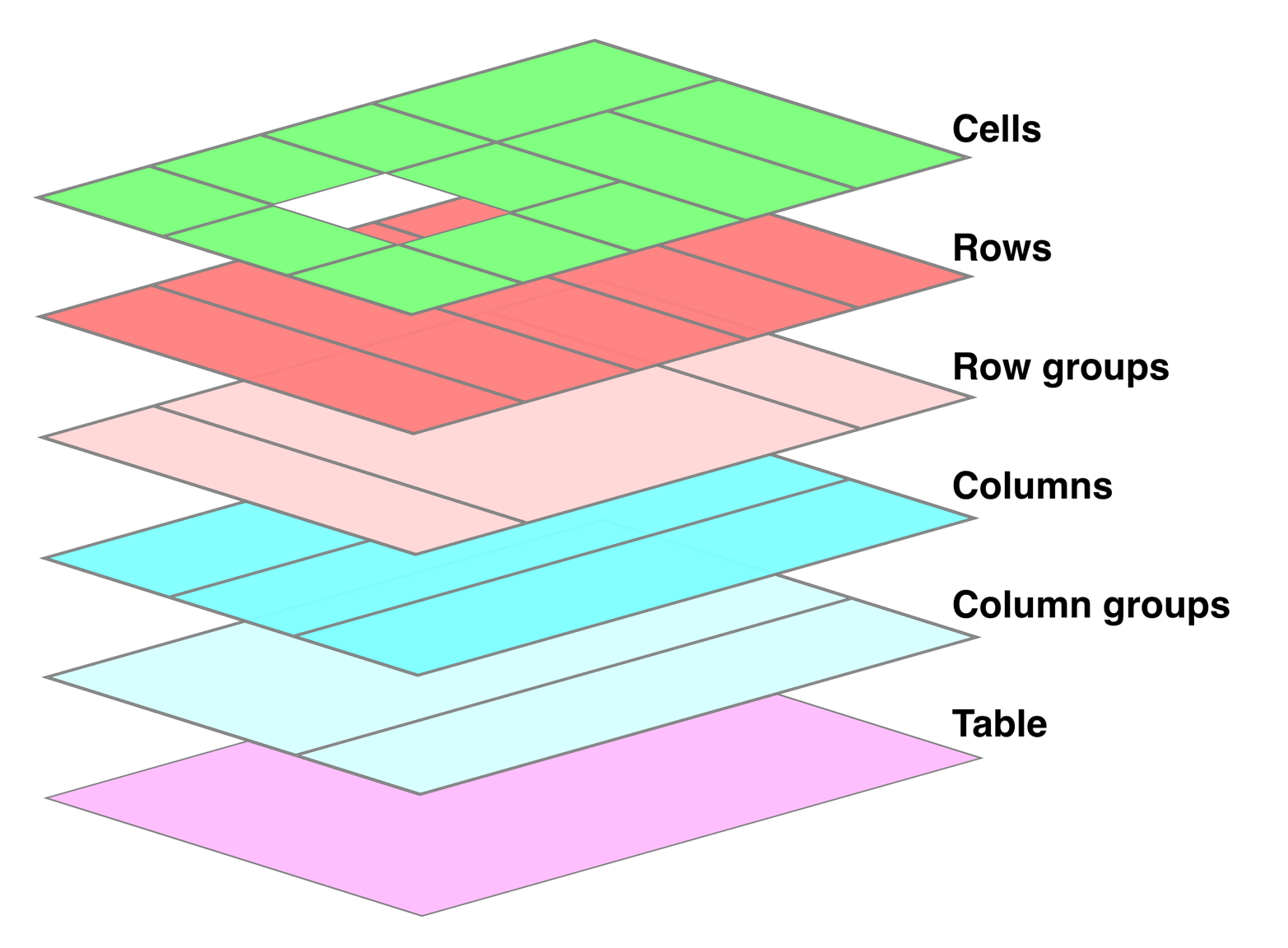
要了解这个分层,上一层的样式会覆盖下一层的样式,这在对表进行样式书写时很重要。
# 1.4 边界模型
边界模型主要是用于描述单元格的边界 border,有两种:分离边界模型和折叠边界模型。可以使用border-collapse属性来选择表的边界模型,其值一般是collapse或separate。
# 1.4.1 分离边界模型
分离边界模型:表本身以及表的单元格都有各自的边界border,表与单元格之间还有内边距,并且单元格与单元格之间也有间距。
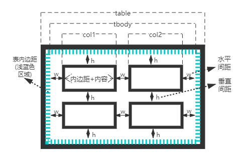
单元格与单元格之间的间距是由border-spacing控制的,要注意的一点是,表内边距与这个间距是相加的(并不是折叠)。如果单元格内容为空,默认也会为它绘制 border 的(默认是empty-cells:show),如果设置empty-cells:hide那将不会为空的单元格绘制 border。
<html>
  <head>
    <style type="text/css">
      table {
        border-collapse: separate; /*分离边界模型*/
        border: 1px solid black;
        padding: 5px; /*表与单元格之间的间距,其实就是表的内边距*/
        border-spacing: 5px 8px; /*单元格与单元格之间,水平间距5px,垂直间距8px*/
      }
      td {
        border: 3px double black; /*单元格里有各自的border,这里都是双实线*/
        padding: 3px;
        empty-cells: hide; /*单元格为空,此时根据empty-cells的值,不会为空单元格绘制border*/
      }
    </style>
  </head>
  <body>
    <table cellspacing="0">
      <tr>
        <td>cell one</td>
        <td>cell two</td>
      </tr>
      <tr>
        <td>cell three</td>
        <td></td>
      </tr>
    </table>
  </body>
  <html></html>
</html>
2
3
4
5
6
7
8
9
10
11
12
13
14
15
16
17
18
19
20
21
22
23
24
25
26
27
28
29
30
# 1.4.2 折叠边界模型
折叠边界模型:表本身以及表的单元格,它们的边界都是折叠在一起的,表与单元格之间没有内边距(因为表与单元格边界折叠了),并且单元格与单元格之间也没有间距(因为单元格与单元格边界也折叠了)。

它们所有的边界都已经折叠在一起了,所以border-spacing的设置会被忽略,表的内边距也被忽略掉。empty-cells:hide其实也会被忽略,会强制给空单元格绘制 border。将上面例子里的border-collapse: separate改为border-collapse: collapse就可以查看折叠边界模型的效果。
<html>
  <head>
    <style type="text/css">
      table {
        border-collapse: collapse; /*折叠边界模型*/
        border: 1px solid black;
        padding: 5px; /*表内边距失效*/
        border-spacing: 5px 8px; /*单元格之间的间距失效*/
      }
      td {
        border: 3px double black; /*单元格共享border,这里都是双实线*/
        padding: 3px; /*内容与单元格之间的内边距还是有效的*/
        empty-cells: hide; /*失效*/
      }
    </style>
  </head>
  <body>
    <table cellspacing="0">
      <tr>
        <td>cell one</td>
        <td>cell two</td>
      </tr>
      <tr>
        <td>cell three</td>
        <td>cell four</td>
      </tr>
    </table>
  </body>
  <html></html>
</html>
2
3
4
5
6
7
8
9
10
11
12
13
14
15
16
17
18
19
20
21
22
23
24
25
26
27
28
29
30
比较有趣的一点就是边界折叠后,表分层对边界没有太大的影响,它有自己的一套优先级顺序来决定边界的样式:
border-style为hidden的边界会优先于其他规则;- 宽的边界优先于窄的边界,也就是 width 值大的优先;
- 边界线条类型按照这个顺序优先:
double、solid、dashed、dotted、ridge、outset、groove、inset、none; - 如果线条类型和 width 都相同,但颜色不同,那颜色就由表分层的顺序来决定了。
# 1.5 表大小
# 1.5.1 基本计算
上一节的两种边界模式会导致表的宽高计算不一样。
分离边界模型的宽:
- 假设表边界是 4px,表内边距是 3px,水平间距是 6px,单元格边界是 2px,单元格内容加上内边距是 20px;
- 那么表总宽就是 tbody 的宽加上表左右边界再加上表左右内边距,即
table = 4px + 3px + tbody + 3px + 4px; - 而 tbody 的宽是所有列加上所有水平间距,默认所有单元格相同,即
tbody = 6px * 3 + col * 2; - col 的宽是内容加上内边距再加上单元格左右边界,即
col = 2px + 20px + 2px; - 最后表总宽为
table = 4px + 3px + (6px * 3 + (2px + 20px + 2px) * 2) + 3px + 4px,总共 80px。
折叠边界模型的宽:
- 没有表内边距,也没有水平垂直间距;假设表边界和单元格边界都是 1px,单元格内容加上内边距是 20px;
- 那么表总宽就是 tbody 的宽加上表左右边界的一半,即
table = 0.5px + tbody + 0.5px; - 而 tbody 的宽是所有列的宽之和,默认所有单元格相同,即
tbody = col * 3; - col 的宽是内容加上内边距再加上单元格左右边界的一半,即
col = 0.5px + 20px + 0.5px; - 最后表总宽为
table = 0.5px + (0.5px + 20px + 0.5px) * 3 + 0.5px,总共 64px。
# 1.5.2 固定和自动
以上是最基础的宽度高度计算,但是表宽高在具体计算时有不同的表现,其中表宽有固定宽度布局和自动宽度布局两种表现方式,而表高就只有自动高度布局。可以使用table-layout属性来为表选择布局模式,其值为auto | fixed。
两种表现方式的区别:固定宽度布局主要是以第一行为基准,而自动宽度布局要“征询”所有行的“意见”。
固定宽度布局:
- 如果列设置了
width值,那么这一列的宽度就是该width值。 - 如果列设置了
auto值,但是该列第一行单元格设置了width值,那么这一列的宽度就是第一行单元格的width值。 - 如果列设置了
auto值,但是该列第一行单元格设置了width值,并且这个单元格跨列了,那么会被划分到各自的列里。 - 算出了总列宽,但是表也单独设置了宽度并且还比总列宽的值大,多出部分会分配给列(也是第一行为基准)。如果有几列没有设置
width值,多出部分会平分给这几列;如果所有列都有固定的width值,那就将多出的部分平分给所有列。 - 如果表设置的宽度小于算出的总列宽,那会忽略设置的表宽,而总列宽会作为最终的表宽。
<html>
  <head>
    <style>
      table {
        table-layout: fixed; /*固定宽度布局*/
        width: 400px; /*表总宽*/
        border-collapse: collapse; /*表是折叠边界模型*/
      }
      td {
        padding: 0;
        border: 1px solid;
      } /*单元格内边距为0,边界为1包括表边界*/
      col#c1 {
        width: 200px;
      } /*第一列的宽为200px*/
      #r1c2 {
        width: 76px;
      } /*第二列第一行的单元格内容宽为76px*/
      #r2c3 {
        width: 500px;
      } /*不在第一行会被忽略*/
    </style>
  </head>
  <body>
    <table>
      <colgroup>
        <col id="c1" />
        <col id="c2" />
        <col id="c3" />
        <col id="c4" />
      </colgroup>
      <!-- 最后两列没有width,那就会被分配,(400 - 0.5 * 2 - 200 - 0.5 * 2 - 76) / 2 = 61px -->
      <!-- 在浏览器调试代码时,将鼠标悬浮至最后两列显示宽度就是61px,内容自然是61 - 0.5 * 2 = 60px -->
      <tr>
        <td id="r1c1">1-1</td>
        <td id="r1c2">1-2</td>
        <td id="r1c3">1-3</td>
        <td id="r1c4">1-4</td>
      </tr>
      <tr>
        <td id="r2c1">2-1</td>
        <td id="r2c2">2-2</td>
        <td id="r2c3">2-3</td>
        <td id="r2c4">2-4</td>
      </tr>
      <tr>
        <td id="r3c1">3-1</td>
        <td id="r3c2">3-2</td>
        <td id="r3c3">3-3</td>
        <td id="r3c4">3-4</td>
      </tr>
      <tr>
        <td id="r4c1">4-1</td>
        <td id="r4c2">4-2</td>
        <td id="r4c3">4-3</td>
        <td id="r4c4">4-4</td>
      </tr>
    </table>
  </body>
</html>
2
3
4
5
6
7
8
9
10
11
12
13
14
15
16
17
18
19
20
21
22
23
24
25
26
27
28
29
30
31
32
33
34
35
36
37
38
39
40
41
42
43
44
45
46
47
48
49
50
51
52
53
54
55
56
57
58
59
60
自动宽度布局:
- 对于列中的每个单元格,计算
最小单元格宽度。- 确定显示内容所需的最小宽度(内容可在单元格内换行显示);
- 如果单元格设置了
width值,并且大于内容所需的最小宽度,那么最小单元格宽度就是这个width值; - 如果单元格设置的
width值为auto,那么最小单元格宽度就是内容所需的最小宽度。
- 对于列中的每个单元格,计算
最大单元格宽度。- 确定显示内容所需的最大宽度,除了强制换行(
<br>)以外,不会自动进行换行,此时内容最大宽度就是最大单元格宽度。
- 确定显示内容所需的最大宽度,除了强制换行(
- 对于每个列,计算
最小列宽。- 如果列设置了
width值,并且大于列中所有最小单元格宽度,那么最小列宽就是这个width值。 - 如果列没有设置
width值,最小列宽就是列中所有最小单元格宽度里最大的那一个。
- 如果列设置了
- 对于每个列,计算
最大列宽。- 如果列设置了
width值,并且大于列中所有最大单元格宽度,那么最大列宽就是这个width值。 - 如果列没有设置
width值,最大列宽就是列中所有最大单元格宽度里最大的那一个。
- 如果列设置了
- 对于跨多个列的单元格
最小列宽的和必须等于该单元格的最小单元格宽度;最大列宽的和必须等于该单元格的最大单元格宽度。
- 算出了总列宽(使用最大列宽来展示),但是表也单独设置了宽度并且还比总列宽的值大,多出部分会分配给列(也是第一行为基准)。如果有几列没有设置
width值,多出部分会平分给这几列;如果所有列都有固定的width值,那就将多出的部分平分给所有列。 - 如果表设置的宽度小于算出的总列宽,那会忽略设置的表宽,而总列宽会作为最终的表宽。
<html>
  <head>
    <style>
      table {
        table-layout: auto;
        width: auto;
        border-collapse: collapse;
      }
      td {
        border: 1px solid;
        padding: 0;
      }
      col#c3 {
        width: 25%;
      }
      #r1c2 {
        width: 40%;
      }
      #r2c2 {
        width: 50px;
      }
      #r2c3 {
        width: 35px;
      }
      #r4c1 {
        width: 100px;
      }
      #r4c4 {
        width: 1px;
      }
    </style>
  </head>
  <body>
    <table>
      <colgroup>
        <col id="c1" />
        <col id="c2" />
        <col id="c3" />
        <col id="c4" />
      </colgroup>
      <tr>
        <td id="r1c1">1-1</td>
        <td id="r1c2">1-2</td>
        <td id="r1c3">1-3</td>
        <td id="r1c4">1-4</td>
      </tr>
      <tr>
        <td id="r2c1">2-1</td>
        <td id="r2c2">2-2</td>
        <td id="r2c3">2-3</td>
        <td id="r2c4">2-4</td>
      </tr>
      <tr>
        <td id="r3c1">3-1</td>
        <td id="r3c2">3-2</td>
        <td id="r3c3">3-3</td>
        <td id="r3c4">3-4</td>
      </tr>
      <tr>
        <td id="r4c1">4-1</td>
        <td id="r4c2">4-2</td>
        <td id="r4c3">4-3</td>
        <td id="r4c4">4-4</td>
      </tr>
    </table>
  </body>
</html>
2
3
4
5
6
7
8
9
10
11
12
13
14
15
16
17
18
19
20
21
22
23
24
25
26
27
28
29
30
31
32
33
34
35
36
37
38
39
40
41
42
43
44
45
46
47
48
49
50
51
52
53
54
55
56
57
58
59
60
61
62
63
64
65
66
67
上面这个例子,第一列的最小和最大列宽都为 100px,第二列的最小列宽是 50px 而最大列宽是 40%,第三列的最小列宽是 35px 而最大列宽是 25%,第四列的最小和最大列宽都是单元格最小内容宽度。根据第二、三列反推出的表宽大概在一百多,而根据第一、四列反推出的表宽要更大,那就是第一、四列反推是正确的思路。(100+24+4)/(1-25%-40%)=366px,其中24是估算的第四列内容宽度,4是剩余 border 总和。注意:因为百分比还有表格宽度展示使用整数等原因,计算出的总宽度还有列宽度会有误差。
可能觉得自动宽度布局很复杂,那自动高度布局也会很复杂,其实高度取决于内容换行。如果表设置了高的值,它更像是min-height,也就说实际表高度可能比设置的高度要大。如果实际高度小于设置高度,那可能会扩展出新行也可能会留出空白。建议尽可能避免设置表高度。
# 1.6 单元格内的对齐
水平对齐方式:因为单元格被视为块级别的框(单独拿一个来看),那么使用text-align就可以完成单元格里内联内容的水平对齐了。text-align属性,其值left | right | center | justify,这个justify稍微注意一下是两端对齐,会调整单词和字母间的间隔,使各行的长度恰好相等。
垂直对齐方式:直接使用vertical-align属性,经常使用的值top | bottom | middle | baseline,而sub | super | text-top | text-bottom这几个被应用在单元格时会被忽略(内部内联元素使用vertical-align时,还是所有值都有效)。还有这个baseline复杂一些,它是基线对齐,会让一行里的所有单元格内容按照初始单元格基线对齐,初始单元格基线一般是内容第一行的文本底线。
参考:text-align 水平对齐和vertical-align 垂直对齐
# 二、居中布局
# 2.1 水平居中
水平居中意思是让子元素在父容器内部水平方向上是居中显示的。
# 2.1.1 使用 text-align
使用text-align: center是最简单的一种水平对齐方式,不过 text-align 属性是设置在具有块级特性的元素上的,然后对元素内部的内联内容进行水平居中对齐。可以回顾一下之前的文字水平对齐。那么子元素得是内联元素(文本也行)或者display: inline-block内联块级元素也可以。
该方法的优点是,text-align的兼容性很好,如果搭配display: inline-block还能对多个子元素在一排上进行水平居中布局的。有个小缺点就是,text-align 会影响到子元素文本内容对齐方式,需要在子元素上额外设置自己的 text-align 来屏蔽父容器的 text-align。

<html>
  <head>
    <style type="text/css">
      .parent {
        width: 600px;
        border: 1px solid red;
        /*让元素内部的并具有内联性质的子元素进行水平居中对齐*/
        text-align: center;
      }
      .col1,
      .col2,
      .col3 {
        /*内联块级元素*/
        display: inline-block;
        width: 100px;
        height: 100px;
        text-align: left;
      }
      .col1 {
        background-color: red;
      }
      .col2 {
        background-color: yellow;
      }
      .col3 {
        background-color: blue;
      }
    </style>
  </head>
  <body>
    <div class="parent">
      <div class="col1"></div>
      <div class="col2"></div>
      <div class="col3"></div>
    </div>
  </body>
  <html></html>
</html>
2
3
4
5
6
7
8
9
10
11
12
13
14
15
16
17
18
19
20
21
22
23
24
25
26
27
28
29
30
31
32
33
34
35
36
37
38
如果熟悉浏览器兼容,text-align: -moz-center和text-align: -webkit-center是能对元素内部具有块性质的子元素进行水平居中对齐的。效果跟上面不一样,因为是块级元素,所以内容都单独占据一行,那么效果就是在一列上的元素都是水平居中对齐的。

<html>
  <head>
    <style type="text/css">
      .parent {
        width: 600px;
        border: 1px solid red;
        text-align: center;
        /* 让元素内部的并具有块性质的子元素进行水平居中对齐 */
        text-align: -webkit-center;
      }
      .col1,
      .col2,
      .col3 {
        width: 100px;
        height: 100px;
        text-align: left;
      }
      .col1 {
        background-color: red;
      }
      .col2 {
        background-color: yellow;
      }
      .col3 {
        background-color: blue;
      }
    </style>
  </head>
  <body>
    <div class="parent">
      <div class="col1"></div>
      <div class="col2"></div>
      <div class="col3"></div>
    </div>
  </body>
  <html></html>
</html>
2
3
4
5
6
7
8
9
10
11
12
13
14
15
16
17
18
19
20
21
22
23
24
25
26
27
28
29
30
31
32
33
34
35
36
37
# 2.1.2 使用 auto 外边距
如果一个块级元素显式设置了宽度,它的外边距设置为auto时,那么这个块级元素会水平居中(原因是块级元素的隐藏等式)。其实这种方法跟上面的text-align: -moz-center和text-align: -webkit-center的效果是类似的,只是我们这种方法没有兼容性问题。
这种方法优点是,比较简单常用,缺点就是只能对一个元素进行水平居中布局,其他内容只能写到子元素内部了。相比于text-align: center+display: inline-block这种方法,会多套一层元素。
<html>
  <head>
    <style type="text/css">
      .parent-fix {
        width: 600px;
        border: 1px solid red;
      }
      .parent {
        width: 310px;
        /* 让parent居中 */
        margin: 0 auto;
      }
      /* 其他内容只能写到parent内部了 */
      .col1,
      .col2,
      .col3 {
        display: inline-block;
        width: 100px;
        height: 100px;
      }
      .col1 {
        background-color: red;
      }
      .col2 {
        background-color: yellow;
      }
      .col3 {
        background-color: blue;
      }
    </style>
  </head>
  <body>
    <div class="parent-fix">
      <div class="parent">
        <div class="col1"></div>
        <div class="col2"></div>
        <div class="col3"></div>
      </div>
    </div>
  </body>
  <html></html>
</html>
2
3
4
5
6
7
8
9
10
11
12
13
14
15
16
17
18
19
20
21
22
23
24
25
26
27
28
29
30
31
32
33
34
35
36
37
38
39
40
41
42
还可以将子元素替换为table,因为 table 也是具有块级性质的。
<html>
  <head>
    <style type="text/css">
      .parent-fix {
        width: 600px;
        border: 1px solid red;
      }
      .parent {
        /* 具有块级性质 */
        display: table;
        width: 300px;
        /* 让parent也就是表格居中 */
        margin: 0 auto;
      }
      /* 其他内容只能写到parent内部了,其他内容其实就是单元格了 */
      .col1,
      .col2,
      .col3 {
        display: table-cell;
        width: 100px;
        height: 100px;
      }
      .col1 {
        background-color: red;
      }
      .col2 {
        background-color: yellow;
      }
      .col3 {
        background-color: blue;
      }
    </style>
  </head>
  <body>
    <div class="parent-fix">
      <div class="parent">
        <div class="col1"></div>
        <div class="col2"></div>
        <div class="col3"></div>
      </div>
    </div>
  </body>
  <html></html>
</html>
2
3
4
5
6
7
8
9
10
11
12
13
14
15
16
17
18
19
20
21
22
23
24
25
26
27
28
29
30
31
32
33
34
35
36
37
38
39
40
41
42
43
44
# 2.1.3 绝对定位+位移变换
该方法的核心就是使用绝对定位将子元素的位置居中,但不是子元素中心点居中了,那就需要使用transform: translateX(-50%);进行调整。
该方法优点是,还算比较简单,缺点就是开启了相对定位以及绝对定位,绝对定位脱离了文档流,也只能对一个元素进行水平居中布局。相比于text-align: center+display: inline-block这种方法,会多套一层元素。其实你要是知道各自的宽度和间隔,也不是不能减少一层元素,只是计算比较麻烦没有灵活性。
<html>
  <head>
    <style type="text/css">
      .parent-fix {
        position: relative;
        width: 600px;
        height: 100px;
        border: 1px solid red;
      }
      .parent {
        position: absolute;
        width: 310px;
        /*从左往右偏移父元素宽度的50%*/
        left: 50%;
        /*左移调整,数值是自身宽度的50%*/
        transform: translateX(-50%);
      }
      /*其他内容只能写到parent内部了*/
      .col1,
      .col2,
      .col3 {
        display: inline-block;
        width: 100px;
        height: 100px;
      }
      .col1 {
        background-color: red;
      }
      .col2 {
        background-color: yellow;
      }
      .col3 {
        background-color: blue;
      }
    </style>
  </head>
  <body>
    <div class="parent-fix">
      <div class="parent">
        <div class="col1"></div>
        <div class="col2"></div>
        <div class="col3"></div>
      </div>
    </div>
  </body>
  <html></html>
</html>
2
3
4
5
6
7
8
9
10
11
12
13
14
15
16
17
18
19
20
21
22
23
24
25
26
27
28
29
30
31
32
33
34
35
36
37
38
39
40
41
42
43
44
45
46
47
# 2.2 垂直居中
垂直居中意思是让子元素在父容器内部垂直方向上是居中显示的。
# 2.2.1 使用 vertical-align
使用vertical-align需要回顾一下vertical-align和文字垂直对齐。
vertical-align是直接设置在内联元素或者单元格上的,并且这两种情况还有区别。设置在内联元素上,是让内联元素本身相对于 line box 进行垂直对齐的。而设置在单元格上,是让单元格内部内容相对于单元格这个容器进行垂直对齐的。
这里我们使用“设置在单元格上”这个方式。优点就是能对多个子元素在一列上进行垂直居中布局的。缺点的话其实还好,子元素同级要使用文本时也是居中的,其实文本直接用 div 包裹起来就行了,不算是什么问题吧。
<html>
  <head>
    <style type="text/css">
      .parent {
        display: table-cell;
        vertical-align: middle;
        width: 100px;
        height: 500px;
        border: 1px solid red;
      }
      .col1,
      .col2,
      .col3 {
        width: 100px;
        height: 100px;
      }
      .col1 {
        background-color: red;
      }
      .col2 {
        background-color: yellow;
      }
      .col3 {
        background-color: blue;
      }
    </style>
  </head>
  <body>
    <div class="parent">
      <div class="col1"></div>
      <div class="col2"></div>
      <div class="col3"></div>
    </div>
  </body>
  <html></html>
</html>
2
3
4
5
6
7
8
9
10
11
12
13
14
15
16
17
18
19
20
21
22
23
24
25
26
27
28
29
30
31
32
33
34
35
36
# 2.2.2 绝对定位+位移变换
跟水平居中的第三种方案一样,使用绝对定位将子元素的位置居中,再使用transform: translateY(-50%);进行调整
该方法优点是,还算比较简单,子元素同级的文本不受到影响。缺点就是开启了相对定位以及绝对定位,绝对定位脱离了文档流,也只能对一个元素进行水平居中布局。
<html>
  <head>
    <style type="text/css">
      .parent-fix {
        position: relative;
        width: 100px;
        height: 500px;
        border: 1px solid red;
      }
      .parent {
        position: absolute;
        width: 100px;
        /*从左往右偏移父元素宽度的50%*/
        top: 50%;
        /*左移调整,数值是自身宽度的50%*/
        transform: translateY(-50%);
      }
      /*其他内容只能写到parent内部了*/
      .col1,
      .col2,
      .col3 {
        width: 100px;
        height: 100px;
      }
      .col1 {
        background-color: red;
      }
      .col2 {
        background-color: yellow;
      }
      .col3 {
        background-color: blue;
      }
    </style>
  </head>
  <body>
    <div class="parent-fix">
      <div class="parent">
        <div class="col1"></div>
        <div class="col2"></div>
        <div class="col3"></div>
      </div>
    </div>
  </body>
  <html></html>
</html>
2
3
4
5
6
7
8
9
10
11
12
13
14
15
16
17
18
19
20
21
22
23
24
25
26
27
28
29
30
31
32
33
34
35
36
37
38
39
40
41
42
43
44
45
46
# 2.2.3 绝对定位+auto 外边距
其实这各方案也能在水平居中里使用的,核心就是利用定位元素的隐藏等式来让元素进行居中的,当然你还得熟悉 auto。
具体等式是这样的:
top + margin-top + border-top-height + padding-top + height + padding-bottom + border-bottom-height + margin-bottom + bottom = the height of the containing block
因为包含块的高度就是父级元素的高度,让子元素高度显示设置,然后让 top 和 bottom 都设置为 0,内边距和边框可以不同设置,最后让上下外边距为 auto。css 就会按照上面的的等式以及刚刚设置的其他值,为外边距自动分配数值,这样就达到了一个垂直居中的效果。
<html>
  <head>
    <style type="text/css">
      .parent-fix {
        position: relative;
        width: 100px;
        height: 500px;
        border: 1px solid red;
      }
      .parent {
        position: absolute;
        width: 100px;
        height: 300px;
        top: 0;
        bottom: 0;
        margin: auto 0;
      }
      /*其他内容只能写到parent内部了*/
      .col1,
      .col2,
      .col3 {
        width: 100px;
        height: 100px;
      }
      .col1 {
        background-color: red;
      }
      .col2 {
        background-color: yellow;
      }
      .col3 {
        background-color: blue;
      }
    </style>
  </head>
  <body>
    <div class="parent-fix">
      <div class="parent">
        <div class="col1"></div>
        <div class="col2"></div>
        <div class="col3"></div>
      </div>
    </div>
  </body>
  <html></html>
</html>
2
3
4
5
6
7
8
9
10
11
12
13
14
15
16
17
18
19
20
21
22
23
24
25
26
27
28
29
30
31
32
33
34
35
36
37
38
39
40
41
42
43
44
45
46
# 2.3 水平+垂直居中
# 2.3.1 使用单元格
其实就是单元格内的对齐,也就是使用 text-align 加上 vertical-align,可以同时设置在单元格上,因为单元格可以视为块级元素,所以可以使用 text-align,而 vertical-align 本来就有一个特殊场景使用在单元格上。当然子元素得是 inline-block,不然满足不了两者。
<html>
  <head>
    <style type="text/css">
      .outer {
        display: table-cell;
        width: 400px;
        height: 400px;
        text-align: center;
        vertical-align: middle;
        border: 1px solid red;
      }
      .inner {
        display: inline-block;
        width: 200px;
        height: 200px;
        background-color: blue;
      }
    </style>
  </head>
  <body>
    <div class="outer">
      <div class="inner"></div>
    </div>
  </body>
  <html></html>
</html>
2
3
4
5
6
7
8
9
10
11
12
13
14
15
16
17
18
19
20
21
22
23
24
25
26
# 2.3.2 vertical-align+auto 外边距
这个方法其实就是对上一种方案的改进,不使用 inline-block,直接让块级元素的外边距为auto。
<html>
  <head>
    <style type="text/css">
      .outer {
        display: table-cell;
        width: 400px;
        height: 400px;
        text-align: center;
        vertical-align: middle;
        border: 1px solid red;
      }
      .inner {
        width: 200px;
        height: 200px;
        margin: 0 auto;
        background-color: blue;
      }
    </style>
  </head>
  <body>
    <div class="outer">
      <div class="inner"></div>
    </div>
  </body>
  <html></html>
</html>
2
3
4
5
6
7
8
9
10
11
12
13
14
15
16
17
18
19
20
21
22
23
24
25
26
以上两种方法都使用了单元格,如果.outer 的 width 设置为100%,水平居中就失效了。原因就是表宽计算问题,此时表就一个单元格,内容大概是200px,并且还设置单元格width: 100%。css 就会认为你这一列的列宽是200 / 100% = 200px,只有一列那么总列宽就是200px,又因为表没有显式设置宽度,那么总列宽会作为最终的表宽也就是200px,这样就导致水平居中失效了。
解决办法是,在单元格外加一个 div 并设置display: table; width: 100%;,代码如下
<html>
  <head>
    <style type="text/css">
      .parent {
        display: table;
        width: 100%;
      }
      .outer {
        display: table-cell;
        width: 100%;
        height: 400px;
        text-align: center;
        vertical-align: middle;
        border: 1px solid red;
      }
      .inner {
        display: inline-block;
        width: 200px;
        height: 200px;
        background-color: blue;
      }
    </style>
  </head>
  <body>
    <div class="parent">
      <div class="outer">
        <div class="inner"></div>
      </div>
    </div>
  </body>
  <html></html>
</html>
2
3
4
5
6
7
8
9
10
11
12
13
14
15
16
17
18
19
20
21
22
23
24
25
26
27
28
29
30
31
32
# 2.3.3 绝对定位+位移变换
利用绝对定位和 top、left 进行偏移,然后使用 transform 进行调整。
<html>
  <head>
    <style type="text/css">
      .outer {
        position: relative;
        width: 400px;
        height: 400px;
        border: 1px solid red;
      }
      .inner {
        position: absolute;
        width: 200px;
        height: 200px;
        top: 50%;
        left: 50%;
        transform: translate(-50%, -50%);
        background-color: blue;
      }
    </style>
  </head>
  <body>
    <div class="outer">
      <div class="inner"></div>
    </div>
  </body>
  <html></html>
</html>
2
3
4
5
6
7
8
9
10
11
12
13
14
15
16
17
18
19
20
21
22
23
24
25
26
27
# 2.3.4 绝对定位+auto 外边距
该方案核心就是利用定位元素的隐藏等式来让元素进行居中的,当然你还得熟悉 auto。
定位元素的水平方向: left + margin-left + border-left-width + padding-left + width + padding-right + border-right-width + margin-right + right = the width of the containing block
定位元素的垂直方向: top + margin-top + border-top-height + padding-top + height + padding-bottom + border-bottom-height + margin-bottom + bottom = the height of the containing block
<html>
  <head>
    <style type="text/css">
      .outer {
        position: relative;
        width: 400px;
        height: 400px;
        border: 1px solid red;
      }
      .inner {
        position: absolute;
        width: 200px;
        height: 200px;
        top: 0;
        left: 0;
        bottom: 0;
        right: 0;
        margin: auto;
        background-color: blue;
      }
    </style>
  </head>
  <body>
    <div class="outer">
      <div class="inner"></div>
    </div>
  </body>
  <html></html>
</html>
2
3
4
5
6
7
8
9
10
11
12
13
14
15
16
17
18
19
20
21
22
23
24
25
26
27
28
29