# 多列布局
# 一、什么是多列布局
多列布局会把内容按列排序的方式进行布局,就像文本在报纸上的排列那样。
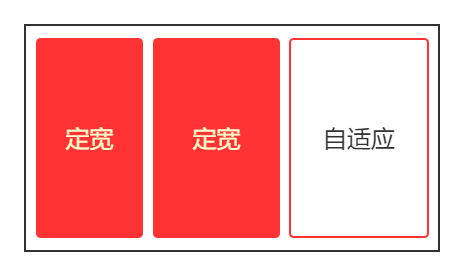
多列布局的分类,大概分为两列布局、三列布局和等分等高布局。像两列布局和三列布局,列可采用定宽或者自适应,两列布局还好情况不复杂(左列定宽右列自适应),但是三列情况就多一些了。
三列布局中,如果左边两个是定宽右边那个是自适应,这个情况跟两列布局类似;如果左右两边是定宽而中间那个是自适应,这就有些复杂了,还会衍生出圣杯布局和双飞翼布局。
# 二、两列布局

两列布局一般情况是左列定宽右列自适应,它的实现方式有三种:
- float + calc()
- float + BFC
- 使用 table 表格
# 2.1 float + calc()
其实float + calc()这种实现方式的前身是float + margin,因为calc()这个方法是 css3 推出的,在 css3 之前是使用边距和auto 宽度来控制自适应列的展示的。
左列设置左浮动,这样后面的元素与左列会在同一行(浮动效果)从而形成两列;左列设置固定宽度,右列自适应并且不能被左列遮挡,需要设置左边距,宽度其实不用设置(宽度加上左边距等于一行,块级元素特性)。
<html>
  <head>
    <style type="text/css">
      .left,
      .right {
        height: 200px;
      }
      .left {
        float: left;
        width: 300px;
        background-color: red;
      }
      .right {
        margin-left: 300px;
        background-color: #cccccc;
      }
    </style>
  </head>
  <body>
    <!--左列,左浮动,固定宽度-->
    <div class="left"></div>
    <!--右列,自适应宽度,设置好左边距-->
    <div class="right"></div>
  </body>
  <html></html>
</html>
2
3
4
5
6
7
8
9
10
11
12
13
14
15
16
17
18
19
20
21
22
23
24
25
26
如果右列的某个后代元素使用了清除浮动,这个后代元素会单独去新的一行里显示,这就破坏了两列布局。为什么会去新的一行里显示,可以回顾一下清除浮动这一章节。另外一个问题是,一个浮动另一个不浮动,层级上有问题,并且这两个之间可能会留出空隙来(老版浏览器)。
为了解决上面的问题,可以直接让右列也浮动起来,右列宽度直接使用 css3 里的calc()来计算,右列宽度 = 100% - 左列宽度。
<html>
  <head>
    <style type="text/css">
      .left,
      .right {
        height: 200px;
      }
      .left {
        float: left;
        width: 300px;
        background-color: red;
      }
      .right {
        float: right;
        width: calc(100% - 300px);
        background-color: #cccccc;
      }
    </style>
  </head>
  <body>
    <!--左列,左浮动,固定宽度-->
    <div class="left"></div>
    <!--右列,右浮动(左浮动也可以),calc()来自适应-->
    <div class="right"></div>
  </body>
  <html></html>
</html>
2
3
4
5
6
7
8
9
10
11
12
13
14
15
16
17
18
19
20
21
22
23
24
25
26
27
# 2.2 float + BFC
其实就是BFC 的作用之一,BFC 不会被浮动区域覆盖。float + BFC 这个方案优点就是简单,但是留下的问题就是一个不浮动另一个不浮动,不过问题不大。
<html>
  <head>
    <style type="text/css">
      .left,
      .right {
        height: 200px;
      }
      .left {
        float: left;
        width: 300px;
        background-color: red;
      }
      /*display: flow-root会创建无副作用的BFC*/
      .right {
        display: flow-root;
        background-color: #cccccc;
      }
    </style>
  </head>
  <body>
    <div class="left"></div>
    <div class="right"></div>
  </body>
  <html></html>
</html>
2
3
4
5
6
7
8
9
10
11
12
13
14
15
16
17
18
19
20
21
22
23
24
25
# 2.3 使用 table 表格
对非<table>元素使用表格布局,来达到两列布局的效果。需要注意的点就是,采用 100%宽度的固定宽度布局,再加上两个 div,其中一个 div 是固定宽度,另一个不设置宽度,它会由总表宽减去已有宽度(左列的固定宽度)得到。这种两列布局,兼容性不错,就是得熟悉表格布局(边界模式和宽度计算方式)。
<html>
  <head>
    <style type="text/css">
      /*表格布局,固定宽度,宽度设置页面的100%*/
      .parent {
        display: table;
        table-layout: fixed;
        width: 100%;
      }
      .left,
      .right {
        height: 200px;
      }
      .left {
        display: table-cell;
        width: 300px;
        background-color: red;
      }
      .right {
        display: table-cell;
        background-color: #cccccc;
      }
    </style>
  </head>
  <body>
    <div class="parent">
      <div class="left"></div>
      <div class="right"></div>
    </div>
  </body>
  <html></html>
</html>
2
3
4
5
6
7
8
9
10
11
12
13
14
15
16
17
18
19
20
21
22
23
24
25
26
27
28
29
30
31
32
# 三、三列布局
三列布局有一种情况是,左边两个是定宽右边那个是自适应,它的实现方式与两列布局基本一致,所以不再这一节里赘述了。
三列布局另一种情况是,左右两边是定宽而中间那个是自适应。
# 3.1 经典的圣杯布局
圣杯布局是头部、中间内容和底部构成,而这个最重要的中间内容就是一个三列布局,并且是左右两边是定宽而中间那个是自适应的情况。

在 css3 之前常使用float + margin来实现,你可能会写成这个样子:
<html>
  <head>
    <style type="text/css">
      .left,
      .right,
      .center {
        height: 200px;
      }
      .left {
        float: left;
        width: 300px;
        background-color: red;
      }
      .center {
        margin-left: 300px;
        margin-right: 300px;
        background-color: #cccccc;
      }
      .right {
        float: right;
        width: 300px;
        background-color: blue;
      }
    </style>
  </head>
  <body>
    <div class="left"></div>
    <div class="center"></div>
    <div class="right"></div>
  </body>
  <html></html>
</html>
2
3
4
5
6
7
8
9
10
11
12
13
14
15
16
17
18
19
20
21
22
23
24
25
26
27
28
29
30
31
32
对应效果图:

什么原因呢?可以想一下right这个 div 在没有浮动前处于什么位置?是不是在center这个 div 的下边界那里(块级元素特性)?再根据浮动规则的其中一条“浮动元素的顶边不能比它原本未浮动前所在框体顶边还高”,现在你明白了怎么回事吧!
有一个解决办法就是把right这个 div 和center这个 div 的代码位置交换一下,但是代码阅读体验不好,并且还可能会影响搜索引擎对网页的收录。还有个解决办法就是把center这个 div 放到最前面,左右两个浮动 div 再使用相对定位。
<html>
  <head>
    <style type="text/css">
      .left,
      .right,
      .center {
        height: 200px;
      }
      .center {
        margin-left: 300px;
        margin-right: 300px;
        background-color: #cccccc;
      }
      .left {
        float: left;
        position: relative;
        bottom: 200px;
        width: 300px;
        background-color: red;
      }
      .right {
        float: right;
        position: relative;
        bottom: 200px;
        width: 300px;
        background-color: blue;
      }
    </style>
  </head>
  <body>
    <div class="center"></div>
    <div class="left"></div>
    <div class="right"></div>
  </body>
  <html></html>
</html>
2
3
4
5
6
7
8
9
10
11
12
13
14
15
16
17
18
19
20
21
22
23
24
25
26
27
28
29
30
31
32
33
34
35
36
其实可以使用经典的解决方案,center这个 div 还是放到最前面,在让这三个 div 都浮动,利用“margin 为负值”将左右两个 div 提上来。因为让center这个 div 也浮动了(块级元素变为浮动元素),那么它的自适应宽度失效了(没法使用某一边的外边距了),那么就需要添加一个父级 div(父级的边界或者内边距可以约束子级浮动元素)。
<html>
  <head>
    <style type="text/css">
      /* 设置父级BFC的原因是需要包含子级浮动的高度 */
      .parent {
        display: flow-root;
        padding-left: 300px;
        padding-right: 300px;
      }
      .left,
      .right,
      .center {
        height: 200px;
      }
      .center {
        float: left;
        width: 100%;
        background-color: #cccccc;
      }
      .left {
        width: 300px;
        float: left;
        margin-left: -300px;
        position: relative;
        right: 100%;
        background-color: red;
      }
      /*比较有趣的一点,.right设置float: left或float: right,效果一样*/
      .right {
        width: 300px;
        float: left;
        margin-right: -300px;
        background-color: blue;
      }
    </style>
  </head>
  <body>
    <div class="parent">
      <!--子元素都浮动,那就需要这个父级元素,最好设置成BFC-->
      <div class="center"></div>
      <div class="left"></div>
      <div class="right"></div>
    </div>
  </body>
  <html></html>
</html>
2
3
4
5
6
7
8
9
10
11
12
13
14
15
16
17
18
19
20
21
22
23
24
25
26
27
28
29
30
31
32
33
34
35
36
37
38
39
40
41
42
43
44
45
46
这个解决方案的重点就在于margin-left: -300px或者margin-right: -300px这种负值外边距的使用,它对浮动的影响可以查看之前的边距对浮动的影响。
还有要注意的一点,并没有使用margin-left: 100%,因为考虑到 center 区域比 left 区域宽度小的话,left 这个浮动元素就回不到上一行了;并且它并不需要 min-width 的限制。最后要注意的一点就是,左右两列回到上一行后,左列还在 center 区域的右边界,需要使用相对定位将它定位到左边空处。
# 3.2 双飞翼布局
双飞翼布局是对经典圣杯布局的一种优化,最主要的优化就是去掉了相对定位,并且将父级元素的 contentArea 宽度设置为 100%(肯定比左右两列之和要大),这样就能避免类似于margin-left: 100%的问题(上一节说过),所以双飞翼可以直接使用margin-left: 100%来对左列设置位置。
<html>
  <head>
    <style type="text/css">
      /* 设置父级BFC的原因是需要包含子级浮动的高度 */
      .parent {
        display: flow-root;
      }
      .left,
      .right,
      .center,
      .inner {
        height: 200px;
      }
      .center {
        float: left;
        width: 100%;
        background-color: #cccccc;
      }
      .inner {
        margin-left: 300px;
        margin-right: 300px;
        background-color: green;
      }
      .left {
        width: 300px;
        float: left;
        margin-left: -100%;
        background-color: red;
      }
      /*比较有趣的一点,.right设置float: left或float: right,效果一样*/
      .right {
        width: 300px;
        float: left;
        margin-left: -300px;
        background-color: blue;
      }
    </style>
  </head>
  <body>
    <div class="parent">
      <!--子元素都浮动,那就需要这个父级元素,最好设置成BFC-->
      <div class="center">
        <div class="inner"></div>
      </div>
      <div class="left"></div>
      <div class="right"></div>
    </div>
  </body>
  <html></html>
</html>
2
3
4
5
6
7
8
9
10
11
12
13
14
15
16
17
18
19
20
21
22
23
24
25
26
27
28
29
30
31
32
33
34
35
36
37
38
39
40
41
42
43
44
45
46
47
48
49
50
不过双飞翼有个问题,当浏览器缩小的比左右两列之和还小时,右列会覆盖左列(可以加上 min-width 限制)。
# 3.3 圣杯的其他实现
我们使用**float + calc()**来实现看看:
<html>
  <head>
    <style type="text/css">
      .left,
      .right,
      .center {
        height: 200px;
        float: left;
      }
      .left {
        width: 300px;
        background-color: red;
      }
      .center {
        width: calc(100% - 600px);
        background-color: #cccccc;
      }
      .right {
        width: 300px;
        background-color: blue;
      }
    </style>
  </head>
  <body>
    <div class="left"></div>
    <div class="center"></div>
    <div class="right"></div>
  </body>
  <html></html>
</html>
2
3
4
5
6
7
8
9
10
11
12
13
14
15
16
17
18
19
20
21
22
23
24
25
26
27
28
29
30
如果使用float + BFC呢?其实跟float + margin类似,问题也一样,需要交换right这个 div 和center这个 div 的代码位置。
<html>
  <head>
    <style type="text/css">
      .left,
      .right,
      .center {
        height: 200px;
      }
      .left {
        float: left;
        width: 300px;
        background-color: red;
      }
      .center {
        display: flow-root;
        background-color: #cccccc;
      }
      .right {
        float: right;
        width: 300px;
        background-color: blue;
      }
    </style>
  </head>
  <body>
    <div class="left"></div>
    <div class="right"></div>
    <div class="center"></div>
  </body>
  <html></html>
</html>
2
3
4
5
6
7
8
9
10
11
12
13
14
15
16
17
18
19
20
21
22
23
24
25
26
27
28
29
30
31
前两种都有双飞翼布局类似的问题,当浏览器缩小的比左右两列之和还小时,右列会跑到新行去(可以加上 min-width 限制)。
使用 table 表格的话,跟两列布局没什么区别,也不会出现什么问题。
<html>
  <head>
    <style type="text/css">
      /*表格布局,固定宽度,宽度设置页面的100%*/
      .parent {
        display: table;
        table-layout: fixed;
        width: 100%;
      }
      .left,
      .right,
      .center {
        height: 200px;
      }
      .left {
        display: table-cell;
        width: 300px;
        background-color: red;
      }
      .right {
        display: table-cell;
        width: 300px;
        background-color: blue;
      }
      .center {
        background-color: #cccccc;
      }
    </style>
  </head>
  <body>
    <div class="parent">
      <div class="left"></div>
      <div class="center"></div>
      <div class="right"></div>
    </div>
  </body>
  <html></html>
</html>
2
3
4
5
6
7
8
9
10
11
12
13
14
15
16
17
18
19
20
21
22
23
24
25
26
27
28
29
30
31
32
33
34
35
36
37
38
# 四、等分布局
等分布局把一行分成若干列,这些列的宽度都相等。它的实现一般有两种:浮动和表格。
# 4.1 使用浮动或表格
4 个都向左浮动,分配的宽度为 25%
<html>
  <head>
    <style type="text/css">
      .parent {
        display: flow-root;
      }
      .col {
        float: left;
        width: 25%;
        height: 200px;
      }
      .cell1 {
        background-color: red;
      }
      .cell2 {
        background-color: yellow;
      }
      .cell3 {
        background-color: blue;
      }
      .cell4 {
        background-color: green;
      }
    </style>
  </head>
  <body>
    <div class="parent">
      <div class="col cell1"></div>
      <div class="col cell2"></div>
      <div class="col cell3"></div>
      <div class="col cell4"></div>
    </div>
  </body>
  <html></html>
</html>
2
3
4
5
6
7
8
9
10
11
12
13
14
15
16
17
18
19
20
21
22
23
24
25
26
27
28
29
30
31
32
33
34
35
表格的话,设置父元素为display: table,4 个子元素为display: table-cell,表要记得设置宽度。
<html>
  <head>
    <style type="text/css">
      /*表格布局,固定宽度,宽度设置页面的100%*/
      .parent {
        display: table;
        table-layout: fixed;
        width: 100%;
      }
      .col {
        display: table-cell;
        height: 200px;
      }
      .cell1 {
        background-color: red;
      }
      .cell2 {
        background-color: yellow;
      }
      .cell3 {
        background-color: blue;
      }
      .cell4 {
        background-color: green;
      }
    </style>
  </head>
  <body>
    <div class="parent">
      <div class="col cell1"></div>
      <div class="col cell2"></div>
      <div class="col cell3"></div>
      <div class="col cell4"></div>
    </div>
  </body>
  <html></html>
</html>
2
3
4
5
6
7
8
9
10
11
12
13
14
15
16
17
18
19
20
21
22
23
24
25
26
27
28
29
30
31
32
33
34
35
36
37
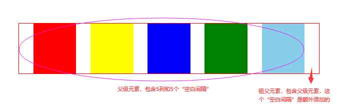
# 4.2 空白间隔问题

可能会遇到间隔问题,如上图。而空白间隔应该要比展示列多一个或者少一个,表格方式的倒还好(分离边界模型),主要是浮动方式修改起来有些麻烦。浮动方式修改,比较笨的解决办法是,使用空白 div 块来作为空白间隔;另外一种,让边距充当空白间隔,然后对多出或者缺少的空白间隔进行特殊处理。


边距充当空白间隔的问题和解决方案:
- 如果对子级元素使用外边距充当空白间隔,按百分比分配宽度时就需要考虑外边距了。外边距没考虑好,浮动元素可能会跳到下一行去了。其实可以使用
box-sizing: border-box将子级元素改为 IE 盒模型,内边距被包含在宽度中了,让内边距作为空白间隔,这就不会影响宽度分配了。 - 但是空白间隔的多出或者缺少没有解决。子级元素的宽度分配是依赖于父级元素的,如果让父级元素设置内边距,或许可以增加一个空白间隔,但是无法抵消一个空白间隔(内边距不能为负数)。再者,我们希望空白间隔也是用百分比,子级元素倒好说,但是父级设置边距用百分比是没有参考对象。那么,综合这两个问题,可以引入一个祖父元素,对父级元素设置外边距使用百分比,这就可以增加或抵消一个空白间隔了。
- 最后一个问题是,父级元素设置外边距的百分比数值,与子元素设置内边距的百分比数值,这两者之间有没有联系?答案是有的,下面我们来分析一下。
我们假设,祖父元素宽度为 A,父级元素宽度为 B,父级元素设置外边距的百分比数值为x,子元素设置内边距的百分比数值为y。它们有什么联系呢?联系就在于在最后一个空白区域,这个空白区域的宽度等于B * y,也等于A - B这个差值,这个差值其实就是父级元素设置外边距来额外添加的一个空白间隔,因为父级元素设置了这一个外边距,那么1 - x = B / A。
将这两个等式联合起来可以消掉 A 和 B,最后可以得到x = y / (y + 1)。我们看下面这个代码,子元素设置内边距的百分比数值为5%,根据前面这个结论式子,可以算出父级元素设置外边距的百分比数值为4.762%。并且这个式子的关系,不会受等分数量还有祖父宽度的影响
<html>
  <head>
    <style type="text/css">
      .parent-fix {
        border: 1px solid red;
        width: 600px;
      }
      .parent {
        display: flow-root;
        margin-right: 4.762%;
      } /*是margin-right,因为要在最右边添加一个空白间隔*/
      .col {
        float: left;
        box-sizing: border-box;
        width: 20%;
        padding-left: 5%;
      }
      .cell1 {
        height: 100px;
        background-color: red;
      }
      .cell2 {
        height: 100px;
        background-color: yellow;
      }
      .cell3 {
        height: 100px;
        background-color: blue;
      }
      .cell4 {
        height: 100px;
        background-color: green;
      }
      .cell5 {
        height: 100px;
        background-color: skyblue;
      }
    </style>
  </head>
  <body>
    <div class="parent-fix">
      <div class="parent">
        <div class="col">
          <div class="cell1"></div>
        </div>
        <div class="col">
          <div class="cell2"></div>
        </div>
        <div class="col">
          <div class="cell3"></div>
        </div>
        <div class="col">
          <div class="cell4"></div>
        </div>
        <div class="col">
          <div class="cell5"></div>
        </div>
      </div>
    </div>
  </body>
  <html></html>
</html>
2
3
4
5
6
7
8
9
10
11
12
13
14
15
16
17
18
19
20
21
22
23
24
25
26
27
28
29
30
31
32
33
34
35
36
37
38
39
40
41
42
43
44
45
46
47
48
49
50
51
52
53
54
55
56
57
58
59
60
61
62
接下来我们看怎么抵消一个空白间隔。我们假设,祖父元素宽度为 A,父级元素宽度为 B,父级元素设置外边距的百分比数值为x,子元素设置内边距的百分比数值为y。要注意的一点,x我们取的是绝对值,因为父级左外边距是负值,它会让 A 祖父宽度比 B 父级宽度小,从而让第一个空白区域区域抵消掉。那么这个空白区域的宽度是B - A,并且也是等于B * y;前面是长度之差的关系,长度之比就是1 + x = B / A。
将这两个等式联合起来可以消掉 A 和 B,最后可以得到x = y / (1 - y)。我们看下面这个代码,子元素设置内边距的百分比数值为5%,根据前面这个结论式子,可以算出父级元素设置外边距的百分比数值为5.263%,使用时记得加上负号。并且这个式子的关系,不会受等分数量还有祖父宽度的影响
<html>
  <head>
    <style type="text/css">
      .parent-fix {
        border: 1px solid red;
        width: 600px;
        overflow: hidden;
      }
      .parent {
        display: flow-root;
        margin-left: -5.263%;
      } /*是margin-left,因为要在最左边抵消一个空白间隔*/
      .col {
        float: left;
        box-sizing: border-box;
        width: 20%;
        padding-left: 5%;
      }
      .cell1 {
        height: 100px;
        background-color: red;
      }
      .cell2 {
        height: 100px;
        background-color: yellow;
      }
      .cell3 {
        height: 100px;
        background-color: blue;
      }
      .cell4 {
        height: 100px;
        background-color: green;
      }
      .cell5 {
        height: 100px;
        background-color: skyblue;
      }
    </style>
  </head>
  <body>
    <div class="parent-fix">
      <div class="parent">
        <div class="col">
          <div class="cell1"></div>
        </div>
        <div class="col">
          <div class="cell2"></div>
        </div>
        <div class="col">
          <div class="cell3"></div>
        </div>
        <div class="col">
          <div class="cell4"></div>
        </div>
        <div class="col">
          <div class="cell5"></div>
        </div>
      </div>
    </div>
  </body>
  <html></html>
</html>
2
3
4
5
6
7
8
9
10
11
12
13
14
15
16
17
18
19
20
21
22
23
24
25
26
27
28
29
30
31
32
33
34
35
36
37
38
39
40
41
42
43
44
45
46
47
48
49
50
51
52
53
54
55
56
57
58
59
60
61
62
63
表格方式怎么解决空白间隔的问题?如果表格的边界是折叠边界模型的话,解决方式和浮动基本一样,就不再赘述了。如果表格的边界是分离边界模型的话,可以使用border-spacing来充当空白间隔,并且它有个特点就是最左边和最右边都会与表有 space,这样就不用自己多添加一个空白间隔了,但是它有个缺点就是怎么用数值不能用百分比。
也就是说使用border-spacing可以实现“多一个空白间隔”的情况,少一个“空白间隔”可能还是得用之前的方式,这里也不再赘述了
<html>
  <head>
    <style type="text/css">
      .parent {
        display: table;
        border-collapse: separate; /*分离边界模型*/
        table-layout: fixed;
        width: 600px;
        border-spacing: 20px 0; /*单元格与单元格之间,水平间距20px,垂直间距0*/
        border: 1px solid red;
      }
      .col {
        display: table-cell;
        height: 100px;
      }
      .cell1 {
        background-color: red;
      }
      .cell2 {
        background-color: yellow;
      }
      .cell3 {
        background-color: blue;
      }
      .cell4 {
        background-color: green;
      }
    </style>
  </head>
  <body>
    <div class="parent">
      <div class="col cell1"></div>
      <div class="col cell2"></div>
      <div class="col cell3"></div>
      <div class="col cell4"></div>
    </div>
  </body>
  <html></html>
</html>
2
3
4
5
6
7
8
9
10
11
12
13
14
15
16
17
18
19
20
21
22
23
24
25
26
27
28
29
30
31
32
33
34
35
36
37
38
39
空白间隔问题其实有一种更好的办法规避,那就是直接使用弹性盒布局配合justify-content属性,都不需要上面这些计算过程,空白间隔大小自动分配。
# 五、等高布局
等高布局把一行分成若干列,这些列的高度都相等。它的实现一般有两种:1.表格,2.溢出配合边距。
# 5.1 使用表格
我们知道表格的高度和单元格高度是自动计算的,也就说它的高度是根据内容多少来显示的。那么同一行的高度呢?其实是默认相等的,除了跨行以外。
当然,基本的设置还是要有的,表格 display 值,单元格 display 值,表格要固定宽度并且显示设置宽度。
<html>
  <head>
    <style type="text/css">
      .parent {
        display: table;
        table-layout: fixed;
        width: 600px;
      }
      .left {
        display: table-cell;
        background-color: red;
      }
      .right {
        display: table-cell;
        background-color: yellow;
      }
    </style>
  </head>
  <body>
    <div class="parent">
      <div class="left"></div>
      <div class="right">
        CSS1:1996年12月正式推出CSS1,对字体、尺寸、颜色、文本、位置、背景、边框等进行了规范,这个阶段主要使用table和CSS1来定位表单的外观和样式。
        CSS2:1998年5月正式推出CSS2,扩展了CSS1,添加了很多新属性和伪元素,这个阶段主要使用div和li来分割元素再搭配CSS2来定义表单界面的外观。
        CSS2.1:2004年2月正式推出了CSS2.1,纠正了CSS2中的一些错误,也删除了一些不被浏览器所支持的属性(有些出现在CSS3规范中了)。
        CSS3:2010年推出的全新版本CSS3,被分为若干个相互独立的模块,包括盒子模型、列表模块、超链接方式、语言模块、背景和边框、文字特效、多栏布局等模块。
      </div>
    </div>
  </body>
  <html></html>
</html>
2
3
4
5
6
7
8
9
10
11
12
13
14
15
16
17
18
19
20
21
22
23
24
25
26
27
28
29
30
31
# 5.2 溢出配合边距
这种方法非常巧妙,在学习使用这种方法时,最好了解一下内外边距的影响,还需要了解overflow: hidden的触发临界点。
具体是让父级元素设置overflow: hidden,子级浮动并且设置padding-bottom: 9999px;和margin-bottom: -9999px;这种特殊的处理方式。这种特殊的处理方式有几种叫法:内外补丁负值法、内边距补偿法。
分析:
- 我们期望的效果是父容器的高度是随着最高列的内容高度来自动调整的。其他几列内容高度肯定是不如最高列的,那就需要使用内边距补偿短缺的高度。因为内边距算作展示效果里的,所有这个方法的等高布局是一种伪登高布局。
- 但是我们并不清楚实际场景中哪一列会是最高列,所以给所有列都设置了 padding,除最高列的其他列要补偿的高度并不相同,那可以先让 padding 都取一个超大值,再使用
overflow: hidden将多余的展示尺寸都截取掉,这样就可以形成一个视觉上等高的几列。 - 我们知道这个父容器的高度并没有显示设置,它是依赖于子元素的布局尺寸撑起来的,而之前又使用了 padding,它既增大了布局尺寸也增大了展示尺寸,那么父容器的边界此时肯定是一直包裹这子元素的边界的,也就是说
overflow: hidden并不会生效。 - 刚好 margin 取负值可以减少布局尺寸但又不影响展示尺寸,这样就可以让
overflow: hidden生效了。还有就是,期望让父容器的高度是随着最高列的内容高度来自动调整,那就让 padding 和 margin 的绝对值相等,最后剩下的布局尺寸就是最高列的内容高度了。
<html>
  <head>
    <style type="text/css">
      .parent {
        overflow: hidden;
        width: 600px;
      }
      .col {
        float: left;
        padding-bottom: 9999px;
        margin-bottom: -9999px;
      }
      .left {
        width: 50%;
        background-color: red;
      }
      .right {
        width: 50%;
        background-color: yellow;
      }
    </style>
  </head>
  <body>
    <div class="parent">
      <div class="col left">CSS</div>
      <div class="col right">
        CSS1:1996年12月正式推出CSS1,对字体、尺寸、颜色、文本、位置、背景、边框等进行了规范,这个阶段主要使用table和CSS1来定位表单的外观和样式。
        CSS2:1998年5月正式推出CSS2,扩展了CSS1,添加了很多新属性和伪元素,这个阶段主要使用div和li来分割元素再搭配CSS2来定义表单界面的外观。
      </div>
    </div>
  </body>
  <html></html>
</html>
2
3
4
5
6
7
8
9
10
11
12
13
14
15
16
17
18
19
20
21
22
23
24
25
26
27
28
29
30
31
32
33
其实每列的实际高度就是每列的 contentArea 高度,视觉上的等高是每列 contentArea 高度加上“还留在父元素框内的 padding 高度”,多余的 padding 都被overflow: hidden截掉了。
# 六、css3 中的多列布局
# 6.1 列数和最小宽度
css3 中通过column-count属性来对一个元素的内容进行多列布局,该属性的值可以是auto表示由 css 自动分配,也可以是一个整数表示有几列。
还有一个属性是column-width,表示列的宽度或者列的最小宽度,也可以设置auto也可以设置一个数值。
其实这两个属性可以简写在一起,比如column-count: 4; column-width: 100px;其实是可以简写成columns: 4 100px;,千万要注意是columns而不是column。
<html>
  <head>
    <style type="text/css">
      .parent {
        border: 1px solid red;
        width: 600px;
        column-count: 4;
        column-width: 100px;
      }
      .col1 {
        height: 100px;
        background-color: red;
      }
      .col2 {
        height: 100px;
        background-color: yellow;
      }
      .col3 {
        height: 100px;
        background-color: blue;
      }
      .col4 {
        height: 100px;
        background-color: green;
      }
    </style>
  </head>
  <body>
    <div class="parent">
      <div class="col1"></div>
      <div class="col2"></div>
      <div class="col3"></div>
      <div class="col4"></div>
    </div>
  </body>
  <html></html>
</html>
2
3
4
5
6
7
8
9
10
11
12
13
14
15
16
17
18
19
20
21
22
23
24
25
26
27
28
29
30
31
32
33
34
35
36
37
# 6.2 空白间隔、间隔边框
column-gap这个属性可以更改列与列之间的空白间隔,默认值是normal对应的是1em的长度,可以设置具体数值(正整数)。
<html>
  <head>
    <style type="text/css">
      .parent {
        border: 1px solid red;
        width: 600px;
        columns: 4 100px;
        column-gap: 20px;
      }
      .col1 {
        height: 100px;
        background-color: red;
      }
      .col2 {
        height: 100px;
        background-color: yellow;
      }
      .col3 {
        height: 100px;
        background-color: blue;
      }
      .col4 {
        height: 100px;
        background-color: green;
      }
    </style>
  </head>
  <body>
    <div class="parent">
      <div class="col1"></div>
      <div class="col2"></div>
      <div class="col3"></div>
      <div class="col4"></div>
    </div>
  </body>
  <html></html>
</html>
2
3
4
5
6
7
8
9
10
11
12
13
14
15
16
17
18
19
20
21
22
23
24
25
26
27
28
29
30
31
32
33
34
35
36
37
column-rule这个属性是用来设置列与列之间的边框的,它有三个方面:边框宽度、边框颜色和边框样式。可以分开写:column-rule-width、column-rule-color和column-rule-style。
<html>
  <head>
    <style type="text/css">
      .parent {
        width: 600px;
        border: 1px solid red;
        columns: 4 100px;
        column-gap: 20px;
        column-rule: 2px solid green;
      }
      .col1 {
        height: 100px;
        background-color: red;
      }
      .col2 {
        height: 100px;
        background-color: yellow;
      }
      .col3 {
        height: 100px;
        background-color: blue;
      }
      .col4 {
        height: 100px;
        background-color: green;
      }
    </style>
  </head>
  <body>
    <div class="parent">
      <div class="col1"></div>
      <div class="col2"></div>
      <div class="col3"></div>
      <div class="col4"></div>
    </div>
  </body>
  <html></html>
</html>
2
3
4
5
6
7
8
9
10
11
12
13
14
15
16
17
18
19
20
21
22
23
24
25
26
27
28
29
30
31
32
33
34
35
36
37
38
可以看到空白间隔的宽度是包含里column-rule的宽度,也就是说column-rule的宽度不会自己再占空间。
# 6.3 横跨所有列
column-span这个属性是为某列设置是否横跨所有列,默认值是none表示不跨列,all表示跨所有列。
<html>
  <head>
    <style type="text/css">
      .parent {
        width: 600px;
        border: 1px solid red;
        columns: 4 100px;
        column-gap: 20px;
        column-rule: 2px solid green;
      }
      .col1 {
        height: 100px;
        background-color: red;
      }
      .col2 {
        height: 100px;
        background-color: yellow;
      }
      .col3 {
        height: 100px;
        background-color: blue;
      }
      .col4 {
        height: 100px;
        background-color: green;
      }
      .col5 {
        height: 100px;
        background-color: skyblue;
        column-span: all;
      }
    </style>
  </head>
  <body>
    <div class="parent">
      <div class="col1"></div>
      <div class="col2"></div>
      <div class="col3"></div>
      <div class="col4"></div>
      <div class="col5"></div>
    </div>
  </body>
  <html></html>
</html>
2
3
4
5
6
7
8
9
10
11
12
13
14
15
16
17
18
19
20
21
22
23
24
25
26
27
28
29
30
31
32
33
34
35
36
37
38
39
40
41
42
43
44
# 七、全屏布局
全屏布局指的是 html 铺满整个浏览器页面,没有水平和垂直的滚动条,让 html 跟着页面大小变化而变化。
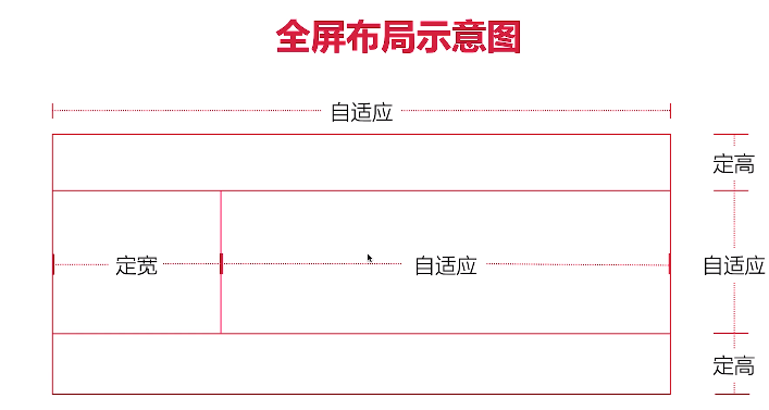
跟圣杯布局差不多。
<html>
  <head>
    <style type="text/css">
      body,
      html {
        margin: 0;
      }
      .header {
        position: fixed;
        width: 100%;
        height: 100px;
        top: 0;
        left: 0;
        right: 0;
        background-color: skyblue;
      }
      .footer {
        position: fixed;
        width: 100%;
        height: 100px;
        bottom: 0;
        left: 0;
        right: 0;
        background-color: lightblue;
      }
      .content {
        position: fixed;
        width: 100%;
        top: 100px;
        bottom: 100px;
        left: 0;
        right: 0;
        background-color: red;
      }
      .left {
        float: left;
        width: 400px;
        height: 100%;
        overflow: auto;
        background-color: yellow;
      }
      /*.right {
            float: left; width: calc(100% - 400px); height: 100%;
            overflow: auto; background-color: green;
        }*/
      .right {
        height: 100%;
        margin-left: 400px;
        overflow: auto;
        background-color: green;
      }
    </style>
  </head>
  <body>
    <div class="header"></div>
    <div class="content">
      <div class="left"></div>
      <div class="right"></div>
    </div>
    <div class="footer"></div>
  </body>
</html>
2
3
4
5
6
7
8
9
10
11
12
13
14
15
16
17
18
19
20
21
22
23
24
25
26
27
28
29
30
31
32
33
34
35
36
37
38
39
40
41
42
43
44
45
46
47
48
49
50
51
52
53
54
55
56
57
58
59
60
61
62