# 盒模型
# 一、盒子的构成与设置
# 1.1 盒子的构成
在 CSS 中,所有元素都是一个“盒子(box)”结构,这个盒子有一个盒边框,在这个边框内部有个显示内容区域,显示内容与边框之间还会有填充(内边距),边框与其他盒子之间也有间距(外边距)。可以看下面这个盒模型图:
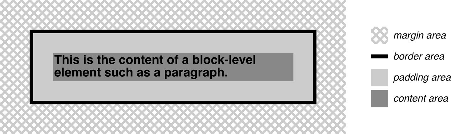
解释:
- content area: 这个区域是用来显示内容,大小可以通过设置 width 和 height。
- padding area: 包围在内容区域外部的空白区域; 大小通过 padding 相关属性设置。
- border area: 边框盒包裹内容和内边距。大小通过 border 相关属性设置。
- margin area: 这是最外面的区域,是盒子和其他元素之间的空白区域。大小通过 margin 相关属性设置。
# 1.2 盒子的相关设置
标准盒模型的 width 和 height 其实就是 contentArea 的宽高,但是IE 盒模型的 width 和 height 是 contentArea、paddingArea 以及 borderArea 这三者的和值,通过改变box-sizing: content-box(W3C)和box-sizing: border-box(IE)就可以达到自由切换的效果。
margin可以统一设置上下左右的外边距,比如margin: 0 10px 20px 30px意思就是上外边距是 0、右外边距是 10px、下外边距是 20px、左外边距是 30px。也可以margin: 0 10px上下外边距是 0、左右外边距是 10px。单独设置一边也可以的,比如margin-top:0; margin-right:10px; margin-bottom:20px; margin-left:30px;,
border可以统一设置也可以单独设置一边。主要注意的是它还有其他样式可以设置,比如颜色 border-color、宽度 border-width、线条类型 border-style。
padding也可以统一设置也可以单独设置一边。padding 只能是非负数;而 margin 可以是负数,并且可能会影响到自身的位置以及大小,在四、内外边距的影响会详细说明。
<html>
  <head>
    <style type="text/css">
      .container {
        border-top: 5px dotted green;
        border-right: 1px solid black;
        border-bottom: 10px double blue;
      }
      .box {
        border: 1px solid #333333;
        border-top-style: dotted;
        border-right-width: 20px;
        border-bottom-color: red;
        margin: 20px 20px;
      }
    </style>
  </head>
  <body>
    <div class="container">
      <div class="box">Change my borders.</div>
    </div>
  </body>
  <html></html>
</html>
2
3
4
5
6
7
8
9
10
11
12
13
14
15
16
17
18
19
20
21
22
23
24
上面代码的效果图:
# 二、块级盒子和内联盒子
在水平书写模式中,页面通常是从左到右、从上到下这样一个顺序来显示元素的(阿拉伯语言等除外),盒子也是基于这种正常的元素排列顺序来说的。
CSS 盒子最主要的两种盒子就是块级盒子(Block box)和内联盒子(Inline box),它们主要的区别就是在排列顺序上表现不一样。比如块级盒子主要是垂直排列(一个块级元素就默认占据一行),而内联盒子主要是水平排列(多个内联元素在一行里 inline)。
块级盒子会表现出以下行为:
- 块级盒子默认会与父容器一样宽;
- 每个块级盒子都会单独占一行,也就是说,不会有其他块级盒子和当前块级盒子在一行里;
- width 和 height 属性可以发挥作用;
- 内外边距和边框会将其他元素从当前盒子周围“推开”。
内联盒子会表现出以下行为:
- 内联盒子不会单独占一行,多个内联盒子可以在一行里(并且留了间隙,所以一般不用内联盒子)。
- width 和 height 属性将不起作用,原因是它是由内部撑起来的。
- 垂直方向的内外边距以及边框会被应用,虽然被应用了,但并不会推开上下的其他内联盒子(真要推开,也是靠行高来影响的)。
- 水平方向的内外边距以及边框会被应用,并且会把左右的内联盒子推开。
<html>
  <head>
    <style type="text/css">
      p {
        width: 300px;
        height: 150px;
        border: 2px solid red;
      }
      span {
        margin: 20px; /* 外边距和边框虽然是生效的,垂直是推不开的其他内联元素的,而水平方向的可以 */
        padding: 10px; /* 生效 */
        width: 30px; /* 内联盒子忽略宽度 */
        height: 10px; /* 内联盒子忽略高度 */
        background-color: lightblue;
        border: 2px solid blue;
      }
    </style>
  </head>
  <body>
    <p>
      I am a paragraph and this is a <span>span</span> inside that paragraph. A span is an inline element and so does
      not respect width and height.
    </p>
  </body>
  <html></html>
</html>
2
3
4
5
6
7
8
9
10
11
12
13
14
15
16
17
18
19
20
21
22
23
24
25
26
上面代码的效果图:

除非特殊指定,<h1>、<p>和<div>等在默认情况下都是块级盒子,<span>、<a>、<em>和<strong>等在默认情况下都是内联盒子。可以通过display来指定或者修改元素的盒子类型。
<html>
  <head>
    <style type="text/css">
      div {
        display: inline;
        background-color: red;
      }
      span {
        display: block;
        background-color: green;
      }
    </style>
  </head>
  <body>
    <div>div元素</div>
    <!--变成在一行里排列的内联元素-->
    <div>div元素</div>
    <!--变成在一行里排列的内联元素-->
    <span>span元素</span
    ><!--变成占满一行的块级元素-->
    <span>span元素</span
    ><!--变成占满一行的块级元素-->
  </body>
  <html></html>
</html>
2
3
4
5
6
7
8
9
10
11
12
13
14
15
16
17
18
19
20
21
22
23
24
25
# 三、display 的其他值
# 3.1 none
display: none一般用于隐藏元素。它所在位置会被其他元素占领,不会留出空白。
<html>
  <head>
    <style type="text/css">
      .none {
        display: none;
      }
    </style>
  </head>
  <body>
    <div>示例文本1</div>
    <div class="none">示例文本2</div>
    <div class="none">示例文本3</div>
    <div>示例文本4</div>
  </body>
  <html></html>
</html>
2
3
4
5
6
7
8
9
10
11
12
13
14
15
16
# 3.2 inline-block
希望元素在一行里排列,并且还能设置宽高(块级特点),但又不想它因为内外边距的原因导致与其他元素在垂直方向上重叠(上一节的 span 例子,内联特点),那么可以采用display: inline-block结合块级和内联两种方式的优点来使用。说简单点就是在一行里排列块级元素,并且垂直方向的内外边距能推开其他内容。
<html>
  <head>
    <style type="text/css">
      p {
        width: 300px;
        height: 150px;
        border: 2px solid red;
      }
      span {
        display: inline-block;
        margin: 20px; /* 会推开文字 */
        padding: 10px;
        width: 30px; /* 生效 */
        height: 10px; /* 生效 */
        background-color: lightblue;
        border: 2px solid blue;
      }
    </style>
  </head>
  <body>
    <p>
      I am a paragraph and this is a <span>span</span> inside that paragraph. A span is an inline element and so does
      not respect width and height.
    </p>
  </body>
  <html></html>
</html>
2
3
4
5
6
7
8
9
10
11
12
13
14
15
16
17
18
19
20
21
22
23
24
25
26
27
上面代码的效果图:
# 3.3 inline-table
inline-table 与 inline-block 是类似的,只不过它是单独针对于<table>的。table 元素是属于 block 类型的,使用display: inline-table可以让 table 元素在行内排列。
<html>
  <head>
    <style type="text/css">
      table {
        border: 2px solid blue;
        margin: 30px;
        display: inline-table;
      }
      td {
        border: 2px solid red;
      }
    </style>
  </head>
  <body>
    你好
    <table>
      <tr>
        <td>A</td>
        <td>A</td>
      </tr>
      <tr />
      <tr>
        <td>B</td>
        <td>C</td>
      </tr>
      <tr />
    </table>
    你好
  </body>
  <html></html>
</html>
2
3
4
5
6
7
8
9
10
11
12
13
14
15
16
17
18
19
20
21
22
23
24
25
26
27
28
29
30
31
# 3.4 list-item
display: list-item可以将多个元素作为列表来显示。
<html>
  <head>
    <style type="text/css">
      div {
        display: list-item;
        list-style-type: circle;
        margin-left: 30px;
      }
    </style>
  </head>
  <body>
    <div>文本1</div>
    <div>文本2</div>
    <div>文本3</div>
  </body>
  <html></html>
</html>
2
3
4
5
6
7
8
9
10
11
12
13
14
15
16
17
# 3.5 run-in 和 compact
display: run-in的元素将被包含在后面的 block 类型元素的内部,而display: compact的元素将被放置在 block 类型元素的左边。在 css2.1 被删除了,在 css3 恢复了但是很多浏览器没有实现,了解一下就行了。
# 四、内外边距的影响
# 4.1 展示尺寸与布局尺寸
我们看待一个元素,要从两方面去分析它的,一个是视觉上,另一个就是布局上的。
首先在视觉上,元素给我们呈现的视觉大小是由contentArea、paddingArea和borderArea决定的。比如给元素加上background-color,这个颜色所占区域就是 contentArea、paddingArea、borderArea 加起来的总区域。
看下面这个例子,宽高其实都是 100px 的 div,第一个加了 margin,第二个加了 padding,第三个加了 padding 和 border,实际给我们呈现的效果除了 content 以外就只有 padding 和 border 还会影响视觉大小,而 margin 根本不会影响元素的视觉大小。我们暂且将元素在视觉上的展示大小称为元素的展示尺寸,它的值等于border + padding + content这个和值。(是不是想起 IE 盒的 width 和 height)
<html>
  <head>
    <style type="text/css">
      div {
        width: 100px;
        height: 100px;
      }
      .div1 {
        background-color: green;
        margin: 20px;
      }
      .div2 {
        background-color: yellow;
        padding: 20px;
      }
      .div3 {
        background-color: blue;
        padding: 20px;
        border: 2px solid red;
      }
    </style>
  </head>
  <body>
    <div class="div1"></div>
    <div class="div2"></div>
    <div class="div3"></div>
  </body>
  <html></html>
</html>
2
3
4
5
6
7
8
9
10
11
12
13
14
15
16
17
18
19
20
21
22
23
24
25
26
27
28
29
然后在布局上,contentArea、paddingArea、borderArea和marginArea会决定元素在正常布局流中占据的空间大小。
还是上面这个例子。三个 div 左右的外边距都是顶着父容器左右边框的,那么内容加上左右填充再加上左右边框最后加上左右外边距,这个值就等于父容器内容的宽度,也就说三个 div 盒子占据的空间宽度相同(这是一个伏笔)。而他们的占据的空间高度呢?同样也是如此,内容加上上下填充再加上上下边框最后加上上下外边距,在数值上几乎是一样的(除了第三个 div 有上下边框,浏览器 F12 查看)。我们暂且将元素在布局流中占据的空间大小称为元素的布局尺寸,它的值等于margin + border + padding + content这个和值。
看下面这个例子,将第一个 div 的 margin-bottom 从20px慢慢改变到-20px。在改变过程中,你会发现后面两个 div 会慢慢往上挪动,形成一种步步紧逼的样子。这个现象其实就是因为第一个 div 占据的空间慢慢变小(布局尺寸减小),多出的空间被后面的 div 占据了。然后你还会发现展示效果一直是 102×102 的矩形区域,只不过会发生重叠,布局尺寸的减少并不会导致展示效果被压缩,也就说展示尺寸和布局尺寸之间没有强关联,只是数值上相差margin值而已。
<html>
  <head>
    <style type="text/css">
      div {
        width: 100px;
        height: 100px;
        border: 1px solid red;
      }
      /* margin: 20px 20px 0 20px;中的第三个值从20px慢慢变到0再慢慢变到-20px */
      .div1 {
        background-color: green;
        margin: 20px 20px 0 20px;
      }
      .div2 {
        background-color: yellow;
        padding: 20px;
        opacity: 0.8;
      }
      .div3 {
        background-color: blue;
        padding: 20px;
      }
    </style>
  </head>
  <body>
    <div class="div1"></div>
    <div class="div2"></div>
    <div class="div3"></div>
  </body>
  <html></html>
</html>
2
3
4
5
6
7
8
9
10
11
12
13
14
15
16
17
18
19
20
21
22
23
24
25
26
27
28
29
30
31
还有一个比较有意思的点,改变布局尺寸,展示效果位移的可能是自己也可能是下一个元素。如果改变的是元素在排列方向上靠前的外边距,那展示效果位移的就是自己;如果改变的是排列方向上靠后的外边距,那展示效果位移的就是下一个元素。看下面这个例子,将第二个 div 的 margin-top 慢慢从0变为-40px,你会发现下面两个 div 在慢慢向上挪动。如果是 margin-bottom,那就只有最后一个 div 移动。
PS:排列方向,就是根据元素特性来排列(在正常布局流中),比如块级元素就是垂直方向(因为它们单独占一行,所以是进行上下的一个排列),内联元素就是水平方向。
<html>
  <head>
    <style type="text/css">
      div {
        width: 100px;
        height: 100px;
        border: 1px solid red;
      }
      .div1 {
        background-color: green;
        margin: 20px;
      }
      .div2 {
        background-color: yellow;
        margin-top: -40px;
        padding: 20px;
        opacity: 0.8;
      }
      .div3 {
        background-color: blue;
        padding: 20px;
      }
    </style>
  </head>
  <body>
    <div class="div1"></div>
    <div class="div2"></div>
    <div class="div3"></div>
  </body>
  <html></html>
</html>
2
3
4
5
6
7
8
9
10
11
12
13
14
15
16
17
18
19
20
21
22
23
24
25
26
27
28
29
30
31
我们一直没说内边距对布局尺寸的影响,其实很简单,就是内边距只能增大布局尺寸而不能减小布局尺寸,原因就是 padding 只能是正值。那么可以下结论了,内边距既能改变布局尺寸也能改变展示尺寸,而外边距一般只能改变布局尺寸。
# 4.2 块级元素的隐藏等式
你会看到上面的结论有“一般”这个词,因为有一种情况比较特殊,也是之前埋下的伏笔。块级元素在非排列方向上(也就是块级元素是水平方向上)的外边距,可能会影响到展示尺寸。
因为块级元素有个特点,水平占据一行。什么意思呢?块级元素布局尺寸的宽度必须等于父元素内容的宽度,也就是这个等式margin-left + border-left-width + padding-left + width + padding-right + border-right-width + margin-right = the width of the parent element(准确来说是等于父容器内容的宽度,子元素水平方向的布局尺寸等于父元素的内容的宽度)。垂直方向是没有这个等式的,因为块级元素高度的auto是由本身内容决定的,块级元素宽度的auto是由父级宽度决定的。
上一节的那些例子,父级元素宽度不变,子级元素有显示设置宽度、内边距以及边框,只需要左右外边距来补齐布局尺寸宽度即可。再看下面这个例子,没有设置子元素宽度(那就默认auto),并且让左右外边距取负值,要维持那个等式,那得让展示尺寸的宽度增大才行。当然左右外边距取正值也会影响到展示尺寸宽度(减小)。
<html>
  <head>
    <style type="text/css">
      .outer {
        width: 150px;
        height: 75px;
        border: 2px solid green;
        margin: 25px;
      }
      /* 宽度没有设置或者为auto,左右外边距取负值。 */
      .inner {
        height: 25px;
        border: 1px solid red;
        margin-left: -20px;
      }
    </style>
  </head>
  <body>
    <div class="outer">
      <div class="inner"></div>
    </div>
  </body>
  <html></html>
</html>
2
3
4
5
6
7
8
9
10
11
12
13
14
15
16
17
18
19
20
21
22
23
24
由于这个等式的关系,只要让子元素的左右内外边距固定不变,父元素宽度变大,那子元素宽度跟着变大(父变小那子也变小);或者父元素宽度固定,让子元素的左右内外边距变大,那子元素的宽度反而会变小(边距变小那子就变大)。我们常把这种子元素叫做自适应的盒子。
<html>
  <head>
    <style>
      .outer {
        width: 200px;
        height: 200px;
        background-color: red;
        margin: 50px 0 0 100px;
      }
      .inner {
        height: 100px;
        background-color: blue;
        /* 子元素宽度由margin来决定(父元素width固定),还应用了外边距取负数 */
        margin: 50px -150px 0 -50px;
      }
    </style>
  </head>
  <body>
    <div class="outer">
      <div class="inner"></div>
    </div>
  </body>
</html>
2
3
4
5
6
7
8
9
10
11
12
13
14
15
16
17
18
19
20
21
22
23
# 4.3 在内联元素上的表现
前面两小节基本上说的是块级元素,讨论了块级元素在排列方向以及非排列方向上展示尺寸和布局尺寸的效果和作用。那么内联元素呢?
内联元素在排列方向上(内联水平排列),跟块级元素在排列方向上(块级垂直排列)一样。展示尺寸和布局尺寸都是有效果作用也正常。
但是内联元素在非排列方向上(也就是垂直方向),跟块级元素在非排列方向上(也就是水平方向)同样是受到限制的。展示尺寸没问题,该怎么展示就怎么展示,和块级元素在水平方向一样。只是布局尺寸就不一样,块级元素水平方向有一个关于布局尺寸的隐藏等式,内联元素垂直方向是没有这样的等式,而是有一个line box的限制。
line box会限制相邻两行内联元素的内外边距影响,可以回想一下内联盒子的最后两条表现,上下左右的内外边距被应用,左右内外边距可以推开相邻内联盒子,而上下内外边距是推不开相邻内联盒子。
其实内联元素具体是内联替换元素或者内联块级元素的时候,那布局尺寸的功能都开始生效了,不过还是相对于line box来说的,通过影响line box来间接影响到相邻两行。
以上不明白的去看内联元素的排列,这里只是简单说一下。然后我们小节一下,在元素的“排列方向”上,展示尺寸和布局尺寸是正常工作的,在在元素的“非排列方向”上,展示尺寸仍正常工作,而布局尺寸会受到限制。
# 4.4 上下外边距折叠
在正常布局流中相邻块级元素的上下外边距有折叠。
解释说明:
- 正常布局流:块级盒子一般是垂直排列,内联盒子一般是水平排列,可以看后面的章节——正常布局流。
- 相邻块级元素:也就是上下紧挨着的块级盒子(跟盒子大小无关,也肯定是各占一行)。
- 上下外边距:其实是两个盒子之间相互靠近的外边距(各自出一个外边距)。
- 折叠:取两个值中最大的那个作为最终值(同号,并且绝对值最大),那个小值会被忽略掉(可以理解为重叠)。与折叠相反的就是“累积”,意思是两个值相加。
具体场景(第 4 个场景比较特殊):
两个相邻的块级盒子。它们之间的间隔当然只是上下的外边距起作用,如果两个相靠近的外边距同号(同时为正数或负数),那外边距是折叠的;而异号的话就是累积的。
<html>
  <head>
    <style type="text/css">
      .outer {
        display: inline-block;
        width: 150px;
        border: 2px solid green;
        padding: 25px;
      }
      .inner {
        display: block;
        width: 150px;
        height: 75px;
      }
      .left1 {
        margin-bottom: 10px;
        border: 1px solid red;
      } /* 可以试着改一下margin-bottom*/
      .right1 {
        margin-top: 10px;
        border: 1px solid blue;
      }
      .left2 {
        margin-bottom: -10px;
        border: 1px solid red;
      } /* 可以试着改一下margin-bottom*/
      .right2 {
        margin-top: 10px;
        border: 1px solid blue;
      }
      .left3 {
        margin-bottom: -10px;
        border: 1px solid red;
      } /* 可以试着改一下margin-bottom*/
      .right3 {
        margin-top: -10px;
        border: 1px solid blue;
      }
    </style>
  </head>
  <body>
    <div class="outer">
      <div class="inner left1"></div>
      <div class="inner right1"></div>
    </div>
    <div class="outer">
      <div class="inner left2"></div>
      <div class="inner right2"></div>
    </div>
    <div class="outer">
      <div class="inner left3"></div>
      <div class="inner right3"></div>
    </div>
  </body>
  <html></html>
</html>
1
2
3
4
5
6
7
8
9
10
11
12
13
14
15
16
17
18
19
20
21
22
23
24
25
26
27
28
29
30
31
32
33
34
35
36
37
38
39
40
41
42
43
44
45
46
47
48
49
50
51
52
53
54
55
56两个相邻的内联盒子。它们之间的间隔当然只是左右的外边距起作用,两个相靠近的外边距不管正负,都是累积的,也就说不会发生折叠。其他的具有内联性质的比如 inline-block 也是如此。然后垂直方向就不要考虑了,因为他们有 line box 隔离了相邻两行。
<html>
  <head>
    <style type="text/css">
      .outer {
        width: 200px;
        border: 2px solid green;
        padding: 25px;
        margin-bottom: 25px;
      }
      .inner {
        display: inline;
      }
      .left1 {
        margin-right: 10px;
        border: 1px solid red;
      } /* 可以试着改一下margin-right*/
      .right1 {
        margin-left: 10px;
        border: 1px solid blue;
      }
      .left2 {
        margin-right: -10px;
        border: 1px solid red;
      } /* 可以试着改一下margin-right*/
      .right2 {
        margin-left: 10px;
        border: 1px solid blue;
      }
      .left3 {
        margin-right: -10px;
        border: 1px solid red;
      } /* 可以试着改一下margin-right*/
      .right3 {
        margin-left: -10px;
        border: 1px solid blue;
      }
    </style>
  </head>
  <body>
    <div class="outer">
      <div class="inner left1">ABCDEF</div>
      <div class="inner right1">GHIJKL</div>
    </div>
    <div class="outer">
      <div class="inner left2">ABCDEF</div>
      <div class="inner right2">GHIJKL</div>
    </div>
    <div class="outer">
      <div class="inner left3">ABCDEF</div>
      <div class="inner right3">GHIJKL</div>
    </div>
  </body>
  <html></html>
</html>
1
2
3
4
5
6
7
8
9
10
11
12
13
14
15
16
17
18
19
20
21
22
23
24
25
26
27
28
29
30
31
32
33
34
35
36
37
38
39
40
41
42
43
44
45
46
47
48
49
50
51
52
53
54四个相邻的浮动元素。相靠近的左右外边距是累积的,相靠近的上下外边距也是累积的,但是它可以在浮动规则下尽可能的往上靠。什么意思呢?元素都左浮动,上一行在左边比较“低”,而在右边比较“高”(活动空间比左边多),那么浮动元素宁愿将左边位置空出来都要去右边位置高的地方。
<html>
  <head>
    <style type="text/css">
      /*设置224的原因,2个宽度就是200,左右外边距最大是20,有4个1px的边界*/
      .outer {
        display: flow-root;
        width: 224px;
        border: 2px solid green;
        padding: 25px;
      }
      .inner {
        float: left;
        width: 100px;
        height: 20px;
      }
      .cell1 {
        margin-right: 10px;
        margin-bottom: 10px;
        border: 1px solid red;
      }
      .cell2 {
        margin-left: 10px;
        margin-bottom: -5px;
        height: 25px;
        border: 1px solid blue;
      }
      .cell3 {
        margin-right: -10px;
        margin-top: -5px;
        margin-bottom: 0px;
        height: 25px;
        border: 1px solid red;
      }
      .cell4 {
        margin-left: -10px;
        margin-top: 0px;
        margin-bottom: 0px;
        border: 1px solid blue;
      }
    </style>
  </head>
  <body>
    <div class="outer">
      <div class="inner cell1">cell1</div>
      <div class="inner cell2">cell2</div>
      <div class="inner cell3">cell3</div>
      <div class="inner cell4">cell4</div>
    </div>
  </body>
  <html></html>
</html>
1
2
3
4
5
6
7
8
9
10
11
12
13
14
15
16
17
18
19
20
21
22
23
24
25
26
27
28
29
30
31
32
33
34
35
36
37
38
39
40
41
42
43
44
45
46
47
48
49
50
51两个块级元素嵌套,如果父级元素没有设置边框或者没有设置内边距或者没有其他内容将父子隔开,那么子级元素设置的上下外边距就会与父级的上下外边距进行折叠。除了改变父级的盒子设置,还可以将子元素改为内联块级元素,或者使用 BFC,都可解决折叠问题。
<html>
  <head>
    <style type="text/css">
      .outer {
        width: 200px;
        margin: 5px;
        background-color: blue;
      }
      .inner {
        height: 25px;
        border: 1px solid red;
        margin: 30px;
      }
    </style>
  </head>
  <body>
    <div class="outer">
      <div class="inner">AAA</div>
    </div>
    <!--先看上面这一个outer,父子的上下外边距是否折叠。然后再打开下面的注释,看两个同样的outer是否也折叠上下外边距-->
    <!--<div class="outer">
         <div class="inner">AAA</div>
     </div>-->
  </body>
  <html></html>
</html>
1
2
3
4
5
6
7
8
9
10
11
12
13
14
15
16
17
18
19
20
21
22
23
24
25
26
其实不止相邻元素的上下外边距会有折叠,其实父子元素的上边距也可能会折叠。如果父元素没有边框,那么它们与顶部的距离就是父子上外边距里的最大值,并且父子上下之间是紧紧贴在一起的(也就是子元素的外边距不起作用了,原因是父元素没有边框,效果直接传递到父元素了)。比如父元素的上外边距是20px,子上外边距是50px,那么它们与顶部的距离就是50px。
<html>
  <head>
    <style>
      .outer {
        width: 200px;
        height: 200px;
        background-color: red;
        margin: 20px 0 0 0;
        /* 加上边框或者BFC就可以解决父子上外边距折叠问题 */
        /*border: 1px  green solid;*/
      }
      .inner {
        width: 100px;
        height: 100px;
        background-color: blue;
        /* 左右外边距是正常的 */
        margin: 50px 0 0 50px;
      }
    </style>
  </head>
  <body>
    <div class="outer">
      <div class="inner"></div>
    </div>
  </body>
</html>
2
3
4
5
6
7
8
9
10
11
12
13
14
15
16
17
18
19
20
21
22
23
24
25
26
# 五、内联元素的排列
块级元素的排列还是很简单的,展示尺寸控制水平和垂直的展示效果,布局尺寸直接占满父级内容的一行(margin 可取负数,情况稍微复杂点,上一节说过),而垂直方向上的布局尺寸就是正常表现了,没什么可说的,自己回顾上一节的内容。
而内联元素的排列,在水平方向上展示尺寸和布局尺寸是正常表现,但是在垂直方向上元素的上下内外边距并不会推开其他内联元素,它有自己的一套展示规则。
# 5.1 替换元素与非替换元素
替换元素(replaced element):元素本身是不具有内容的,但是可以由它的一些属性决定它的最终展示内容(比如 src)。可以理解为元素本身的内容被替换掉了,或者说一些内容嵌入到了这个元素中。
替换元素的特点:最终的展示内容可以提前通过width和height来控制,如果你没有使用这两个来控制大小,它的内容是具有一个原始尺寸,这个原始尺寸会成为最终的展示效果大小。
非替换元素(nonreplaced element):与替换元素相反,自己有内容也会成为最终的展示内容,不会被元素其他属性引来的内容所替换。
<img>、<input>、<textarea>、<select>、<object>等是 h5 以前常见的替换元素,h5 新增了<video>、<canvas>、<menu>等替换元素。其他大部分 HTML 元素是非替换元素。
绝大部分替换元素是具有内联性质的,而又因为替换元素的内容具有原始尺寸的特点(意思是你具有内联性质却还能用 width 和 height 来控制),所以在后面讨论内联元素的排列时会拿内联非替换元素来说,而不是内联替换元素(也不会拿内联块级来说)。那么其实剩下的内联元素基本就是和文本有关的,讨论内联元素的排列时可以与下一章的内容(字体与文本属性)一起看。
# 5.2 inline box 和 line box
我们知道内联非替换元素在正常布局流上的排列,是从左到右(ltr),排满后换到下一行继续排列。如下概念图。

回想一下内联元素的表现,最后两条“表现”的内在意思是什么?其实就是,视觉效果依旧,布局在水平上依旧但垂直方向上无效了。四周的contentArea + paddingArea + borderArea仍旧影响到内联元素的展示效果,并且contentArea + 左右paddingArea + 左右borderArea + 左右marginArea可以推开(左右)相邻的内联元素(左右外边距取负值还能拉近),而contentArea + 上下paddingArea + 上下borderArea + 上下marginArea却不会推开(上下)相邻的内联元素(上下外边距取负值也不能拉近)。搞不明白的去看展示尺寸与布局尺寸。
<html>
  <head>
    <style type="text/css">
      .parent {
        font-size: 20px;
        line-height: 20px;
        width: 280px;
        border: 1px solid;
        margin: 0;
      }
      /* 上下视觉效果(contentAre+paddingArea+borderArea)还是有的,左右可以推开,上下却不行*/
      /* 然后padding改为margin,视觉效果回到了contentAre(因为padding没了),左右可以推开,上下却不行*/
      span {
        padding: 50px 30px;
        background-color: red;
        opacity: 0.7;
      }
    </style>
  </head>
  <body>
    <div class="parent">This is text, this is text, this is text, <span>this is text,</span> this is text.</div>
  </body>
</html>
2
3
4
5
6
7
8
9
10
11
12
13
14
15
16
17
18
19
20
21
22
23
上下推不开的原因是每一行都有一个line box,是一整行的实际渲染区域。如下概念图。因为不可能让一行所有内联非替换元素的 padding 和 margin 等,都去影响相邻行的内联非替换元素,引入 line box 可以让相邻行以整行的形式相互影响。line box 这个概念非常像块级元素,占据一行。区别还是蛮大的,相邻行的line box紧挨着的,并没有什么内外边距和边界;不能设置固定宽高,它的宽高是由内部所有的内联元素共同决定的。

line box 隔绝了相邻行里内联非替换元素之间的影响,内联非替换元素对 line box 也是不会使用margin进行什么推开和拉近的。因为内联非替换元素有自己的inline box,并且有vertical-align和line-height来决定内联非替换元素在垂直方向上的摆放。inline box是内联元素的渲染区域,inline box 的高度在大部分情况下就是该内联元素的line-height的值。(内联替换元素或者内联块级元素时,inline box 的高度是布局尺寸高度。)

inline box与line box的关系:line box 包含了一行所有的 inline box。一行中最高的 inline box 的顶部会构成 line box 的顶部,一行中最低的 inline box 的底部会构成 line box 的底部。如下图,稍微严谨一点的图了。

# 5.3 line-height 和 baseline
因为在前面说过“不可能让一行所有内联非替换元素的 padding 和 margin 等都去影响相邻行的内联非替换元素”,所以引进了line box。但是行与行之间,或者说文字之间的上下空隙总得有,不然会不美观。所以有了行高line-height,它主要是给内联非替换元素开辟垂直空间的,也就是决定了内联非替换元素的 inline box 高度(然后间接影响到 line box 的高度)。
内联非替换元素的内容常见的就是文字,font-size会决定文字的显示高度(它是一个影响因素),css 会让line-height减去font-size,再将得到的值也就是leading平分为两半,一半放在文字的上方,一半放在文字的下方。如果 line-height 没有显式设置,那浏览器会给个默认值(1.2或1.4等等,具体看浏览器了)。
<html>
  <head>
    <style type="text/css">
      .parent {
        font-size: 20px;
        line-height: 20px; /* 值改为10px、20px、40px试试 */
        width: 200px;
        border: 1px solid;
      }
    </style>
  </head>
  <body>
    <div class="parent">This is text, this is text, this is text.</div>
  </body>
</html>
2
3
4
5
6
7
8
9
10
11
12
13
14
15
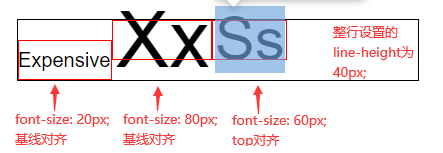
当遇到复杂场景时,比如一行的文字大小不一或者内联非替换元素内容高低不一,它们在垂直方向上应该是怎样摆放的?我们来介绍最基本也是 css 默认的一种方式——baseline对齐。baseline(基线)是用于在上面放置字符的一条假象的基准线,在英文字体中,baseline 通常是小写字母x的底部边缘(其他字符可能有下沉,比如g和p等等),如下图。其实汉字与另外一些文字是其实没有基线概念的,但在 css 中还是让它们按照英文的基线对齐的(也可以使用vertical-align其他值)。

我们看下面这个例子。Xx的 font-size 从20px增大到80px,Xx一直在基线上,而Xx的inline box上移了。原因是字体的中心(line-height 的中心)与Xx基线的距离越来越远。
<html>
  <head>
    <style type="text/css">
      .parent {
        font-family: Arial;
        font-size: 20px;
        line-height: 40px;
        width: 600px;
        border: 1px solid;
      }
      /* 将font-size从20px变为80px */
      .text2 {
        font-size: 20px;
      }
      /* 以下是调试代码 */
      .parent {
        position: relative;
      }
      .parent span::after {
        content: "";
        position: absolute;
        border: 1px solid red;
        box-sizing: border-box;
      }
      .text1::after {
        bottom: 0;
        left: 0;
        width: 94px;
        height: 40px;
      }
      .text2::after {
        top: 0;
        left: 94px;
        width: 85px;
        height: 40px;
      }
    </style>
  </head>
  <body>
    <div class="parent"><span class="text1">Expensive</span> <span class="text2">Xx</span></div>
  </body>
</html>
2
3
4
5
6
7
8
9
10
11
12
13
14
15
16
17
18
19
20
21
22
23
24
25
26
27
28
29
30
31
32
33
34
35
36
37
38
39
40
41
42
# 5.4 vertical-align
vertical-align是内联非替换元素的垂直对齐方式,默认值是baseline也就是上一小节说的基线对齐。它还有其他值,sub | super | top | text-top | middle | bottom | text-bottom | <length> | <percentage>。
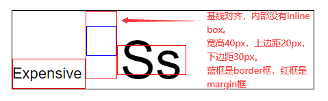
vertical-align: baseline:垂直对齐方式的默认值。让子元素的 baseline 与父元素内部的 baseline 对齐,更具体点是子元素的 baseline 会与它当前所在行的 baseline 对齐。
一行里所有使用 baseline 对齐方式的内联非替换元素,这些元素的 baseline 与line box顶部的距离,距离最大的那个元素的 baseline 就是当前所在行的 baseline 位置。绝大数情况下(排除内联替换元素和内联块级元素),一行里字体最大的文本,它的line-height所在的中心点与它的 baseline 的距离最大,那么它的 baseline 就成了这一行的 baseline。
上面这种是对内的,而父元素对外暴露的 baseline 会有两种情况,一是内部有inline box并且没有溢出处理(下一节会讲),那最后一个inline box的 baseline 就是父元素对外暴露的 baseline(简单来说就是最后一行的 baseline);二是内部没有inline box或者有溢出处理,那对外暴露的 baseline 就是父元素的 margin-bottom 位置。
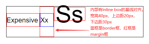
vertical-align: top:让元素的inline box顶部与当前行的line box顶部进行对齐。
vertical-align: bottom:让元素的inline box底部与当前行的line box底部进行对齐。
<html>
  <head>
    <style type="text/css">
      .parent {
        font-family: Arial;
        font-size: 20px;
        line-height: 40px;
        width: 400px;
        border: 1px solid;
      }
      /* 将font-size从20px变为80px */
      .text2 {
        font-size: 80px;
      }
      /* top可以改为bottom */
      .text3 {
        font-size: 60px;
        vertical-align: top;
      }
      /* 以下是调试代码 */
      .parent {
        position: relative;
      }
      .parent span::after {
        content: "";
        position: absolute;
        border: 1px solid red;
        box-sizing: border-box;
      }
      .text1::after {
        bottom: 0;
        left: 0;
        width: 94px;
        height: 40px;
      }
      .text2::after {
        top: 0;
        left: 94px;
        width: 100px;
        height: 40px;
      }
      /* 如果对齐模式由top改为bottom后,这里的top也要改为bottom */
      .text3::after {
        top: 0;
        left: 194px;
        width: 75px;
        height: 40px;
      }
    </style>
  </head>
  <body>
    <div class="parent">
      <span class="text1">Expensive</span> <span class="text2">Xx</span> <span class="text3">Ss</span>
    </div>
  </body>
</html>
2
3
4
5
6
7
8
9
10
11
12
13
14
15
16
17
18
19
20
21
22
23
24
25
26
27
28
29
30
31
32
33
34
35
36
37
38
39
40
41
42
43
44
45
46
47
48
49
50
51
52
53
54
55
56
上面代码的效果图:
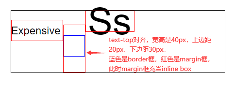
vertical-align: text-top:让元素的inline box顶部与父元素的字体顶部进行对齐。
vertical-align: text-bottom:让元素的inline box底部与父元素的字体底部进行对齐。
“父元素的字体顶部”的解释:父元素里设置 font-size 大小的文字,放在父元素内部显示时,文字所占的区域(F12 鼠标悬浮在字体上时显现的字体框)。并不是文字的 inline-box 也不是 line-box。
<html>
  <head>
    <style type="text/css">
      .parent {
        font-family: Arial;
        font-size: 20px;
        line-height: 40px;
        width: 400px;
        border: 1px solid;
      }
      .text3 {
        font-size: 15px;
        vertical-align: text-top;
      }
      .text4 {
        font-size: 15px;
        vertical-align: bottom;
      }
      /* 以下是调试代码 */
      .parent {
        position: relative;
      }
      .parent span::after {
        content: "";
        position: absolute;
        border: 1px solid red;
        box-sizing: border-box;
      }
      .text1::after {
        top: 0;
        left: 0;
        width: 95px;
        height: 40px;
      }
      .text2::after {
        bottom: 17px;
        left: 95px;
        width: 28px;
        height: 23px;
      }
      .text3::after {
        bottom: 0;
        left: 123px;
        width: 76px;
        height: 40px;
      }
      .text4::after {
        bottom: 0;
        left: 199px;
        width: 75px;
        height: 40px;
      }
    </style>
  </head>
  <body>
    <div class="parent">
      <span class="text1">Expensive</span> <span class="text2">Xx</span> <span class="text3">Expensive</span>
      <span class="text4">Expensive</span>
    </div>
  </body>
</html>
2
3
4
5
6
7
8
9
10
11
12
13
14
15
16
17
18
19
20
21
22
23
24
25
26
27
28
29
30
31
32
33
34
35
36
37
38
39
40
41
42
43
44
45
46
47
48
49
50
51
52
53
54
55
56
57
58
59
60
61
上面代码的效果图:
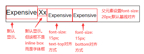
上面例子分析:可以看到第二个框我们没有画 inline box,而是画的是文字的实际区域,第三个<span>设置的是text-top 对齐,那么第三个<span>设对应的 inline box 的顶部会与第二个框的顶部进行对齐。这样会导致整行的 line box 底部被顶下去,那么第四个<span>设置的bottom对齐就会在实际过程中与第三个<span>inline box 的底部对齐(因为第三个<span>inline box 是目前最低的 inline box)。
vertical-align: middle:让元素的中部与父元素内部 baseline 再加上x-height/2的位置进行对齐。x-height/2就是父元素使用字体里的小写字母x的一半。
<html>
  <head>
    <style type="text/css">
      .parent {
        /*这种字体下的middle对齐,inline box以及最终的line-height高度都是line-height值*/
        /*其他字体可能因为x-height值不准确的缘故,会导致最后line box高度与line-height值有一点点误差*/
        font-family: Courier New;
        font-size: 20px;
        line-height: 40px;
        width: 400px;
        border: 1px solid;
      }
      .text3 {
        font-size: 40px;
        vertical-align: middle;
      }
      /* 以下是调试代码 */
      .parent {
        position: relative;
      }
      .parent span::after {
        content: "";
        position: absolute;
        border: 1px solid red;
        box-sizing: border-box;
      }
      .text1::after {
        bottom: 0;
        left: 0;
        width: 114px;
        height: 40px;
      }
      .text2::after {
        bottom: 9px;
        left: 114px;
        width: 36px;
        height: 23px;
      }
      .text3::after {
        bottom: 0;
        left: 150px;
        width: 59px;
        height: 40px;
      }
    </style>
  </head>
  <body>
    <div class="parent">
      <span class="text1">Expensive</span> <span class="text2">Xx</span> <span class="text3">Ss</span>
    </div>
  </body>
</html>
2
3
4
5
6
7
8
9
10
11
12
13
14
15
16
17
18
19
20
21
22
23
24
25
26
27
28
29
30
31
32
33
34
35
36
37
38
39
40
41
42
43
44
45
46
47
48
49
50
51
52
上面代码的效果图:

vertical-align: sub:让元素的 baseline 与父元素内部下标基线(下标点符号)进行对齐。
vertical-align: super:让元素的 baseline 与父元素内部上标基线(上标点符号)进行对齐。
<html>
  <head>
    <style type="text/css">
      .parent {
        font-family: Arial;
        font-size: 20px;
        line-height: 40px;
        width: 400px;
        border: 1px solid;
      }
      .text3 {
        font-size: 40px;
        vertical-align: sub;
      }
      /* 以下是调试代码 */
      .parent {
        position: relative;
      }
      .parent span::after {
        content: "";
        position: absolute;
        border: 1px solid red;
        box-sizing: border-box;
      }
      .text1::after {
        bottom: 0;
        left: 0;
        width: 95px;
        height: 40px;
      }
      .text2::after {
        top: 11px;
        left: 95px;
        width: 66px;
        height: 23px;
      }
      .text3::after {
        top: 0;
        left: 107px;
        width: 54px;
        height: 40px;
      }
    </style>
  </head>
  <body>
    <div class="parent">
      <span class="text1">Expensive</span> <span class="text2">,</span> <span class="text3">Ss</span>
    </div>
  </body>
</html>
2
3
4
5
6
7
8
9
10
11
12
13
14
15
16
17
18
19
20
21
22
23
24
25
26
27
28
29
30
31
32
33
34
35
36
37
38
39
40
41
42
43
44
45
46
47
48
49
50
上面代码的效果图:

vertical-align的另外两种取值:
<length>使元素的 baseline 对齐到父元素内部 baseline 之上的给定长度。可以是负数。<percentage>使元素的 baseline 对齐到父元素内部 baseline 之上的给定百分比,该百分比是 line-height 属性的百分比。可以是负数。
# 5.5 替换元素和内联块级的影响
内联非替换元素的内外边距是不参与它的 inline box 高度的,而替换元素和内联块级元素的内外边距是参与它的 inline box 高度的。那么行高 line-height,就影响不到替换元素和内联块级元素,必须得考虑上下内外边距了。
替换元素和内联块级元素相似的点在于它们都具有内联性质,但又具有宽高设置。区别在于替换元素的内容是由属性决定或者被嵌入,而内联块级元素的内容就是自己的 contentArea 区域。
两者内容的区别也会导致两者对外暴露 baseline 的不同,替换元素没有子元素,自己的 contentArea 区域也不会生效,那么替换元素对外暴露的基线就是 margin-bottom 位置了。
内联块级元素因为有自己的 contentArea 区域,会根据内容来确定对外暴露的 baseline。当内部有 inline box 并且没有溢出处理(下一节会讲),那最后一个 inline box 对应的基线就是对外暴露的基线(简单来说就是最后一行的 baseline);当内部没有 inline box 或者有溢出处理,那对外暴露的基线就是 margin-bottom 位置。
最后还有一个注意事项,line-height 对替换元素和内联块级元素的间接影响。即使 line-height 没有设置但还会有默认值(1.2 或 1.4 等),那么替换元素和内联块级元素在与文字进行类似于图文混排时,就会出现底边空白间隙的问题,这个就是 line-height 给文字加上下half-leading的影响。解决办法可以更改 line-height,或者换其他对齐方式,如果只有图片可以将 font-size 设为 0。
我们来看三个例子,前两个讲了两种基线情况,最后一个讲 text-top 对齐。
<html>
  <head>
    <style type="text/css">
      .parent {
        font-family: Arial;
        font-size: 20px;
        line-height: 40px;
        width: 400px;
        border: 1px solid;
      }
      .text2 {
        display: inline-block;
        width: 40px;
        height: 40px;
        box-sizing: border-box;
        border: 1px solid blue;
        margin-top: 20px; /*现在的line box顶部就是由inline-block的margin-top决定的*/
        margin-bottom: 30px; /*这个margin-bottom要与父元素的baseline对齐*/
        vertical-align: baseline;
      }
      .text3 {
        font-size: 70px;
      }
      /* 以下是调试代码 */
      .parent {
        position: relative;
      }
      .parent span::after,
      .parent div::after {
        content: "";
        position: absolute;
        border: 1px solid red;
        box-sizing: border-box;
      }
      .text1::after {
        bottom: 0;
        left: 0;
        width: 97px;
        height: 40px;
      }
      .text2::after {
        top: 0;
        left: 97px;
        height: 90px;
        width: 42px;
      }
      .text3::after {
        bottom: 18px;
        left: 139px;
        width: 92px;
        height: 40px;
      }
    </style>
  </head>
  <body>
    <div class="parent">
      <span class="text1">Expensive</span>
      <div class="text2"></div>
      <span class="text3">Ss</span>
    </div>
  </body>
</html>
2
3
4
5
6
7
8
9
10
11
12
13
14
15
16
17
18
19
20
21
22
23
24
25
26
27
28
29
30
31
32
33
34
35
36
37
38
39
40
41
42
43
44
45
46
47
48
49
50
51
52
53
54
55
56
57
58
59
60
61
62
上面代码的效果图:
<html>
  <head>
    <style type="text/css">
      .parent {
        font-family: Arial;
        font-size: 20px;
        line-height: 40px;
        width: 400px;
        border: 1px solid;
      }
      .text2 {
        display: inline-block;
        width: 40px;
        height: 40px;
        box-sizing: border-box;
        border: 1px solid blue;
        margin-top: 20px; /*现在的line box顶部就是由inline-block的margin-top决定的*/
        margin-bottom: 30px; /*现在的line box底部就是由inline-block的margin-bottom决定的*/
        vertical-align: baseline;
      }
      .text3 {
        font-size: 70px;
      }
      /* 以下是调试代码 */
      .parent {
        position: relative;
      }
      .parent span::after,
      .parent div::after {
        content: "";
        position: absolute;
        border: 1px solid red;
        box-sizing: border-box;
      }
      .text1::after {
        bottom: 30px;
        left: 0;
        width: 97px;
        height: 40px;
      }
      .text2::after {
        top: 0;
        left: 97px;
        height: 90px;
        width: 42px;
      }
      .text3::after {
        top: 2px;
        left: 139px;
        width: 92px;
        height: 40px;
      }
    </style>
  </head>
  <body>
    <div class="parent">
      <span class="text1">Expensive</span>
      <div class="text2">Xx</div>
      <span class="text3">Ss</span>
    </div>
  </body>
</html>
2
3
4
5
6
7
8
9
10
11
12
13
14
15
16
17
18
19
20
21
22
23
24
25
26
27
28
29
30
31
32
33
34
35
36
37
38
39
40
41
42
43
44
45
46
47
48
49
50
51
52
53
54
55
56
57
58
59
60
61
62
上面代码的效果图:
<html>
  <head>
    <style type="text/css">
      .parent {
        font-family: Arial;
        font-size: 20px;
        line-height: 40px;
        width: 400px;
        border: 1px solid;
      }
      .text2 {
        display: inline-block;
        width: 40px;
        height: 40px;
        box-sizing: border-box;
        border: 1px solid blue;
        margin-top: 20px; /*这个margin-top要与父元素的文字元素顶部对齐*/
        margin-bottom: 30px; /*现在的line box底边就是由inline-block的margin-bottom决定的*/
        vertical-align: text-top;
      }
      .text3 {
        font-size: 70px;
      }
      /* 以下是调试代码 */
      .parent {
        position: relative;
      }
      .parent span::after,
      .parent div::after {
        content: "";
        position: absolute;
        border: 1px solid red;
        box-sizing: border-box;
      }
      .text1::after {
        top: 17px;
        left: 0;
        width: 97px;
        height: 40px;
      }
      .text2::after {
        bottom: 0;
        left: 97px;
        height: 90px;
        width: 42px;
      }
      .text3::after {
        top: 0;
        left: 139px;
        width: 92px;
        height: 40px;
      }
    </style>
  </head>
  <body>
    <div class="parent">
      <span class="text1">Expensive</span>
      <div class="text2"></div>
      <span class="text3">Ss</span>
    </div>
  </body>
</html>
2
3
4
5
6
7
8
9
10
11
12
13
14
15
16
17
18
19
20
21
22
23
24
25
26
27
28
29
30
31
32
33
34
35
36
37
38
39
40
41
42
43
44
45
46
47
48
49
50
51
52
53
54
55
56
57
58
59
60
61
62
上面代码的效果图:
# 六、溢出 overflow
盒子无法容纳太多内容时会发生溢出(overflow),css 提供了几种解决溢出的方案,在元素上使用overflow属性,其值可以是visible、hidden、scroll、auto。如果只是单独对一个方向指定,那就是overflow-x或overflow-y属性了。
# 6.1 visible
overflow 属性默认是visible,也就是仍然显示溢出内容,因为 css 不会让内容自动消失或者做其他处理,这会方便开发者去发现问题并自由灵活地处理。
# 6.2 hidden
overflow 属性设置hidden,表示超出部分隐藏。父元素设置了overflow: hidden,如果子级元素的边界超过了父级元素的边界,就会截取掉超出的部分(超出部分隐藏)。其实就是子级元素的展示效果超出就会被截取。
<html>
  <head>
    <style type="text/css">
      .outer {
        width: 100px;
        height: 100px;
        overflow: hidden;
        padding: 20px; /*并不会按照父级的padding来截取超过部分,而是按照border*/
        border: 1px solid;
      }
      .inner {
        /* 子元素显示设置宽高,父元素有20px内边距 */
        width: 100px;
        height: 100px;
        /* 子元素使用负值外边距,减少了布局尺寸,子元素向上位移20px,向左位移40px */
        /* 位移后,子元素的上边界与父元素的上边界重合,子元素的左边界超出父元素左边界20px */
        margin-top: -20px; /* 计算过程 20 - 20 = 0 */
        margin-left: -40px; /* 计算过程 20 - 40 = -20 */
        background-color: blue;
      }
    </style>
  </head>
  <body>
    <div class="outer">
      <div class="inner"></div>
    </div>
  </body>
  <html></html>
</html>
2
3
4
5
6
7
8
9
10
11
12
13
14
15
16
17
18
19
20
21
22
23
24
25
26
27
28
29
<html>
  <head>
    <style type="text/css">
      .outer {
        width: 100px;
        height: 100px;
        overflow: visible;
        /*并不会按照父级的padding来截取超过部分,而是按照border*/
        padding: 20px;
        border: 1px solid;
      }
      .inner {
        /* 子元素显示设置宽高,父元素有20px内边距 */
        /* 子元素使用正值外边距,加大了布局尺寸 */
        margin: 20px 20px 20px 0;
        /* 子元素的下边界超出父元素的下边界2px,子元素的右边界超出父元素右边界2px */
        width: 122px; /* 父右边界-子右边界:(20+100+20) - (20+122) = -2 */
        height: 102px; /* 父下边界-子下边界:(20+100+20) - (20+20+102) = -2 */
        background-color: blue;
      }
    </style>
  </head>
  <body>
    <div class="outer">
      <div class="inner"></div>
    </div>
  </body>
  <html></html>
</html>
2
3
4
5
6
7
8
9
10
11
12
13
14
15
16
17
18
19
20
21
22
23
24
25
26
27
28
29
还有一个经典的例子,使用overflow: hidden配合展示尺寸与布局尺寸来实现等高布局。
# 6.3 scroll
overflow 属性设置为scroll,表示该元素添加一个滚动条,用来滚动展示内部元素。父元素设置了overflow: scroll,如果子元素布局尺寸超过了父级的contentArea(块级水平方向得注意,下面会说),那就会为父元素添加滚动条。
滚动条是有滚动底纹的,这个底纹也会占据 contentArea 的空间,一般都是17px。使用overflow: scroll,会先给两个方向都加上滚动底纹(不管有没有溢出),单独使用overflow-x或overflow-y会只给一个方向加滚动底纹,但也是不管有没有溢出都会加上滚动底纹。
<html>
  <head>
    <style type="text/css">
      .outer {
        width: 100px;
        height: 100px;
        overflow: scroll; /* 先加了两个滚动底纹,会占去17px的空间,溢出时再添加滚动条 */
        padding: 20px;
        border: 1px solid;
      }
      .inner {
        display: inline-block;
        margin: 10px;
        width: 64px; /* 此时布局尺寸为64+10+10=84,再加上滚动条的17那就是101,比父级内容宽度100多出1px,所以会有滚动条 */
        height: 64px; /* 此时布局尺寸为64+10+10=84,再加上滚动条的17那就是101,比父级内容高度100多出1px,所以会有滚动条 */
        background-color: blue;
      }
    </style>
  </head>
  <body>
    <div class="outer">
      <div class="inner"></div>
    </div>
  </body>
  <html></html>
</html>
2
3
4
5
6
7
8
9
10
11
12
13
14
15
16
17
18
19
20
21
22
23
24
25
26
块级元素的水平方向滚动条触发比较特殊,因为块级元素的隐藏等式导致布局尺寸就是父级内容宽度,那么水平方向滚动条的触发条件就得换成边框超过就算触发(展示效果超过就触发)。同样情况的有display: table。
<html>
  <head>
    <style type="text/css">
      .outer {
        width: 100px;
        height: 100px;
        overflow: scroll; /* 先加了两个滚动底纹,会占去17px的空间,溢出时再添加滚动条 */
        padding: 20px;
        border: 1px solid;
      }
      .inner {
        display: block; /*块级元素的水平方向会特殊一些*/
        margin: 10px;
        width: 94px; /* 此时子元素水平右边框距离父元素左内边距是10+94+17=121,而父元素水平右边框距离父元素左内边距是100+20=121,刚好多出1px,所以会有滚动条 */
        height: 64px; /* 此时布局尺寸为64+10+10=84,再加上滚动条的17那就是101,比父级内容高度100多出1px,所以会有滚动条 */
        background-color: blue;
      }
    </style>
  </head>
  <body>
    <div class="outer">
      <div class="inner"></div>
    </div>
  </body>
  <html></html>
</html>
2
3
4
5
6
7
8
9
10
11
12
13
14
15
16
17
18
19
20
21
22
23
24
25
26
# 6.4 auto
overflow 属性设置为auto,跟scroll意思差不多,也是在溢出时添加滚动条。区别就是auto在没有溢出时不会添加滚动底纹,溢出的时候再添加滚动底纹和滚动条,那么在触发溢出前也不会被白白占去17px的空间了(溢出后也不会)。
<html>
  <head>
    <style type="text/css">
      .outer {
        width: 100px;
        height: 100px;
        overflow: auto; /* 触发溢出后才会加滚动底纹和滚动条,不会占去17px的空间 */
        padding: 20px;
        border: 1px solid;
      }
      .inner {
        display: inline-block;
        margin: 10px;
        width: 81px; /* 此时布局尺寸为81+10+10=101,比父级内容宽度100多出1px,所以会有滚动条 */
        height: 81px; /* 此时布局尺寸为81+10+10=101,比父级内容高度100多出1px,所以会有滚动条 */
        background-color: blue;
      }
    </style>
  </head>
  <body>
    <div class="outer">
      <div class="inner"></div>
    </div>
  </body>
  <html></html>
</html>
2
3
4
5
6
7
8
9
10
11
12
13
14
15
16
17
18
19
20
21
22
23
24
25
26
<html>
  <head>
    <style type="text/css">
      .outer {
        width: 100px;
        height: 100px;
        overflow: auto; /* 触发溢出后才会加滚动底纹和滚动条,不会占去17px的空间 */
        padding: 20px;
        border: 1px solid;
      }
      .inner {
        display: block; /*块级元素的水平方向会特殊一些*/
        margin: 10px;
        width: 111px; /* 此时子元素水平右边框距离父元素左内边距是10+111=121,而父元素水平右边框距离父元素左内边距是100+20=121,刚好多出1px,所以会有滚动条 */
        height: 81px; /* 此时布局尺寸为81+10+10=101,比父级内容高度100多出1px,所以会有滚动条 */
        background-color: blue;
      }
    </style>
  </head>
  <body>
    <div class="outer">
      <div class="inner"></div>
    </div>
  </body>
  <html></html>
</html>
2
3
4
5
6
7
8
9
10
11
12
13
14
15
16
17
18
19
20
21
22
23
24
25
26
# 6.5 text-overflow
text-overflow是一个文字溢出的属性,经常和overflow搭配使用,比如你的文本只要显示一行,多出的用省略号替代,那么就可以让overflow设置为hidden,text-overflow设置为ellipsis,最后别忘了对文本设置不换行white-space设置为nowrap。
<html>
  <head>
    <style type="text/css">
      div {
        border: 1px solid #333333;
        width: 200px;
        white-space: nowrap; /* 文本不换行 */
        overflow: hidden; /* 超出盒子时隐藏溢出内容 */
        text-overflow: ellipsis; /* 超出的文本末尾使用省略号替代 */
      }
    </style>
  </head>
  <body>
    <div class="box">This box has a height and a width.</div>
  </body>
  <html></html>
</html>
2
3
4
5
6
7
8
9
10
11
12
13
14
15
16
17