# 字体与文本属性
# 一、字体
# 1.1 使用字体
css 有 5 种通用家族字体(泛型字体):
| 名称 | 定义 |
|---|---|
| serif | 有衬线的字体 (衬线一词是指字体笔画尾端的小装饰,存在于某些印刷体字体中) |
| sans-serif | 没有衬线的字体 |
| monospace | 每个字符具有相同宽度的字体,通常用于代码列表。 |
| cursive | 用于模拟笔迹的字体,具有流动的连接笔画。 |
| fantasy | 用来装饰的字体 |
客户端中常见的网页安全字体:
| 字体名称 | 泛型 | 注意 |
|---|---|---|
| Arial | sans-serif | 通常认为最佳做法还是添加 Helvetica 作为 Arial 的首选替代品,尽管它们的字体面几乎相同,但 Helvetica 被认为具有更好的形状,即使 Arial 更广泛地可用。 |
| Courier New | monospace | 某些操作系统有一个 Courier New 字体的替代(可能较旧的)版本叫 Courier。使用 Courier New 作为 Courier 的首选替代方案,被认为是最佳做法。 |
| Georgia | serif | |
| Times New Roman | serif | 某些操作系统有一个 Times New Roman 字体的替代(可能较旧的)版本叫 Times。使用 Times 作为 Times New Roman 的首选替代方案,被认为是最佳做法。 |
| Trebuchet MS | sans-serif | 您应该小心使用这种字体——它在移动操作系统上并不广泛。 |
| Verdana | sans-serif |
调用字体是使用font-family,例如
body {
  font-family: serif;
} /*正个页面的文字使用衬线字体*/
h1,
h2,
h3,
h4 {
  font-family: sans-serif;
} /*标题使用非衬线字体*/
code,
pre,
tt,
kbd {
  font-family: monospace;
} /*代码块等其他地方使用等宽字体*/
p.signature {
  font-family: cursive;
} /*某个特殊的段落使用仿笔迹字体*/
2
3
4
5
6
7
8
9
10
11
12
13
14
15
16
17
18
建议font-family使用字体栈,也就是多个值使用,来分隔,当第一个字体无法被解析时会对下一个字体进行解析。
h1 {
  font-family: Arial, sans-serif;
}
h2 {
  font-family: Charcoal, sans-serif;
}
p {
  font-family: "Times New Roman", serif;
}
address {
  font-family: Chicago, sans-serif;
}
2
3
4
5
6
7
8
9
10
11
12
字体如果名称比较特殊或者它带的关键字与其他字体冲突,那么可以将字体使用''或者""来包裹起来。
p {
  font-family: Times, "Times New Roman", "New Century Schoolbook", Georgia, "New York", serif;
}
h2 {
  font-family: Wedgie, "Karrank%", Klingon, fantasy;
}
h3 {
  font-family: Author, "cursive", cursive;
}
2
3
4
5
6
7
8
9
# 1.2 @font-face
在 css 里使用字体时,该字体是需要存在于客户端(浏览器)里的,而客户端一般只安装了被广泛使用的一些字体。如果我们想使用自定义字体或者还在小范围流行的字体,可以通过 WebFont 功能来从服务器下载该字体。
具体使用的是@font-face,它最常用的两个描述符font-family和src,其中font-family是用来定义下载字体的名字,src是字体下载源(可以是多个,用逗号分隔),src中还可以使用format()用来显式地声明字体文件格式,不支持的格式可以直接跳过节约宽带。
@font-face {
  font-family: WebFont; /*定义字体名称*/
  src: url("font/Fontin_Sans_R_45b.otf") format("opentype"); /*字体下载url*/
}
h1 {
  font-family: WebFont;
} /*使用该字体*/
2
3
4
5
6
7
在一些场景里需要使用类似斜体、粗体和压缩字体,那么先在服务器里准备好斜体和粗体的字体,然后在@font-face里添加font-style: italic、font-weight: bold或font-stretch: condensed,不是都写在一个@font-face里的,是有哪些字体就对应写上几个@font-face。
@font-face {
    font-family: WebFont;
    src: url('Fontin_Sans_R_45b.otf') format("opentype");  /*正常字体*/
}
@font-face {
    font-family: WebFont;
    font-style: italic;
    src: url('Fontin_Sans_I_45b.otf') format("opentype");  /*斜体字体*/
}
@font-face {
    font-family: WebFont;
    font-weight: bold;
    src: url('Fontin_Sans_B_45b.otf') format("opentype");  /*粗体字体*/
}
@font-face {
    font-family: WebFont;
    font-style: italic;
    font-weight: bold;
    src: url('Fontin_Sans_BI_45b.otf') format("opentype");  /*粗斜体字体*/
}
@font-face {
    font-family: WebFont;
    font-style: italic;
    font-stretch: condensed
    src: url('Fontin_Sans_IC_45b.otf') format("opentype");  /*斜体压缩字体*/
}
2
3
4
5
6
7
8
9
10
11
12
13
14
15
16
17
18
19
20
21
22
23
24
25
26
也可以采用先客户端后服务端,客户端的使用是将src:url()改为src:local()
@font-face {
  font-family: WebFont;
  src: local("Helvetica Neue"), url("MgOpenModernaRegular.ttf"); /*先在客户端查找,找不到再去服务端查找*/
}
2
3
4
# 1.3 字体粗细
一般来说,字体的粗细越粗,文字的颜色就越深。font-weight就是用来描述字体的粗细的,它的值有:
normal:默认,该标准字体的默认粗度。bold:粗体。bolder:更粗。lighter:更细。100 | 200 | 300 | 400 | 500 | 600 | 700 | 800 | 900:100 最细 900 最粗,400 对应normal,700 对应bold。
其实100到900可能并没有一一对应(映射)到真实的粗细字体:
- 如果
500没有映射值,它将被赋予和400相同粗细的字体。 - 如果
300没有映射值,它将被赋予比400更细的下一个字体。但是如果没有更细的字体可用,那300被赋予和400相同粗细的字体。此方法也同样适用于200和100。 - 如果
600没有映射值,它将被赋予比500更粗的下一个字体。但是如果没有更粗的字体可用,那600被赋予和500相同粗细的字体。此方法也同样适用于700、800和900。
bolder和lighter在使用时有个比较坑的点,它是在继承到的font-weight基础上更粗或者更细,也就是说它是一个相对值。比如父级是100,那子级使用bolder的话就可能会是normal或者bold。可以看下面这个例子:
<html>
  <head>
    <style type="text/css">
      p {
        font-weight: normal;
      }
      p em {
        font-weight: bolder;
      } /* 假设粗体字体存在,那这个em就是'bold' */
      h1 {
        font-weight: bold;
      } /* 假设粗体字体存在,那此时'bold'对应700 */
      h1 b {
        font-weight: bolder;
      } /* 更粗的字体也存在的话,那这个b是'800' */
      div {
        font-weight: 100;
      } /* 假设更细的字体存在,100会有映射值,那使用bolder会是'normal'。*/
      div strong {
        font-weight: bolder;
      } /* 不存在的话,100会映射到'normal',那使用bolder就会是'bold'  */
    </style>
  </head>
  <body>
    <p class="one">Within this paragraph we find some <em>emphasized text</em>.</p>
    <h1>This H1 contains <b>bold text!</b></h1>
    <div>
      Meanwhile, this DIV element has some <strong>strong text</strong> but it shouldn’t look much different, at least
      in terms of font weight.
    </div>
  </body>
</html>
2
3
4
5
6
7
8
9
10
11
12
13
14
15
16
17
18
19
20
21
22
23
24
25
26
27
28
29
30
31
32
如果你怕100到900映射不到值,可以在下载字体时不使用normal和bold,而是使用100到900这 9 个值:
@font-face {
  font-family: "SwitzeraADF";
  font-weight: 300;
  src: url("f/SwitzeraADF-Light.otf") format("opentype");
}
@font-face {
  font-family: "SwitzeraADF";
  font-weight: 500;
  src: url("f/SwitzeraADF-DemiBold.otf") format("opentype");
}
@font-face {
  font-family: "SwitzeraADF";
  font-weight: 700;
  src: url("f/SwitzeraADF-Bold.otf") format("opentype");
}
@font-face {
  font-family: "SwitzeraADF";
  font-weight: 900;
  src: url("f/SwitzeraADF-ExtraBold.otf") format("opentype");
}
2
3
4
5
6
7
8
9
10
11
12
13
14
15
16
17
18
19
20
# 1.4 字体大小
字体大小使用font-size这个属性,这个属性的值有xx-small | x-small | small | medium | large | x-large | xx-large | smaller | larger | <length> | <percentage>。
<html>
  <head>
    <style type="text/css">
      p.one {
        font-size: xx-small;
      }
      p.two {
        font-size: x-small;
      }
      p.three {
        font-size: small;
      }
      p.four {
        font-size: medium;
      }
      p.five {
        font-size: large;
      }
      p.six {
        font-size: x-large;
      }
      p.seven {
        font-size: xx-large;
      }
    </style>
  </head>
  <body>
    <p class="one">This paragraph (class 'one') has a font size of 'xx-small'.</p>
    <p class="two">This paragraph (class 'two') has a font size of 'x-small'.</p>
    <p class="three">This paragraph (class 'three') has a font size of 'small'.</p>
    <p class="four">This paragraph (class 'four') has a font size of 'medium'.</p>
    <p class="five">This paragraph (class 'five') has a font size of 'large'.</p>
    <p class="six">This paragraph (class 'six') has a font size of 'x-large'.</p>
    <p class="seven">This paragraph (class 'seven') has a font size of 'xx-large'.</p>
  </body>
</html>
2
3
4
5
6
7
8
9
10
11
12
13
14
15
16
17
18
19
20
21
22
23
24
25
26
27
28
29
30
31
32
33
34
35
36
smaller和larger是更小和更大,是在一个继承到的字体大小基础上除以或者乘以一个放大系数,这个放大系数在 css1 的时候是 1.5,现在 css3 是个比较复杂的比率。
<percentage>就是使用百分比了,是相对于父元素字体大小的百分比。
<length>就是使用长度单位的大小了,例子如下:
<html>
  <head>
    <style type="text/css">
      p {
        line-height: 1;
        margin: 0.5em;
      }
      p.one {
        font-size: 36pt;
      }
      p.two {
        font-size: 3pc;
      }
      p.three {
        font-size: 0.5in;
      }
      p.four {
        font-size: 1.27cm;
      }
      p.five {
        font-size: 12.7mm;
      }
    </style>
  </head>
  <body>
    <p class="one">36 point font size</p>
    <p class="two">3 pica font size</p>
    <p class="three">0.5 inch font size</p>
    <p class="four">1.27 centimeter font size</p>
    <p class="five">12.7 millimeter font size</p>
  </body>
</html>
2
3
4
5
6
7
8
9
10
11
12
13
14
15
16
17
18
19
20
21
22
23
24
25
26
27
28
29
30
31
32
最常用的长度单位:
- px: 像素,相对于显示器屏幕分辨率而言的。这是一个绝对单位,它导致了在任何情况下,页面上的文本所计算出来的像素值都是一样的。
- em: 1em 等于我们设计的当前元素的父元素上设置的字体大小。大多数浏览器的默认字体是 16px,那么一开始 1em 等于 16px,但这样的换算很麻烦,所以在 html 或者 body 选择器中声明了
font-size: 62.5%,那么 1em 就等于 10px,在对旧项目使用 em 时就很方便的对 px 除以 10 就可以得到新的 em 了。 - rem: 这个单位的效果和 em 差不多,除了 1rem 等于 HTML 中的根元素的字体大小 ,而不是父元素。这可以让你更容易计算字体大小,但是遗憾的是, rem 不支持 Internet Explorer 8 和以下的版本。
字体替换问题:
font-size-adjust设置的值是字体的 aspect(比例值),aspect 是“该字体的 x 高度”除以“该字体尺寸”。如果页面某个局部需要使用新字体,但需要新旧字体的展示大小一样(以免影响内容大小或布局)。那么就可以通过font-size-adjust和font-size来调整新字体最终展示效果,也就是让替换前后的小写字母x展示效果一样。
推导过程,x展示效果要一样,那么可得到这样一个等式:替换后字体大小 * 替换后的aspect = 替换前的字体大小 * 替换前的aspect。最后就可以得到替换字体后,font-size要设置的新值为替换后字体大小 = 替换前的字体大小 * 替换前的aspect / 替换后的aspect。
<html>
  <head>
    <style type="text/css">
      div {
        font-family: Comic Sans MS;
        font-size: 16px;
        font-size-adjust: 0.54;
      }
      div#div2 {
        font-family: Times New Roman; /*将Comic Sans MS替换成Times New Roman*/
        font-size: 19px; /* 16 * 0.54 / 0.46 约等于19 */
        font-size-adjust: 0.46;
      }
    </style>
  </head>
  <body>
    <div id="div1">It is fine today.Never change your plans because of the weather.</div>
    <div id="div2">It is fine today.Never change your plans because of the weather.</div>
  </body>
  <html></html>
</html>
2
3
4
5
6
7
8
9
10
11
12
13
14
15
16
17
18
19
20
21
# 1.5 斜体、字体压缩拉伸
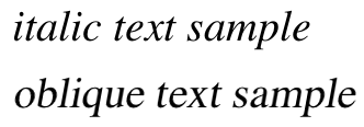
font-style属性用于设置字体是否斜体,值一般就是三个italic | oblique | normal,italic 是最常用的斜体,而 oblique 是一种比较少用的斜体。oblique 的整体倾斜效果没有 italic 大,oblique 就算是倾斜的,它的一部分还是有那种直立的效果(可以通过某种方法将 normal 处理成 oblique)。可以看这下面这个图示:
如果 italic 没有映射到真实的斜体,可以使用 oblique 的版本作为 italic 来使用,而反过来一般是不行。
font-stretch属性用于设置字体压缩拉伸的,可能是拉伸的也可能是压缩的,其值normal | ultra-condensed | extra-condensed | condensed | semicondensed | semi-expanded | expanded | extra-expanded | ultraexpanded,这种和字体大小的值用法类似,如果没有映射到真实的值就可能在页面上不起作用。

# 二、文本属性
# 2.1 缩进
text-indent属性设置在块级元素上,会对其内部的文本第一行的开头进行缩进,它的值有<length>和<percentage>两种方式(百分比是相对于父容器宽度)。解释说明:text-indent是设置在块级元素上,或者说是设置在具有块级特性的元素上,然后对其内部具有内联特性的元素进行缩进。如果你不想对块级父容器设置text-indent,但又想让其内部有缩进的效果,那么可以试着使用左外边距 margin-left。
<html>
  <head>
    <style type="text/css">
      .one {
        text-indent: 3rem;
      }
      .two {
        text-indent: 3rem;
      } /* 无效,得设置在块级元素上 */
      .three {
        margin-left: 3rem;
      }
    </style>
  </head>
  <body>
    <p class="one">
      Said Tommy the Cat as he reeled back to clear whatever foreign matter may have nestled its way into his mighty
      throat.
    </p>
    <span class="two"
      >Said Tommy the Cat as he reeled back to clear whatever foreign matter may have nestled its way into his mighty
      throat. </span
    ><br />
    <span class="three"
      >Said Tommy the Cat as he reeled back to clear whatever foreign matter may have nestled its way into his mighty
      throat.
    </span>
  </body>
</html>
2
3
4
5
6
7
8
9
10
11
12
13
14
15
16
17
18
19
20
21
22
23
24
25
26
27
28
29
# 2.2 水平对齐
text-align属性也设置在块级元素上,会对其内部的文本每一行的文字进行水平方向上的对齐,可取值比较多start | end | left | right | center | justify | match-parent。解释说明:text-align设置在具有块级特性的元素上,然后对其内部具有内联特性的元素进行水平对齐。
- left 和 right 与书写模式无关,就是于行框的左或者右边进行对齐。
- start 和 end 就取决于书写模式。比如从左到右的顺序,那 start 跟 left 是一样的效果,end 和 right 是一样的效果。
- start:表示文本对齐到其行框的开始边缘。
- end:表示文本对齐到其行框的结束边缘。
- justify 是两端对齐,会保证每一行文本显示长度一样,也就说在单词不足的情况下可能会拉伸显示效果。对最后一行无效,justify-all 可以让最后一行也强制两端对齐,不过有些浏览器没有实现该功能。
- match-parent 和 inherit 类似,区别在于 start 和 end 的值根据父元素的 direction 确定,并被替换为恰当的 left 或 right。
<html>
<head>
    <style type="text/css">
    .table { width: 700px; display: table; }
    .row { display: table-row; }
    .cell {
        display: table-cell;
        width: calc(33.33% - 1rem);
        box-sizing: border-box;
        margin: .5rem;
        padding: .5rem;
        background-color: #FFF;
        overflow: hidden;
    }
    p {
        font: .8rem sans-serif;
        max-width: 100%;
        box-sizing: border-box;
        overflow: hidden;
        resize: horizontal;
        background: #E4F0F5;
        padding: .5rem;
        margin: .5rem 0 0;
    }
    .taLeft       { text-align: left;        }
    .taRight      { text-align: right;       }
    .taCenter     { text-align: center;      }
    .taJustify    { text-align: justify;     }
    .taJustifyAll { text-align: justify-all; }
    .taStart      { text-align: start;       }
    .taEnd        { text-align: end;         }

    .rtl { direction: rtl; }
    .ltr { direction: ltr; }
    </style>
</head>
<body>
    <div class="table">
        <div class="row">
            <div class="cell">
                left
                <p class="taLeft">Lorem ipsum dolor sit amet, consectetur adipiscing elit. Nam pellen tesque vehicu la con vallis.</p>
            </div>
            <div class="cell">
                start (ltr)
                <p class="taStart ltr">Lorem ipsum dolor sit amet, consectetur adipiscing elit. Nam pellen tesque vehicu la con vallis.</p>
            </div>
            <div class="cell">
                start (rtl)
                <p class="taStart rtl">Lorem ipsum dolor sit amet, consectetur adipiscing elit. Nam pellen tesque vehicu la con vallis.</p>
            </div>
        </div>
        <div class="row">
            <div class="cell">
                right
                <p class="taRight">Lorem ipsum dolor sit amet, consectetur adipiscing elit. Nam pellen tesque vehicu la con vallis.</p>
            </div>
            <div class="cell">
                end (ltr)
                <p class="taEnd ltr">Lorem ipsum dolor sit amet, consectetur adipiscing elit. Nam pellen tesque vehicu la con vallis.</p>
            </div>
            <div class="cell">
                end (rtl)
                <p class="taEnd rtl">Lorem ipsum dolor sit amet, consectetur adipiscing elit. Nam pellen tesque vehicu la con vallis.</p>
            </div>
        </div>
        <div class="row">
            <div class="cell">
                center
                <p class="taCenter">Lorem ipsum dolor sit amet, consectetur adipiscing elit. Nam pellen tesque vehicu la con vallis.</p>
            </div>
            <div class="cell">
                justify
                <p class="taJustify">Lorem ipsum dolor sit amet, consectetur adipiscing elit. Nam pellen tesque vehicu la con vallis.</p>
            </div>
            <div class="cell">
                justify-all
                <p class="taJustifyAll">Lorem ipsum dolor sit amet, consectetur adipiscing elit. Nam pellen tesque vehicu la con vallis.</p>
            </div>
        </div>
    </div>
    </div>
</body>
</html>
2
3
4
5
6
7
8
9
10
11
12
13
14
15
16
17
18
19
20
21
22
23
24
25
26
27
28
29
30
31
32
33
34
35
36
37
38
39
40
41
42
43
44
45
46
47
48
49
50
51
52
53
54
55
56
57
58
59
60
61
62
63
64
65
66
67
68
69
70
71
72
73
74
75
76
77
78
79
80
81
82
83
84
如果想让文本最后一行进行不同于整个文本的对齐方式,那么可以使用text-align-last,它的值有auto | start | end | left | right | center | justify。
# 2.3 垂直对齐
# 2.3.1 基线与行高
可以参考前面一章的内容——line-height 和 baseline
**基线(baseline)**是用于在上面放置字符的一条假象的基准线,像g和p会有下降。基线位置的确定最好还是去看一下前一章的内容。

**行高(line-height)**主要用于给文字撑出高度用的,最后的值也会作为内联非替换元素的inline box的高度。
line-height取值<number> | <length> | <percentage> | normal。normal是默认值,具体值通常是字体大小的 1.2 倍;<number>是个无单位数值,会乘以该元素的字体大小,与<percentage>差不多;<length>就是最常见的长度值了。不推荐在行高上使用em,因为em是取父级字体大小可能不适用本元素的高度。
# 2.3.2 垂直对齐
可以参考前面一章的内容——vertical-align
垂直对齐使用vertical-align,它是直接设置在内联元素(内联特性)或者单元格上的,也就说你在块级元素上设置vertical-align,其子元素或者内容是没有垂直对齐的。vertical-align的值有baseline | sub | super | top | text-top | middle | bottom | text-bottom | <length> | <percentage>。
- baseline:默认值,让元素的 baseline 与父元素的 baseline 进行对齐。
- middle:中间对齐,让元素的中部与父元素的 baseline 加上x-height的一半(
baseline + x-height / 2)进行对齐。 - sub:下标基线对齐,让元素的 baseline 与父元素的下标基线进行对齐。
- super:上标基线对齐,让元素的 baseline 与父元素的上标基线进行对齐。
- text-top:文本框顶部对齐,让元素的
inline box顶部与父元素的文本框(单行)顶部进行对齐。 - text-bottom:文本框底部对齐,让元素的
inline box底部与父元素的文本框(单行)底部进行对齐。 - top:
line box顶部对齐,让元素的inline box顶部与当前行的line box顶部进行对齐。 - bottom:
line box底部对齐,让元素的inline box底部与当前行的line box底部进行对齐。
<html>
  <head>
    <style type="text/css">
      .outer {
        background-color: red;
      }
      .inner {
        display: inline-block;
        width: 100px;
        height: 100px;
        background-color: skyblue;
        /*底部空隙的问题是预留了字符下降的空间与也就是line-height的影响*/
        /*vertical-align: middle;*/
      }
    </style>
  </head>
  <body>
    <div class="outer">
      <li class="inner"></li>
      <li class="inner"></li>
      <li class="inner"></li>
    </div>
  </body>
</html>
2
3
4
5
6
7
8
9
10
11
12
13
14
15
16
17
18
19
20
21
22
23
24
<html>
  <head>
    <style type="text/css">
      body {
        width: 500px;
      }
      span.raise {
        vertical-align: super;
      }
      span.lower {
        vertical-align: sub;
      }
    </style>
  </head>
  <body>
    <p>
      This paragraph contains <span class="raise">superscripted</span> and <span class="lower">subscripted</span> text.
    </p>
  </body>
</html>
2
3
4
5
6
7
8
9
10
11
12
13
14
15
16
17
18
19
20
vertical-align的另外两种取值:
<length>使元素的基线对齐到父元素的基线之上的给定长度。可以是负数。<percentage>使元素的基线对齐到父元素的基线之上的给定百分比,该百分比是 line-height 属性的百分比。可以是负数。
# 2.3.3 单元格的垂直对齐
一般vertical-align都是设置在内联元素上,然后让内容元素相对于它所在的line box容器进行垂直对齐的。但是vertical-align有个特殊场景,就是设置在单元格上,让单元格内容相对于单元格容器进行垂直对齐。
在单元格上设置vertical-align,其值一般是top | bottom | middle | baseline,取这些值会被忽略sub | super | text-top | text-bottom。
<html>
  <head>
    <style type="text/css">
      .outer {
        display: table-cell;
        /*让单元格里整个内容,相对于单元格这个容器进行一个垂直居中对齐*/
        vertical-align: middle;
        width: 280px;
        height: 200px;
        border: 1px solid;
        margin: 0;
      }
      .inner1 {
        display: inline-block;
        /*让inner1的底部与当前行文本底部对齐*/
        vertical-align: text-bottom;
        width: 50px;
        height: 50px;
        border: 1px solid blue;
      }
      .inner2 {
        display: inline-block;
        /*让inner2的中部与当前行“基线加上x一半高度”这个位置进行对齐*/
        vertical-align: middle;
        width: 40px;
        height: 40px;
        border: 1px solid red;
      }
    </style>
  </head>
  <body>
    <div class="outer">
      Xx
      <div class="inner1"></div>
      Xx
      <div class="inner2">Xx</div>
      Xx<br />XxXxXxXxXxXxXxXx
    </div>
  </body>
</html>
2
3
4
5
6
7
8
9
10
11
12
13
14
15
16
17
18
19
20
21
22
23
24
25
26
27
28
29
30
31
32
33
34
35
36
37
38
39
40
小节一下:text-align设置在父级块元素,让子级内联元素去对齐。vertical-align设置在子级内联元素,让它本身相对于line box去对齐,特殊情况下设置在父级单元格上,让子级元素(块级和内联都行)去对齐。
# 2.4 文本间距
# 2.4.1 词间距
word-spacing属性单词之间的间距的,默认值是 normal,可以设置其他长度值(为 0 跟 normal 一样的效果)。是对于单词来说的,但是在非英语文本下,无法定义这个“词”是什么,所以它可能会失效
<html>
  <head>
    <style type="text/css">
      p.spread {
        word-spacing: 0.5em;
      }
      p.tight {
        word-spacing: -0.5em;
      }
      p.base {
        word-spacing: normal;
      }
      p.norm {
        word-spacing: 0;
      }
      p.text {
        word-spacing: 0.5em;
      }
    </style>
  </head>
  <body>
    <p class="spread">The spaces between words in this paragraph will be increased by 0.5em.</p>
    <p class="tight">The spaces between words in this paragraph will be decreased by 0.5em.</p>
    <p class="base">The spaces between words in this paragraph will be normal.</p>
    <p class="norm">The spaces between words in this paragraph will be normal.</p>
    <p class="text">你是谁?</p>
  </body>
</html>
2
3
4
5
6
7
8
9
10
11
12
13
14
15
16
17
18
19
20
21
22
23
24
25
26
27
28
# 2.4.2 字间距
词间距无法影响到字母间的间距,字间距letter-spacing就是来控制字间距的(<length> | normal),其实它也能影响到词间距。
<html>
  <head>
    <style type="text/css">
      p {
        letter-spacing: 0;
      } /*  identical to 'normal'  */
      p.spacious {
        letter-spacing: 0.25em;
      }
      p.tight {
        letter-spacing: -0.25em;
      }
    </style>
  </head>
  <body>
    <p>The letters in this paragraph are spaced as normal.</p>
    <p class="spacious">The letters in this paragraph are spread out a bit.</p>
    <p class="tight">The letters in this paragraph are smooshed together a bit.</p>
  </body>
</html>
2
3
4
5
6
7
8
9
10
11
12
13
14
15
16
17
18
19
20
# 2.5 文本大小写
text-transform属性用于操作文本里单词的大小写,值uppercase是全部大写,lowercase是全部小写,capitalize是首字母小写,none就不设置大小写按照原文来。
<html>
  <head>
    <style type="text/css">
      h1 {
        text-transform: capitalize;
      }
      strong {
        text-transform: uppercase;
      }
      p.cummings {
        text-transform: lowercase;
      }
      p.raw {
        text-transform: none;
      }
    </style>
  </head>
  <body>
    <h1>The heading-one at the beginninG</h1>
    <p>
      By default, text is displayed in the capitalization it has in the source document, but<strong
        >it is possible to change this</strong
      >
      using the property 'text-transform'.
    </p>
    <p class="cummings">
      For example, one could Create TEXT such as might have been Written by the late Poet e.e.cummings.
    </p>
    <p class="raw">
      If you feel the need to Explicitly Declare the transformation of text to be 'none', that can be done as well.
    </p>
  </body>
</html>
2
3
4
5
6
7
8
9
10
11
12
13
14
15
16
17
18
19
20
21
22
23
24
25
26
27
28
29
30
31
32
33
# 2.6 文本修饰
text-decoration用于对文本进行修饰,也就是加横线的。有这些值:none | [ underline ‖ overline ‖ line-through ‖ blink ]。
none:关闭了任何可能应用于元素的修饰。用于显示默认的文本或者去掉超链接的下划线。underline:给文本加下划线。overline:给文本加上划线。line-through:给文本加上删除线。blink:将本文显示得忽明忽暗,这个功能浏览器不一定实现了。
可以组合使用,但可能会被覆盖:
<html>
<head>
    <style type="text/css">
    a { text-decoration: none; }
    a:hover,
    a:visited {
      text-decoration: underline overline;
    }
    h2.stricken { text-decoration: line-through; }
    h2 { text-decoration: underline overline; }
    </style>
</head>
<body>
    <a href="https://www.baidu.com">百度一下</h1>
    <h2 class="stricken">章节2.1<h2>
    <h2>章节2.2<h2>
</body>
</html>
2
3
4
5
6
7
8
9
10
11
12
13
14
15
16
17
18
text-decoration会用的问题,如果在父元素里使用它,在子元素里可能屏蔽不了。
<html>
  <head>
    <style type="text/css">
      p {
        text-decoration: underline;
        color: black;
      }
      /* 使用颜色silver,再text-decoration改为underline,能降低子元素的下划线显示 */
      strong {
        color: gray;
        text-decoration: none;
      }
    </style>
  </head>
  <body>
    <p>
      This paragraph, which is black and has a black underline, also contains<strong>strongly emphasized text</strong>
      which has the black underline beneath it as well.
    </p>
  </body>
</html>
2
3
4
5
6
7
8
9
10
11
12
13
14
15
16
17
18
19
20
21
# 2.7 文本阴影
text-shadow属性用来给文本加阴影背景的。使用方法:text-shadow: length length length color,值的意思分别是“横方向距离”、“纵方向距离”、“阴影模糊半径”、“阴影颜色”;前两个值为正数时是往右和下偏移,负数就是相反方向;第三个值是阴影所在模糊半径,为 0 时跟原文字一样,越大就越模糊。
<html>
  <head>
    <style type="text/css">
      div {
        text-shadow: 5px 5px 5px gray;
        color: navy;
        font-size: 50px;
        font-weight: bold;
        font-family: 宋体;
      }
    </style>
  </head>
  <body>
    <div>你好</div>
  </body>
  <html></html>
</html>
2
3
4
5
6
7
8
9
10
11
12
13
14
15
16
17
我们甚至可以给文字设置多个阴影:text-shadow: length length length color,length length length color,length length length color
# 2.8 处理文本空白
white-space属性用于处理文本里的空白,其值normal | nowrap | pre | pre-wrap | pre-line。
normal:连续的空白符会被合并,换行符会被当作空白符来处理,满一行(达到父容器宽度)时才会换行。nowrap:与 normal 大部分一致,唯一的区别就是在满一行(达到父容器宽度)时不会进行换行。pre:连续的空白符会被保留,遇到换行符会换行,满一行(达到父容器宽度)时不会进行换行。pre-wrap:连续的空白符会被保留,遇到换行符会换行(填充line box才会换行),满一行(达到父容器宽度)时会换行。pre-line:连续的空白符会被合并,遇到换行符会换行(填充line box才会换行),满一行(达到父容器宽度)时会换行。- 可能还会有
break-spaces,与pre-wrap的行为相同,除了:- 任何保留的空白序列总是占用空间,包括在行尾。
- 每个保留的空格字符后都存在换行机会,包括空格字符之间。
- 这样保留的空间占用空间而不会挂起,从而影响盒子的固有尺寸(最小内容大小和最大内容大小)。
| white-space | 空格(含制表符) | 换行符 | 文字满一行 | 行尾空格 |
|---|---|---|---|---|
| normal | 合并 | 合并 | 换行 | 删除 |
| nowrap | 合并 | 合并 | 不换行 | 删除 |
| pre | 保留 | 换行 | 不换行 | 保留 |
| pre-wrap | 保留 | 换行 | 换行 | 挂起 |
| pre-line | 合并 | 换行 | 换行 | 删除 |
| break-spaces | 保留 | 换行 | 换行 | 换行 |
<html>
  <head>
    <style type="text/css">
      body {
        width: 300px;
      }
      /*normal和nowrap效果大部分一致,超过父容器宽度时,normal会换行,nowrap却不会*/
      p {
        white-space: nowrap;
      } /* normal和nowrap替换看效果*/
    </style>
  </head>
  <body>
    <!--normal和nowrap,都会让多余的空格进行合并,并且换行符也会被视为空格。超过父容器宽度时就不一样了。-->
    <p>
      This paragraph is not allowed to wrap, which means that the only way to end a line is to insert a line-break
      element. If no such element is inserted, then the line will go forever, forcing the user to scroll horizontally to
      read whatever can't be initially displayed <br />in the browser window.
    </p>
  </body>
</html>
2
3
4
5
6
7
8
9
10
11
12
13
14
15
16
17
18
19
20
21
<html>
  <head>
    <style type="text/css">
      body {
        width: 100px;
      }
      /*多余空白被保留,遇到换行符和<br>进行换行,但是超过父容器宽度时却不会自动换行*/
      p {
        white-space: pre;
      }
    </style>
  </head>
  <body>
    <p>
      This paragraph is not allowed to wrap, which means that the only way to end a line is to insert a line-break
      element. If no such element is inserted, then the line will go forever, forcing the user to scroll horizontally to
      read whatever can't be initially displayed <br />in the browser window.
    </p>
  </body>
</html>
2
3
4
5
6
7
8
9
10
11
12
13
14
15
16
17
18
19
20
<html>
  <head>
    <style type="text/css">
      body {
        width: 500px;
      }
      /*pre-wrap其实和pre差不多,多余空白被保留,遇到换行符和<br>进行换行。但是在超过父容器宽度时换行*/
      /*pre-line,多余空白被合并,遇到换行符和<br>进行换行,在超过父容器宽度时换行*/
      p {
        white-space: pre-line;
      } /* pre-wrap和pre-line替换看效果*/
    </style>
  </head>
  <body>
    <!--normal和nowrap,都会让多余的空格进行合并,并且换行符也会被视为空格。超过父容器宽度时就不一样了。-->
    <p>
      This paragraph is not allowed to wrap, which means that the only way to end a line is to insert a line-break
      element. If no such element is inserted, then the line will go forever, forcing the user to scroll horizontally to
      read whatever can't be initially displayed <br />in the browser window.
    </p>
  </body>
</html>
2
3
4
5
6
7
8
9
10
11
12
13
14
15
16
17
18
19
20
21
22
tab-size用于设置(在块级元素上,对内部的内联元素作用)制表符对应的空格,默认情况下是 8 个空格。它还可以设置长度,一个制表符的长度。
<html>
  <head>
    <style type="text/css">
      p {
        white-space: pre-wrap;
        margin: 0.5em;
      }
      code {
        font: 1em monospace, serif;
      }
      .cl01 {
        tab-size: 8;
      }
      .cl02 {
        tab-size: 4;
      }
      .cl03 {
        tab-size: 2;
      }
      .cl04 {
        tab-size: 0;
      }
      .cl05 {
        tab-size: 8;
        white-space: normal;
      }
    </style>
  </head>
  <body>
    <p class="cl01">This sentence is preceded by three tabs, set to a length of 8.</p>
    <p class="cl02">This sentence is preceded by three tabs, set to a length of 4.</p>
    <p class="cl03">This sentence is preceded by three tabs, set to a length of 2.</p>
    <p class="cl04">This sentence is preceded by three tabs, set to a length of 0.</p>
    <p class="cl05">
      This sentence is preceded by three tabs, set to a length of 8—but <code>white-space</code> is <code>normal</code>.
    </p>
  </body>
</html>
2
3
4
5
6
7
8
9
10
11
12
13
14
15
16
17
18
19
20
21
22
23
24
25
26
27
28
29
30
31
32
33
34
35
36
37
38
# 2.9 处理文本换行
# 2.9.1 连字符
在长单词换行或者连起来的词组时常使用连字符-,在编码中是U+00AD或­。在 css 中是hyphens属性,值有manual | auto | none。manual表示手动插入U+00AD或­才会显示连字符,none会忽略连字符即使使用了U+00AD或­,auto是自动根据文本的换行对长单词添加连字符。不过连字符在浏览器可能不会被实现,这个得注意。
# 2.9.2 word-break
word-break用于文本换行时,对单词或者其他文字的处理行为,其值有normal、keep-all、break-all。normal表示使用浏览器默认换行规则,keep-all表示只能在半角空格或连字符处换行、break-all表示允许在单词内换行。
浏览器默认换行:英文下,不会在单词内换行,只会在半角空格或连字符的地方换行;中文不会有这样的问题,标点符号也不会作为一行的首字,会拿一个汉字和标点符号一起换行。
<html lang="en">
  <head>
    <style type="text/css">
      p {
        border: 1px dotted orange;
      }
      div {
        float: left;
        width: 12em;
        margin-right: 3em;
      }
      div h6 {
        text-align: center;
      }
      .d01 {
        word-break: normal;
      }
      .d02 {
        word-break: break-all;
      }
      .d03 {
        word-break: keep-all;
      }
      .cl02 {
        direction: rtl;
      }
    </style>
  </head>
  <body>
    <div class="d01">
      <h6>word-break: normal;</h6>
      <p class="cl01">It is fine today.Never change your plans because of the weather.</p>
      <p class="cl02">هذا هو سلسلة طويلة غامضة من النص العربي، الذي يتدفق من اليمين إلى اليسار.</p>
      <p class="cl03">これは、左から右に流れる漠然と日本語テキストの長い文字列です。</p>
      <p class="cl04">天气真不错,出去逛逛吧?去哪呢?去南京东路步行街吧!</p>
    </div>
    <div class="d02">
      <h6>word-break: break-all;</h6>
      <p class="cl01">It is fine today.Never change your plans because of the weather.</p>
      <p class="cl02">هذا هو سلسلة طويلة غامضة من النص العربي، الذي يتدفق من اليمين إلى اليسار.</p>
      <p class="cl03">これは、左から右に流れる漠然と日本語テキストの長い文字列です。</p>
      <p class="cl04">天气真不错,出去逛逛吧?去哪呢?去南京东路步行街吧!</p>
    </div>
    <div class="d03">
      <h6>word-break: keep-all;</h6>
      <p class="cl01">It is fine today.Never change your plans because of the weather.</p>
      <p class="cl02">هذا هو سلسلة طويلة غامضة من النص العربي، الذي يتدفق من اليمين إلى اليسار.</p>
      <p class="cl03">これは、左から右に流れる漠然と日本語テキストの長い文字列です。</p>
      <p class="cl04">天气真不错,出去逛逛吧?去哪呢?去南京东路步行街吧!</p>
    </div>
  </body>
</html>
2
3
4
5
6
7
8
9
10
11
12
13
14
15
16
17
18
19
20
21
22
23
24
25
26
27
28
29
30
31
32
33
34
35
36
37
38
39
40
41
42
43
44
45
46
47
48
49
50
51
52
可以看上面这个例子里,break-all对英文不友好因为切断了单词,对中文挺正常的(与normal中文环境下一致);而keep-all在英文下还挺正常的(与normal英文环境下一致),但对中文就不友好了,必须遇到标点符号才能换行。综上,最好还是使用word-break: normal。
# 2.9.2 overflow-wrap
英文的换行只在半角空格或连字符的地方换行,但是长单词里没有半角空格和连字符,那它显示时就会超过边界,那么使用overflow-wrap: break-word可以解决长单词的问题。overflow-wrap的另外一个值normal,表示在正常断点处换行,如果长单词超过边界就直接溢出显示。
因为历史原因,word-wrap属性原本属于微软的一个私有属性,在 CSS3 现在的文本规范草案中已经被重名为overflow-wrap。word-wrap现在被当作 overflow-wrap的“别名”。 稳定的谷歌 Chrome 和 Opera 浏览器版本支持这种新语法。
white-space: pre的设置会让overflow-wrap: break-word对长单词的处理失效,因为white-space: pre只在换行符和<br>时换行,在满父容器一行时也不会自动换行的。
<html lang="en">
<head>
<style type="text/css">
p { width: 14em; margin: 2px; background: gold; }
.ow-anywhere { overflow-wrap: normal; }
.ow-break-word { overflow-wrap: break-word; }
.word-break { word-break: break-all; }
.pre { overflow-wrap: break-word; white-space: pre; }
</style>
</head>
<body>
    <p>They say the fishing is excellent at
    Lake <em class="normal">Chargoggagoggmanchauggagoggchaubunagungamaugg</em>,
    though I've never been there myself. (<code>normal</code>)</p>
    <p>They say the fishing is excellent at
    Lake <em class="ow-anywhere">Chargoggagoggmanchauggagoggchaubunagungamaugg</em>,
    though I've never been there myself. (<code>overflow-wrap: normal</code>)</p>
    <p>They say the fishing is excellent at
    Lake <em class="ow-break-word">Chargoggagoggmanchauggagoggchaubunagungamaugg</em>,
    though I've never been there myself. (<code>overflow-wrap: break-word</code>)</p>
    <p>They say the fishing is excellent at
    Lake <em class="word-break">Chargoggagoggmanchauggagoggchaubunagungamaugg</em>,
    though I've never been there myself. (<code>word-break: break-all;</code>)</p>
    <p>They say the fishing is excellent at
    Lake <em class="pre">Chargoggagoggmanchauggagoggchaubunagungamaugg</em>,
    though I've never been there myself. (<code>overflow-wrap: break-word;white-space: pre;</code>)</p>
</html>
2
3
4
5
6
7
8
9
10
11
12
13
14
15
16
17
18
19
20
21
22
23
24
25
26
27
# 2.10 书写模式
# 2.10.1 writing-mode
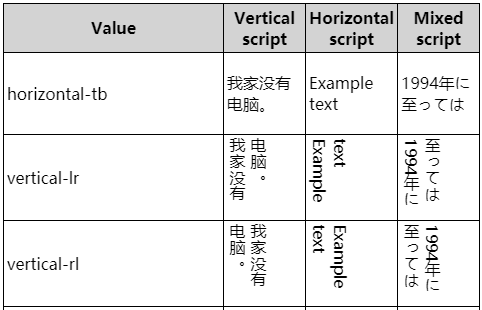
writing-mode属性用于指定三种书写模式,值有horizontal-tb | vertical-rl | vertical-lr。
horizontal-tb:表示一个水平的内联方向,一个从上到下的块方向。默认为文字是从左到右然后从上到下。vertical-rl:表示一个垂直的内联方向,一个从右到左的块方向。默认为文字是从上到下然后从右到左。vertical-lr:表示一个垂直的内联方向,一个从左到右的块方向。默认为文字是从上到下然后从左到右。
# 2.10.2 text-orientation
在确定了书写模式后,我们可以更改个别文本的字符方向,因为有可能需要显示不同语言的文本,或者表头需要临时的不同字符方向的显示。
text-orientation属性就是用于此,有三个值mixed | upright | sideways。特别要注意的是,水平书写方式是正常的,text-orientation是不会起作用,但是会改变writing-mode: vertical-rl和writing-mode: vertical-lr里的字符展示方向,也就是说text-orientation只会影响纵向的。
mixed:默认值。各种语言混合的,原本是怎么展示的就怎么展示。比如英文在垂直展示时是“躺着”的就仍然“躺着”,中文在垂直展示时是“站着”的就仍然“站着”。upright:将字符进行直排。比如英文在垂直展示时是“躺着”的,那现在是“站着”的,中文不变。sideways:所有字符被布局为与水平方式一样,只是整个文本被顺时针旋转 90°。也就是说,它是将horizontal-tb情况下的展示效果顺时针旋转 90°。
<html>
  <head>
    <style>
      [lang="zh"] {
        color: blue;
      }
      .arena p[class] {
        border: 1px dotted;
        float: left;
        width: 11rem;
        height: 9em;
        margin-right: 2rem;
        margin-left: 0;
        writing-mode: vertical-lr;
      }
      .cl1 {
        text-orientation: mixed;
      }
      .cl2 {
        text-orientation: upright;
      }
      .cl3 {
        text-orientation: sideways;
      }
      div.labels {
        clear: left;
        display: flex;
      }
      div.labels h6 {
        display: inline-block;
        width: 11rem;
        text-align: center;
        height: auto;
        margin-top: 0.5em;
        margin-right: 2em;
      }
    </style>
  </head>
  <body>
    <div class="arena">
      <p>
        This is a paragraph of <span lang="zh">中文</span> and English text, largely unstyled.
        <span lang="jp">今天天气不错。</span>
      </p>
      <p class="cl1">
        This is a paragraph of <span lang="zh">中文</span> and English text, largely unstyled.
        <span lang="jp">今天天气不错。</span>
      </p>
      <p class="cl2">
        This is a paragraph of <span lang="zh">中文</span> and English text, largely unstyled.
        <span lang="jp">今天天气不错。</span>
      </p>
      <p class="cl3">
        This is a paragraph of <span lang="zh">中文</span> and English text, largely unstyled.
        <span lang="jp">今天天气不错。</span>
      </p>
      <div class="labels">
        <h6>mixed</h6>
        <h6>upright</h6>
        <h6>sideways</h6>
      </div>
    </div>
  </body>
</html>
2
3
4
5
6
7
8
9
10
11
12
13
14
15
16
17
18
19
20
21
22
23
24
25
26
27
28
29
30
31
32
33
34
35
36
37
38
39
40
41
42
43
44
45
46
47
48
49
50
51
52
53
54
55
56
57
58
59
60
61
62
63
64
# 2.10.3 direction
在以前可以通过改变内联基线方向来影响文本的方向,也就是direction属性和unicode-bidi属性,我们不建议使用它们,因为你可能稍不注意就改变了页面其他地方的显示效果,这两个属性是浏览器文档设计者专用的,我们 web 开发人员了解一下就好。
不建议使用的原因还有一个,html 有个dir决定元素方向,而 css 的direction的效果和它一样并且会覆盖 html 的dir效果,建议是使用 html 的dir而不是 css 的direction。
direction属性有两个值,ltr表示从左到右的方向,这是书写模式下默认的方向(英文等),另一个是与之相反的rtl从右到左。这个属性会影响到块级元素内部文本的方向、表格列的布局、溢出方向等等。
← 2.盒模型 4.变换、过渡、动画 →