# 网格布局
# 一、网格布局简介
网格(Grid)布局是一种二维布局,将内容按照行与列的格式进行排版。可以定义网格线的重复模式,将元素附加到这些网格线上。
通过声明display: grid或display: inline-grid在元素上激活 Grid 布局。该元素会作为一个网格容器,与 flex 布局类似,让直接子元素作为网格项,其他后代并不会成为网格项。
PS:浮动元素会遮盖后方紧挨着的块级元素,但不会遮盖后方紧挨着的网格容器。块级元素嵌套可能会有外边距折叠,而网格容器嵌套是没有外边距嵌套的。
有一些 CSS 属性和特性并不适用于网格容器和网格项:
- css3 的多列属性(
column-count、column-width等)应用在 Grid 容器时会被忽略; - 伪元素
::first-line和::first-letter应用在 Grid 容器时会被忽略; float和clear应用在 Grid 容器时会被忽略;float对网格项还是有影响的;vertical-align对 Grid 项没有影响。
# 二、网格容器组成
Grid 容器是一个“容器”,换句话说,它是一个“格式上下文”。在BFC就提到过这个概念,它是页面中一个独立的渲染区域,拥有自己的渲染规则,会隔离内部元素与外部元素。
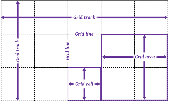
- 网格轨道(grid track)是两个相邻的网格线之间的连续轨道。列轨道其实是块轴轨道,行轨道其实是内联轨道。
- 网格单元(grid cell)是由四条网格线围绕的空间,没有网格线贯穿其中,类似于表格单元。它不能直接用 CSS 网格属性来处理。
- 网格区域(grid area)是由四条网格线围成的矩形区域,由一个或多个网格单元组成。它可以使用 CSS 网格属性来处理,并将网格项与它们关联。
值得注意的是网格项并不是与网格区域强关联的,网格区域可以不放网格项。网格区域可以重叠,也就是它们共用网格单元,对应的网格项也就可以重叠了。
# 三、放置网格线
grid-template-rows与grid-template-columns是用于定义(放置)网格线的,取值是none | <track-list> | <auto-track-list>。其中none表示不明确的网格(默认值),所有的行和其大小都将由grid-auto-rows属性隐式的指定。<track-list> | <auto-track-list>就比较复杂了,后面会一一介绍。
网格线是可以进行命名的,使用数字编号或者其他字词,也是可以数字和字词混用也就是有多个名字,不过要注意网格线不要重复命名(分属于行和列的可以重复)。
# 3.1 固定轨道
让grid-template-rows和grid-template-columns取相对固定的值。非负值的长度大小<length>,非负值且相对于网格容器的<percentage>。
这里说的“固定”意思是网格线之间的距离不随网格轨道中内容的变化而变化。
<html>
<head>
<style>
.grid {
display: inline-grid;
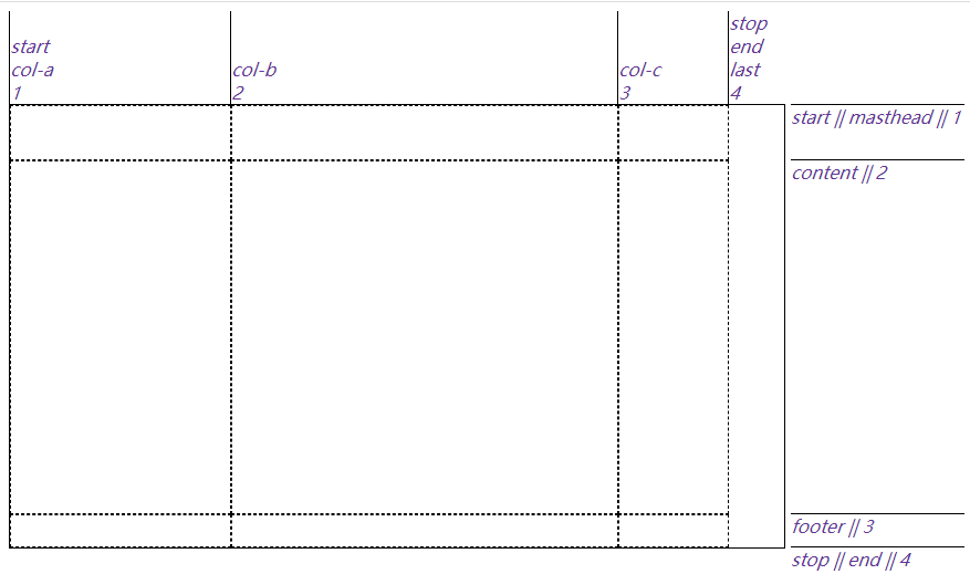
/* 固定宽度,并且给网格线进行命名 */
grid-template-columns: [start col-a] 200px [col-b] 50% [col-c] 100px [stop end last];
/* 固定宽度,并且给网格线进行命名。可以将其中的80%换成minmax(300px, 400px) */
grid-template-rows: [start masthead] 50px [content] 80% [footer] 30px [stop end];
width: 700px;
height: 400px;
border: 1px solid;
}
.gridlines {
text-align: center;
border: 1px dashed;
}
ul li {
display: flex;
}
ul li i {
color: rebeccapurple;
}
.labels1 {
display: grid;
grid-template-columns: 200px 50% 100px 50px;
width: 700px;
padding: 0;
margin-bottom: 0;
}
.labels1 li {
justify-content: flex-end;
align-items: start;
flex-flow: column;
border-left: 1px solid;
}
.labels2 {
display: inline-grid;
grid-template-rows: 50px 80% 30px;
height: 400px;
padding: 0;
margin-left: 0;
margin-top: 0;
vertical-align: top;
}
.labels2 li {
border-top: 1px solid;
}
.labels2 li i::after {
content: " || ";
margin-right: 4px;
}
.labels2 li i:last-child::after {
content: "";
}
</style>
</head>
<body>
<section>
<ul class="labels1">
<li class="col"><i>start</i><i>col-a</i><i>1</i></li>
<li class="col"><i>col-b</i><i>2</i></li>
<li class="col"><i>col-c</i><i>3</i></li>
<li class="col"><i>stop</i><i>end</i><i>last</i><i>4</i></li>
</ul>
<div class="grid">
<span class="gridlines"></span><span class="gridlines"></span> <span class="gridlines"></span
><span class="gridlines"></span> <span class="gridlines"></span><span class="gridlines"></span>
<span class="gridlines"></span><span class="gridlines"></span>
<span class="gridlines"></span>
</div>
<ul class="labels2">
<li class="col"><i>start</i><i>masthead</i><i>1</i></li>
<li class="col"><i>content</i><i>2</i></li>
<li class="col"><i>footer</i><i>3</i></li>
<li class="col"><i>stop</i><i>end</i><i>4</i></li>
</ul>
</section>
</body>
</html>
2
3
4
5
6
7
8
9
10
11
12
13
14
15
16
17
18
19
20
21
22
23
24
25
26
27
28
29
30
31
32
33
34
35
36
37
38
39
40
41
42
43
44
45
46
47
48
49
50
51
52
53
54
55
56
57
58
59
60
61
62
63
64
65
66
67
68
69
70
71
72
73
74
75
76
77
78
79
80
代码效果图:
上面这个例子里第二列的宽度是网格容器的一半大小,虽然会随着网格容器宽度而变化,但不会根据网格项的内容而变化。
如果第二行 content 的高度为100%,它会将第三行挤出网格容器,这不会我们想要的结果,那么可以使用minmax(a, b)来约束第二行 content 的高度,其中“a”是最小尺寸,“b”是最大尺寸。grid-template-rows: [start masthead] 50px [content] minmax(320px, 100%) [footer] 30px [stop end];
minmax(a, b)中,如果“b”小于“a”,“b”将会被抛弃,“a”会作为固定值使用。觉得minmax(a, b)不好用那可以试试calc()。
# 3.2 弹性轨道
让grid-template-rows与grid-template-columns取比较灵活的值,fr单位就可以将可用(剩余)空间按照比例进行分配。例如grid-template-columns: 1fr 1fr 1fr 1fr;相当于grid-template-columns: 25% 25% 25% 25%;。另外就是固定轨道和弹性轨道混搭使用,可以看下面的例子
<html>
  <head>
    <style>
      section {
        position: relative;
      }
      .grid {
        display: grid;
        width: 800px;
        height: 15em;
        grid-template-columns: 15em 4.5fr 3fr 10%;
        grid-template-rows: 1fr;
        border: 1px solid;
      }
      .gridlines {
        display: grid;
        border: 1px dashed;
      }
      .gridlines i {
        height: 1.2em;
      }
      .gridlines i.col.measure {
        align-self: center;
        justify-self: stretch;
        text-align: center;
        height: 1.2em;
      }
    </style>
  </head>
  <body>
    <section>
      <div class="grid boxed lines">
        <span class="gridlines"><i class="col measure">15em</i></span>
        <span class="gridlines"><i class="col measure">4.5fr</i></span>
        <span class="gridlines"><i class="col measure">3fr</i></span>
        <span class="gridlines"><i class="col measure">10%</i></span>
      </div>
    </section>
  </body>
</html>
2
3
4
5
6
7
8
9
10
11
12
13
14
15
16
17
18
19
20
21
22
23
24
25
26
27
28
29
30
31
32
33
34
35
36
37
38
39
40
代码效果图:

也可以使用minmax(a, b),例如grid-template-columns: 15em 4.5fr 3fr 10%;改为grid-template-columns: 15em 4.5fr minmax(5em, 3fr) 10%;,但要记住fr不能用在 minmax 的第一个参数上。改成grid-template-columns: 15em 1fr minmax(0, 500px) 10%;,如果不考虑边框的话,第一列占据 240px,第二列的1fr实际占据 0(这个是最后算的),第三列是 480px,第四列是 80px。
但是如果第二列里有内容,它就不会是 0px 了。由于第二列的每一项的宽度可能不一致,就需要min-content或max-content来约束。min-content表示内容尽可能窄,对于一段文本来说就是保证最长的单词在一行里,这样会有很多换行。max-content表示内容尽可能宽,对于一段文本来说就是不换行。如果每一列都使用max-content,那很有可能导致网格元素溢出,所以max-content经常搭配minmax(a, b)来使用(但可能会发生重叠)。
<html>
  <head>
    <style>
      .grid {
        display: grid;
        width: 250px;
        height: 150px;
        grid-template-rows: 1fr;
        border: 1px solid;
      }
      #div1 {
        grid-template-columns:
          max-content max-content
          max-content max-content;
      }
      #div2 {
        grid-template-columns:
          minmax(0, max-content) minmax(0, max-content)
          minmax(0, max-content) minmax(0, max-content);
      }
      .gridlines {
        border: 1px dashed;
      }
      .block {
        width: 50px;
        height: 50px;
        background-color: blue;
        opacity: 0.5;
        margin: 10px;
      }
    </style>
  </head>
  <body>
    <div class="grid" id="div1">
      <div class="gridlines"><div class="block"></div></div>
      <div class="gridlines"><div class="block" style="width: 100px;"></div></div>
      <div class="gridlines"><div class="block"></div></div>
      <div class="gridlines"><div class="block" style="height: 100px;"></div></div>
    </div>
    <br />
    <div class="grid" id="div2">
      <div class="gridlines"><div class="block"></div></div>
      <div class="gridlines"><div class="block" style="width: 100px;"></div></div>
      <div class="gridlines"><div class="block"></div></div>
      <div class="gridlines"><div class="block" style="height: 100px;"></div></div>
    </div>
  </body>
</html>
2
3
4
5
6
7
8
9
10
11
12
13
14
15
16
17
18
19
20
21
22
23
24
25
26
27
28
29
30
31
32
33
34
35
36
37
38
39
40
41
42
43
44
45
46
47
48
代码效果图:

还可以使用auto,一般要么作为最小值要么作为最大值使用。其实使用auto时,是由align-content和justify-content来决定网格元素尺寸的,在后面几节了会讲。
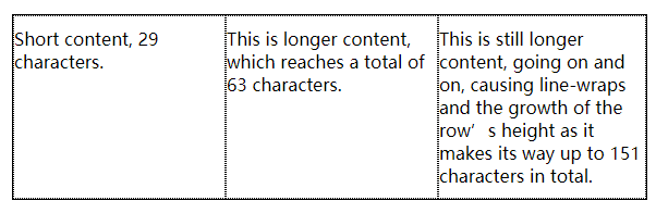
# 3.3 内容适配轨道
min-content、max-content和minmax(a, b)会比较局限,对每一行内容做不到比较完美的适配。fit-content()函数就比较适合用来适配内容大小的,规范里有这样一个伪公式:fit-content(arg) => min(max-content, max(min-content, arg)),可以理解为取“中间”那个合适的值作为网格尺寸。
<html>
  <head>
    <style>
      .grid {
        display: grid;
        grid-template-columns: fit-content(200px) fit-content(200px) fit-content(200px);
        border: 1px solid;
      }
      p {
        border: 1px dotted;
        margin: 0;
        padding: 10px 0;
      }
    </style>
  </head>
  <body>
    <section>
      <div class="grid">
        <p>Short content, 29 characters.</p>
        <p>This is longer content, which reaches a total of 63 characters.</p>
        <p>
          This is still longer content, going on and on, causing line-wraps and the growth of the row’s height as it
          makes its way up to 151 characters in total.
        </p>
      </div>
    </section>
  </body>
</html>
2
3
4
5
6
7
8
9
10
11
12
13
14
15
16
17
18
19
20
21
22
23
24
25
26
27
28
以上代码效果图:
<html>
  <head>
    <style>
      .grid {
        display: grid;
        grid-template-columns: fit-content(200px) fit-content(200px) fit-content(200px);
        border: 1px solid;
      }
      p {
        border: 1px dotted;
        margin: 0;
        padding: 10px 0;
      }
      .img {
        width: 250px;
        height: 50px;
        background-color: blue;
      }
    </style>
  </head>
  <body>
    <section>
      <div class="grid">
        <p>Short content, 29 characters.</p>
        <p><img class="img" />This is longer content, which reaches a total of 63 characters.</p>
        <p>
          This is still longer content, going on and on, causing line-wraps and the growth of the row’s height as it
          makes its way up to 151 characters in total.
        </p>
      </div>
    </section>
  </body>
</html>
2
3
4
5
6
7
8
9
10
11
12
13
14
15
16
17
18
19
20
21
22
23
24
25
26
27
28
29
30
31
32
33
以上代码效果图:
上面第二个例子中有一个 img 图像,第二列的min-content就是 img 的宽度也就是 250px,max-content就是一段文本不换行的长度这里应该是非常大的(估计有 500px)。又因为fit-content(200px),可以带入伪公式:fit-content(200px) => min(500px, max(250px, 200px)),最后结果是 250px。
# 3.4 重复网格线
我们前面的例子每一列的取值基本一样,其实可以使用repeat()函数来简化。比如要设置 5 个轨道,并且都是 50px 宽,那么可以.grid { display: grid; grid-template-columns: repeat(5, 50px); }。除了单个单个重复的,还能一系列一系列重复的,比如要设置 3 个3em-1fr-1fr,那么可以.grid { display: grid; grid-template-columns: repeat(3, 3em 1fr 1fr); }。
<html>
  <head>
    <style>
      section {
        position: relative;
      }
      .grid {
        display: grid;
        width: 800px;
        height: 15em;
        /* grid-template-columns: repeat(3, 3em 1fr 1fr) 3em; 可以平衡两端 */
        grid-template-columns: repeat(3, 3em 1fr 1fr);
        grid-template-rows: 1fr;
        border: 1px solid;
      }
      .gridlines {
        display: grid;
        border: 1px dashed;
      }
      .gridlines i {
        height: 1.2em;
      }
      .gridlines i.col.measure {
        align-self: center;
        justify-self: stretch;
        text-align: center;
        height: 1.2em;
      }
    </style>
  </head>
  <body>
    <section>
      <div class="grid boxed lines">
        <span class="gridlines"><i class="col measure">2em</i></span>
        <span class="gridlines"><i class="col measure">1fr</i></span>
        <span class="gridlines"><i class="col measure">1fr</i></span>
        <span class="gridlines"><i class="col measure">2em</i></span>
        <span class="gridlines"><i class="col measure">1fr</i></span>
        <span class="gridlines"><i class="col measure">1fr</i></span>
        <span class="gridlines"><i class="col measure">2em</i></span>
        <span class="gridlines"><i class="col measure">1fr</i></span>
        <span class="gridlines"><i class="col measure">1fr</i></span>
      </div>
    </section>
  </body>
</html>
2
3
4
5
6
7
8
9
10
11
12
13
14
15
16
17
18
19
20
21
22
23
24
25
26
27
28
29
30
31
32
33
34
35
36
37
38
39
40
41
42
43
44
45
46
以上代码效果图:

如果网格容器宽度或者高度固定,我们可以使用repeat(auto-fill, xx)自动填充网格,也就是将具体数值替换为auto-fill。这样的写法有个局限就是不能使用在“一系列一系列重复”网格中,也就是只有一个固定尺寸。还可以联合使用比如grid-template-columns: repeat(3, 20em) repeat(auto-fill, 4em);,也可以反过来grid-template-columns: repeat(auto-fill, 4em) repeat(3, 20em);,可以反过来的原因就是始终先算固定尺寸(3 个 20em),再用剩余空间算自动填充的(剩余的一些 4em)。
<html>
  <head>
    <style>
      .grid {
        display: grid;
        width: 77em;
        height: 10em;
        border: 1px solid;
        grid-template-columns: repeat(auto-fill, 4em) repeat(3, 20em);
      }
      span {
        border: 1px dashed;
      }
    </style>
  </head>
  <body>
    <div class="grid">
      <span class="gridlines"><i class="col">4em</i></span>
      <span class="gridlines"><i class="col">4em</i></span>
      <span class="gridlines"><i class="col">4em</i></span>
      <span class="gridlines"><i class="col">4em</i></span>
      <span class="gridlines"><i class="col">20em</i></span>
      <span class="gridlines"><i class="col">20em</i></span>
      <span class="gridlines"><i class="col">20em</i></span>
    </div>
  </body>
</html>
2
3
4
5
6
7
8
9
10
11
12
13
14
15
16
17
18
19
20
21
22
23
24
25
26
27
以上代码效果图:

类似的还有repeat(auto-fit, xx),与前面的repeat(auto-fill, xx)功能相同都是自动填充网格,区别就是使用 auto-fit 会剔除不使用的网格轨道(内部没有网格元素)。
<html>
  <head>
    <style>
      .grid {
        display: grid;
        width: auto;
        height: 10em;
        border: 1px solid;
      }
      .grid:nth-of-type(1) {
        grid-template-columns: repeat(auto-fit, 10em);
      }
      .grid:nth-of-type(2) {
        grid-template-columns: repeat(auto-fill, 10em);
      }
      span {
        border: 1px dashed;
      }
      .box01 {
        grid-column: 1;
      }
      .box02 {
        grid-column: 2;
      }
      .box03 {
        grid-column: 4;
      }
      .box04 {
        grid-column: 5;
      }
      .box05 {
        grid-column: 7;
      }

      p {
        text-align: center;
        font: bold 1em Consolas, monospace, sans-serif;
        margin: 1ch;
      }
    </style>
  </head>
  <body>
    <section>
      <p>repeat(auto-fit, 20em)</p>
      <div class="grid">
        <span class="box01">1</span>
        <span class="box02">2</span>
        <span class="box03">4</span>
        <span class="box04">5</span>
        <span class="box05">7</span>
      </div>
      <p>repeat(auto-fill, 20em)</p>
      <div class="grid">
        <span class="box01">1</span>
        <span class="box02">2</span>
        <span class="box03">4</span>
        <span class="box04">5</span>
        <span class="box05">7</span>
      </div>
    </section>
  </body>
</html>
2
3
4
5
6
7
8
9
10
11
12
13
14
15
16
17
18
19
20
21
22
23
24
25
26
27
28
29
30
31
32
33
34
35
36
37
38
39
40
41
42
43
44
45
46
47
48
49
50
51
52
53
54
55
56
57
58
59
60
61
62
# 3.5 网格区域
grid-template-areas用于给网格划分区域的,直接定义网格区域。可以使用特定的字母或者单词来规定某块区域属于哪一块,比如header、leftside、rightside、centent和footer,也可以使用它们的首字母进行替代。
<html>
  <head>
    <style>
      .grid {
        display: grid;
        grid-template-areas:
          "h h h h"
          "l c c r"
          "l f f f";
        grid-template-rows: repeat(3, 3em);
        border: 1px solid;
      }
      span {
        border: 1px dashed;
        text-align: center;
      }
      .header {
        grid-area: h;
      }
      .leftside {
        grid-area: l;
      }
      .rightside {
        grid-area: r;
      }
      .content {
        grid-area: c;
      }
      .footer {
        grid-area: f;
      }
    </style>
  </head>
  <body>
    <div class="grid">
      <span class="box01 header">header</span>
      <span class="box02 content">content</span>
      <span class="box03 leftside">leftside</span>
      <span class="box04 rightside">rightside</span>
      <span class="box05 footer">footer</span>
    </div>
  </body>
</html>
2
3
4
5
6
7
8
9
10
11
12
13
14
15
16
17
18
19
20
21
22
23
24
25
26
27
28
29
30
31
32
33
34
35
36
37
38
39
40
41
42
43
以上代码效果图:

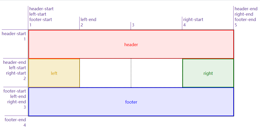
需要注意的一点,grid-template-areas: "h h h h" "l c c r" "l f f f";这样才能跨行,如果是grid-template-areas: "h h h h l c c r l f f f";得到就是一行 12 列的内容了,不会是三行的内容了。还有,跨行或跨列进行合并区域时,只能是矩形,不然 areas 模板会失效。比如grid-template-areas: "h h h h" "l c c r" "l l f f";就不会起作用。
网格区域还是需要网格线来约束大小的,可以看下面这个例子。其中空单元格可以使用...或者.来标记
<html>
  <head>
    <style>
      .grid {
        display: grid;
        grid-template-areas:
          "header  header  header  header"
          "left    ... ... right"
          "footer  footer  footer  footer";
        grid-template-columns: 1fr 100px 100px 1fr;
        grid-template-rows: 40px 100px 40px;
        border: 1px solid;
        width: 500px;
      }
      span {
        border: 1px dashed;
      }
      .header {
        grid-area: header;
      }
      .leftside {
        grid-area: left;
      }
      .rightside {
        grid-area: right;
      }
      .content {
        grid-area: content;
      }
      .footer {
        grid-area: footer;
      }
    </style>
  </head>
  <body>
    <div class="grid boxed lines small">
      <span class="header">header</span>
      <span class="leftside">left</span>
      <span class="rightside">right</span>
      <span class="footer">footer</span>
      <span class="gridlines"></span>
      <span class="gridlines"></span>
    </div>
  </body>
</html>
2
3
4
5
6
7
8
9
10
11
12
13
14
15
16
17
18
19
20
21
22
23
24
25
26
27
28
29
30
31
32
33
34
35
36
37
38
39
40
41
42
43
44
45
以上代码效果图:

给网格区域命名后,会自动给区域首尾的网格线命名了。比如 header 区域,第一行网格线和第一列网格线的名字都是header-start,第二行网格线和第二列网格线的名字都是header-end
# 四、添加网格元素
# 4.1 附加到网格线上
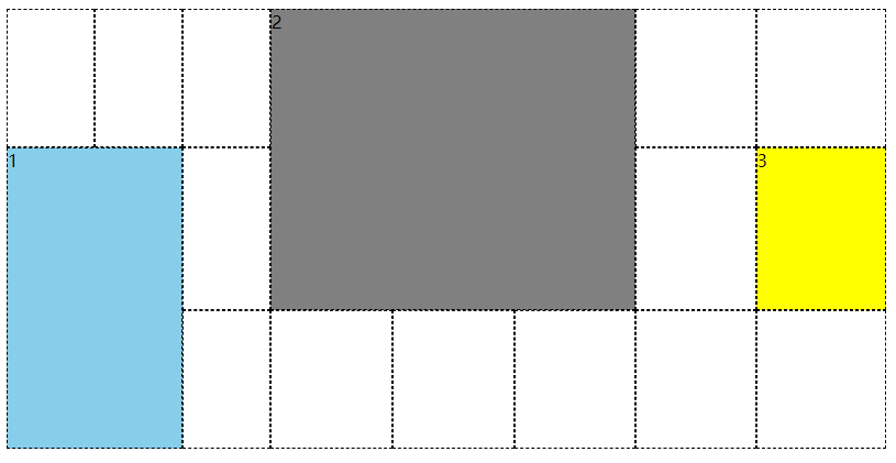
将元素附加到网格线上有四个属性grid-row-start、grid-row-end、grid-column-start和grid-column-end,可以理解为给元素的边界限定范围
<html>
  <head>
    <style>
      .grid {
        display: grid;
        width: 50em;
        height: 25em;
        grid-template-row: repeat(3, 5em);
        grid-template-columns: repeat(3, 5em);
      }
      .box01 {
        grid-row-start: 2;
        grid-row-end: 4;
        grid-column-start: 1;
        grid-column-end: 3;
        background: skyblue;
      }
      .box02 {
        grid-row-start: 1;
        grid-row-end: 3;
        grid-column-start: 4;
        grid-column-end: 7;
        background: gray;
      }
      .box03 {
        grid-row-start: 2;
        grid-row-end: 3;
        grid-column-start: 8;
        grid-column-end: 9;
        background: yellow;
      }
      span {
        border: 1px dashed;
      }
      span[class*="box"] {
        z-index: 1;
      }
    </style>
  </head>
  <body>
    <div class="grid boxed gridlines">
      <span class="box01">1</span><span class="box02">2</span><span class="box03">3</span>
      <span class="gridlines"></span><span class="gridlines"></span><span class="gridlines"></span>
      <span class="gridlines"></span><span class="gridlines"></span><span class="gridlines"></span>
      <span class="gridlines"></span><span class="gridlines"></span><span class="gridlines"></span>
      <span class="gridlines"></span><span class="gridlines"></span><span class="gridlines"></span>
      <span class="gridlines"></span>
    </div>
  </body>
</html>
2
3
4
5
6
7
8
9
10
11
12
13
14
15
16
17
18
19
20
21
22
23
24
25
26
27
28
29
30
31
32
33
34
35
36
37
38
39
40
41
42
43
44
45
46
47
48
49
50
以上代码效果图:
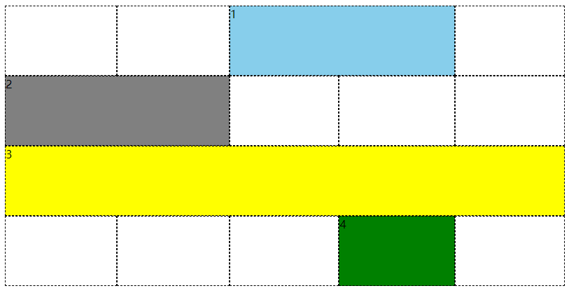
还有一种类似的方式,给它指定跨网格轨道的数量,比如grid-column-start: 3; grid-column-end: span 2;从第三个列线开始往 end 方向跨 2 个 span。其中 span 后面的数值要是正整数,或者省略就是默认为 1。如果是grid-column-start: span 2; grid-column-end: 3;,已第三列线为结束边界,往 start 方向跨 2 个 span(也就是第 1 列线的位置)。
<html>
  <head>
    <style>
      #grid {
        display: grid;
        width: 50em;
        height: 25em;
        grid-rows: repeat(4, 2em);
        grid-columns: repeat(5, 5em);
      }
      .box01 {
        grid-row: 1;
        grid-column-start: 3;
        grid-column-end: span 2;
        background: skyblue;
      }
      .box02 {
        grid-row: 2;
        grid-column-start: span 2;
        grid-column-end: 3;
        background: gray;
      }
      .box03 {
        grid-row: 3;
        grid-column-start: 1;
        grid-column-end: span 5;
        background: yellow;
      }
      .box04 {
        grid-row: 4;
        grid-column-start: span 1;
        grid-column-end: 5;
        background: green;
      }
      span {
        border: 1px dashed;
      }
      span[class*="box"] {
        z-index: 1;
      }
    </style>
  </head>
  <body>
    <div class="grid boxed gridlines" id="grid">
      <span class="box01">1</span><span class="box02">2</span><span class="box03">3</span> <span class="box04">4</span
      ><span class="gridlines"></span><span class="gridlines"></span> <span class="gridlines"></span
      ><span class="gridlines"></span><span class="gridlines"></span> <span class="gridlines"></span
      ><span class="gridlines"></span><span class="gridlines"></span> <span class="gridlines"></span
      ><span class="gridlines"></span>
    </div>
  </body>
</html>
2
3
4
5
6
7
8
9
10
11
12
13
14
15
16
17
18
19
20
21
22
23
24
25
26
27
28
29
30
31
32
33
34
35
36
37
38
39
40
41
42
43
44
45
46
47
48
49
50
51
52
以上代码效果图:
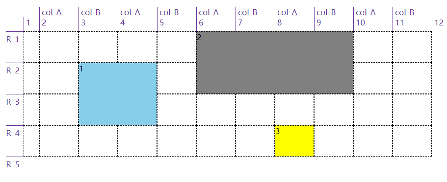
添加元素引用网格线时,并不限于使用编号,网格名称也是可以使用的,混用也可以。可以看下面的例子,R 2、col-A 3和col-A -2是编号和名称混用的场景,编号是可以使用负数的,它表示从网格右侧往左计数(尾端反向计数,尾端-1 就是最后一个),那么col-A -2的意思是从右往左数第 2 个 col-A。
<html>
<head>
<style>
    body {width: 64em; padding: 5em; margin: 1px;}
    #grid {display: grid; width: 54em;
        grid-template-rows: repeat(5, [R] 4em);
        grid-template-columns: 2em repeat(5, [col-A] 5em [col-B] 5em);}
    .one { grid-row-start: R 2; grid-row-end: 4;
        grid-column-start: col-B; grid-column-end: span 2; background: skyblue; }
    .two { grid-row-start: R; grid-row-end: span R 2;
        grid-column-start: col-A 3; grid-column-end: span 2 col-A; background: gray; }
    .three { grid-row-start: 4; grid-column-start: col-A -2; background: yellow; }

    span[class*="box"] {z-index: 1;}
    span { border: 1px dashed; }

    .labels#col {display: grid; grid-template-rows: 5em; grid-template-columns: 2em repeat(5, [col-A] 5em [col-B] 5em) 2em 2em;}
    .labels#row {display: grid; grid-template-rows: repeat(6, [R] 4em); grid-template-columns: 5em;}

    .labels#col {position: absolute; top: 0; left: 5em; margin: 0; padding: 1px;}
    .labels#row {position: absolute; top: 5em; left: 0; margin: 0; padding: 1px;}

    .labels#col li {display: flex; justify-content: flex-end; align-items: flex-start; flex-flow: column;}
    .labels#row li {display: flex; justify-content: flex-end; align-items: flex-start; flex-flow: row;}

    .labels li.line.label i {color: rebeccapurple; font: 1em Arvo, sans-serif;}
    .labels#col li.line.label i {border-left: 1px solid; padding-left: 0.25em;}
    .labels#col li i:last-child {padding-bottom: 0.5em;}
    .labels#col li.high i:last-child {padding-bottom: 4em;}

    .labels .line.col.label  {grid-template-row: 1; grid-template-column: auto / span 1;}

    .labels li.line.label i {color: rebeccapurple; font: 1em Arvo, sans-serif;}
    .labels#col li.line.label i {border-left: 1px solid; padding-left: 0.25em;}
    .labels#row li.line.label i {border-top: 1px solid; padding-top: 0.25em;}

    .labels#row li i {padding-right: 0.5em;}
    .labels#col li i:last-child {padding-bottom: 0.5em;}
    .labels#col li.high i:last-child {padding-bottom: 4em;}
</style>
</head>
<body>
    <div class="grid boxed gridlines" id="grid">
        <span class="box01 one">1</span><span class="box02 two">2</span><span class="box03 three">3</span>
        <span class="gridlines"></span><span class="gridlines"></span><span class="gridlines"></span>
        <span class="gridlines"></span><span class="gridlines"></span><span class="gridlines"></span>
        <span class="gridlines"></span><span class="gridlines"></span><span class="gridlines"></span>
        <span class="gridlines"></span><span class="gridlines"></span><span class="gridlines"></span>
        <span class="gridlines"></span><span class="gridlines"></span><span class="gridlines"></span>
        <span class="gridlines"></span><span class="gridlines"></span><span class="gridlines"></span>
        <span class="gridlines"></span><span class="gridlines"></span><span class="gridlines"></span>
        <span class="gridlines"></span><span class="gridlines"></span><span class="gridlines"></span>
        <span class="gridlines"></span><span class="gridlines"></span><span class="gridlines"></span>
        <span class="gridlines"></span><span class="gridlines"></span><span class="gridlines"></span>
        <span class="gridlines">
    </div>
    <ul class="labels" id="col">
        <li class="col line label"><i>1</i></li>
        <li class="col line label"><i>col-A</i><i>2</i></li>
        <li class="col line label"><i>col-B</i><i>3</i></li>
        <li class="col line label"><i>col-A</i><i>4</i></li>
        <li class="col line label"><i>col-B</i><i>5</i></li>
        <li class="col line label"><i>col-A</i><i>6</i></li>
        <li class="col line label"><i>col-B</i><i>7</i></li>
        <li class="col line label"><i>col-A</i><i>8</i></li>
        <li class="col line label"><i>col-B</i><i>9</i></li>
        <li class="col line label"><i>col-A</i><i>10</i></li>
        <li class="col line label"><i>col-B</i><i>11</i></li>
        <li class="col line label"><i>12</i></li>
    </ul>
    <ul class="labels" id="row">
        <li class="row line label"><i></i><i>1</i></li>
        <li class="row line label"><i>R</i><i>2</i></li>
        <li class="row line label"><i>R</i><i>3</i></li>
        <li class="row line label"><i>R</i><i>4</i></li>
        <li class="row line label"><i>R</i><i>5</i></li>
    </ul>
</body>
</html>
2
3
4
5
6
7
8
9
10
11
12
13
14
15
16
17
18
19
20
21
22
23
24
25
26
27
28
29
30
31
32
33
34
35
36
37
38
39
40
41
42
43
44
45
46
47
48
49
50
51
52
53
54
55
56
57
58
59
60
61
62
63
64
65
66
67
68
69
70
71
72
73
74
75
76
77
78
79
以上代码效果图:
我们可以使用grid-row和grid-column来简写前面提到的四个属性(grid-row-start、grid-row-end、grid-column-start和grid-column-end),需要斜线/来分隔 start 和 end。像这一小节开头的例子可以简写改成以下例子:
<html>
  <head>
    <style>
      .grid {
        display: grid;
        width: 50em;
        height: 25em;
        grid-template-row: repeat(3, 5em);
        grid-template-columns: repeat(3, 5em);
      }
      .box01 {
        grid-row: 2 / 4;
        grid-column: 1 / 3;
        background: skyblue;
      }
      .box02 {
        grid-row: 1 / 3;
        grid-column: 4 / 7;
        background: gray;
      }
      .box03 {
        grid-row: 2 / 3;
        grid-column: 8 / 9;
        background: yellow;
      }
      span {
        border: 1px dashed;
      }
      span[class*="box"] {
        z-index: 1;
      }
    </style>
  </head>
  <body>
    <div class="grid boxed gridlines">
      <span class="box01">1</span><span class="box02">2</span><span class="box03">3</span>
      <span class="gridlines"></span><span class="gridlines"></span><span class="gridlines"></span>
      <span class="gridlines"></span><span class="gridlines"></span><span class="gridlines"></span>
      <span class="gridlines"></span><span class="gridlines"></span><span class="gridlines"></span>
      <span class="gridlines"></span><span class="gridlines"></span><span class="gridlines"></span>
      <span class="gridlines"></span>
    </div>
  </body>
</html>
2
3
4
5
6
7
8
9
10
11
12
13
14
15
16
17
18
19
20
21
22
23
24
25
26
27
28
29
30
31
32
33
34
35
36
37
38
39
40
41
42
43
44
以上代码效果图:
# 4.2 隐式网格
前面的例子都是使用grid-template-xxx定义的显示网格,在添加元素时一般都在这些网格中,如果万一我们添加的元素超出了这些网格,浏览器会怎么处理?浏览器会自动创建对应的行线或列线。
<html>
  <head>
    <style>
      #grid {
        grid-auto-rows: 2em;
        grid-auto-columns: 5em;
        width: 35em;
      }
      #grid {
        display: grid;
        grid-template-rows: 2em 2em;
        grid-template-columns: repeat(6, 4em);
      }
      .box01 {
        grid-column: 1;
        grid-row: 1 / 4;
        border: 5px solid;
        border-color: skyblue;
      }
      .box02 {
        grid-column: 2;
        grid-row: 3 / span 2;
        border: 5px solid;
        border-color: springGreen;
      }
      .box03 {
        grid-column: 3;
        grid-row: span 2 / 3;
        border: 5px solid;
        border-color: salmon;
      }
      .box04 {
        grid-column: 4;
        grid-row: span 4 / 5;
        border: 5px solid;
        border-color: hotPink;
      }
      .box05 {
        grid-column: 5;
        grid-row: span 6 / 5;
        border: 5px solid;
        border-color: lawnGreen;
      }
      .box06 {
        grid-column: 6;
        grid-row: -1 / span 3;
        border: 5px solid;
        border-color: orangeRed;
      }
      .box07 {
        grid-column: 7;
        grid-row: span 3 / -1;
        border: 5px solid;
        border-color: yellowGreen;
      }
      span {
        border: 1px dashed;
      }
      span[class*="box"] {
        z-index: 1;
      }
      span.explicit {
        background: #ddd;
        grid-area: 1 / 1 / 3 / 7;
      }
    </style>
  </head>
  <body>
    <div class="grid gridlines" id="grid">
      <span class="box01">1</span><span class="box02">2</span><span class="box03">3</span> <span class="box04">4</span
      ><span class="box05">5</span><span class="box06">6</span> <span class="box07">7</span
      ><span class="explicit"></span><span class="gridlines"></span> <span class="gridlines"></span
      ><span class="gridlines"></span><span class="gridlines"></span> <span class="gridlines"></span
      ><span class="gridlines"></span><span class="gridlines"></span> <span class="gridlines"></span
      ><span class="gridlines"></span><span class="gridlines"></span> <span class="gridlines"></span
      ><span class="gridlines"></span><span class="gridlines"></span> <span class="gridlines"></span
      ><span class="gridlines"></span><span class="gridlines"></span> <span class="gridlines"></span
      ><span class="gridlines"></span><span class="gridlines"></span> <span class="gridlines"></span
      ><span class="gridlines"></span><span class="gridlines"></span>
    </div>
  </body>
</html>
2
3
4
5
6
7
8
9
10
11
12
13
14
15
16
17
18
19
20
21
22
23
24
25
26
27
28
29
30
31
32
33
34
35
36
37
38
39
40
41
42
43
44
45
46
47
48
49
50
51
52
53
54
55
56
57
58
59
60
61
62
63
64
65
66
67
68
69
70
71
72
73
74
75
76
77
78
79
80
81
82
以上代码效果图:

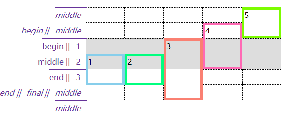
我们可以看到上面这个例子,显示规划了两行六列的网格,7 个 span 中只有第 3 个没有超出,其他都超出了,浏览器自动为它们添加了行线或列线。值得注意的是第 6 个和第 7 个的-1指的是显示网格中尾端反向的网格线(这里就是首端正向第 3 条行线)。
前面的网格线都没有具体的名称,如果有具体的名称情况与上面的类似,主要就是在扩展隐式网格时还能为隐式网格线添加名字。比如下面这个例子中的box01,从2开始往下跨 span 类型的网格,要跨 2 条名称为end的网格线,但显示网格中只有一条end网格线,然后浏览器隐式生成一条end网格线(在下图中是斜体的)。同样box02,从2开始往下跨 span 类型的网格,要跨 1 条名称为final的网格线,但显示网格中没有,那将之前的隐式end网格线又新添一个名字final。后面的box03、box04和box05都是如此。
<html>
  <head>
    <style>
      body {
        width: 64em;
        padding-left: 8.4em;
        padding-top: 1em;
        margin: 1px;
      }
      #grid {
        grid-auto-rows: 2em;
        grid-auto-columns: 5em;
        width: 35em;
        left: 5em;
      }
      #grid {
        display: grid;
        grid-template-rows: [begin] 2em [middle] 2em [end];
        grid-template-columns: repeat(5, 5em);
      }
      .box01 {
        grid-column: 1;
        grid-row: 2 / span end 2;
        border: 5px solid;
        border-color: skyblue;
      }
      .box02 {
        grid-column: 2;
        grid-row: 2 / span final;
        border: 5px solid;
        border-color: springGreen;
      }
      .box03 {
        grid-column: 3;
        grid-row: 1 / span 3 middle;
        border: 5px solid;
        border-color: salmon;
      }
      .box04 {
        grid-column: 4;
        grid-row: span begin 2 / end;
        border: 5px solid;
        border-color: hotPink;
      }
      .box05 {
        grid-column: 5;
        grid-row: span 2 middle / begin;
        border: 5px solid;
        border-color: lawnGreen;
      }
      span {
        border: 1px dashed;
      }
      span[class*="box"] {
        z-index: 1;
      }
      span.explicit {
        background: #ddd;
        grid-area: 1 / 1 / 3 / 6;
      }

      .labels#row {
        display: grid;
        grid-template-rows: repeat(7, 2em);
      }
      .labels#row {
        position: absolute;
        top: 1em;
        left: 0;
        margin: 0;
        padding: 1px;
      }
      .labels#row li {
        display: flex;
        justify-content: flex-end;
        align-items: flex-start;
        flex-flow: row;
      }

      .labels li.line.label i {
        color: rebeccapurple;
        font: 1em Arvo, sans-serif;
      }
      .labels li.line.label.implicit i {
        font-style: italic;
      }
      .labels#row li.line.label i {
        border-top: 1px solid;
        padding-top: 0.25em;
      }
      .labels#row li i {
        padding-right: 0.5em;
      }
      .labels li i::after {
        content: " || ";
        margin-right: 4px;
      }
      .labels li i:last-child::after {
        content: "";
      }
    </style>
  </head>
  <body>
    <div class="grid gridlines" id="grid">
      <span class="box01">1</span><span class="box02">2</span><span class="box03">3</span> <span class="box04">4</span
      ><span class="box05">5</span><span class="explicit"></span> <span class="gridlines"></span
      ><span class="gridlines"></span><span class="gridlines"></span> <span class="gridlines"></span
      ><span class="gridlines"></span><span class="gridlines"></span> <span class="gridlines"></span
      ><span class="gridlines"></span><span class="gridlines"></span> <span class="gridlines"></span
      ><span class="gridlines"></span><span class="gridlines"></span>
      <span class="gridlines"></span>
    </div>
    <ul class="labels" id="row">
      <li class="row line label implicit"><i>middle</i></li>
      <li class="row line label implicit"><i>begin</i><i>middle</i></li>
      <li class="row line label"><i>begin</i><i>1</i></li>
      <li class="row line label"><i>middle</i><i>2</i></li>
      <li class="row line label"><i>end</i><i>3</i></li>
      <li class="row line label implicit"><i>final</i><i>middle</i></li>
      <li class="row line label implicit"><i>middle</i></li>
    </ul>
  </body>
</html>
2
3
4
5
6
7
8
9
10
11
12
13
14
15
16
17
18
19
20
21
22
23
24
25
26
27
28
29
30
31
32
33
34
35
36
37
38
39
40
41
42
43
44
45
46
47
48
49
50
51
52
53
54
55
56
57
58
59
60
61
62
63
64
65
66
67
68
69
70
71
72
73
74
75
76
77
78
79
80
81
82
83
84
85
86
87
88
89
90
91
92
93
94
95
96
97
98
99
100
101
102
103
104
105
106
107
108
109
110
111
112
113
114
115
116
117
118
119
120
121
122
123
以上代码效果图:
我们并没讲隐式添加的网格的尺寸为什么和显式的一样,因为上面的例子都使用了grid-auto-rows或grid-auto-columns来约束隐式网格尺寸,如果不使用这两个属性,那么新添的行的高度会根据这一行的内容高度作为最终高度,新添加的列的宽度会根据这一列的内容宽度作为最终宽度。这个同样也应用于网格流中,看下面这个例子。
<html>
  <head>
    <style>
      .grid {
        display: inline-grid;
        vertical-align: top;
        margin-right: 3em;
        grid-template-rows: 120px 120px;
        grid-template-columns: 120px 120px;
      }
      #g1 {
        grid-auto-rows: 120px;
      }
      span[class*="box"] {
        font-size: 1.5em;
        border: 5px solid;
      }
      *[class*="01"] {
        color: hsl(0, 67%, 50%);
        background: hsla(0, 67%, 50%, 0.2);
        border-color: skyblue;
      }
      *[class*="02"] {
        color: hsl(24, 67%, 50%);
        background: hsla(24, 67%, 50%, 0.2);
        border-color: salmon;
      }
      *[class*="03"] {
        color: hsl(48, 67%, 50%);
        background: hsla(48, 67%, 50%, 0.2);
        border-color: hotPink;
      }
      *[class*="04"] {
        color: hsl(72, 67%, 50%);
        background: hsla(72, 67%, 50%, 0.2);
        border-color: lawnGreen;
      }
      *[class*="05"] {
        color: hsl(96, 67%, 50%);
        background: hsla(96, 67%, 50%, 0.2);
        border-color: blueViolet;
      }
      *[class*="06"] {
        color: hsl(120, 67%, 50%);
        background: hsla(120, 67%, 50%, 0.2);
        border-color: burlyWood;
      }
    </style>
  </head>
  <body>
    <div class="grid boxed gridlines" id="g1">
      <span class="box01">1</span><span class="box02">2</span><span class="box03">3</span> <span class="box04">4</span
      ><span class="box05">5</span><span class="box06">6</span>
    </div>
    <div class="grid boxed gridlines" id="g2">
      <span class="box01">1</span><span class="box02">2</span><span class="box03">3</span> <span class="box04">4</span
      ><span class="box05">5</span><span class="box06">6</span>
    </div>
  </body>
</html>
2
3
4
5
6
7
8
9
10
11
12
13
14
15
16
17
18
19
20
21
22
23
24
25
26
27
28
29
30
31
32
33
34
35
36
37
38
39
40
41
42
43
44
45
46
47
48
49
50
51
52
53
54
55
56
57
58
59
60
以上代码效果图:

# 4.3 附加到网格区域中
事先定义好网格区域,直接使用grid-area可以将元素添加到网格区域中。其实在网格区域这节的例子里就使用了grid-area,如下。
<html>
  <head>
    <style>
      .grid {
        display: grid;
        grid-template-areas:
          "h h h h"
          "l c c r"
          "l f f f";
        grid-template-rows: repeat(3, 3em);
        border: 1px solid;
      }
      span {
        border: 1px dashed;
        text-align: center;
      }
      .header {
        grid-area: h;
      }
      .leftside {
        grid-area: l;
      }
      .rightside {
        grid-area: r;
      }
      .content {
        grid-area: c;
      }
      .footer {
        grid-area: f;
      }
    </style>
  </head>
  <body>
    <div class="grid">
      <span class="box01 header">header</span>
      <span class="box02 content">content</span>
      <span class="box03 leftside">leftside</span>
      <span class="box04 rightside">rightside</span>
      <span class="box05 footer">footer</span>
    </div>
  </body>
</html>
2
3
4
5
6
7
8
9
10
11
12
13
14
15
16
17
18
19
20
21
22
23
24
25
26
27
28
29
30
31
32
33
34
35
36
37
38
39
40
41
42
43
以上代码效果图:
以上只是grid-area为一个值的场景,有些场景下它有 4 个值并用/分隔。比如下面例子中的grid-area: 1 / 1 / 2 / 2,就是上 / 左 / 下 / 右的网格线顺序,与 css 属性的上右下左是反的。
<html>
  <head>
    <style>
      #grid {
        width: 400px;
        height: 150px;
      }
      #grid {
        display: inline-grid;
        grid-template-rows: [r1-start] 1fr [r1-end r2-start] 2fr [r2-end];
        grid-template-columns: [col-start] 1fr [col-end main-start] 1fr [main-end];
      }
      .box01 {
        grid-area: r1 / main / r1 / main;
        border: 5px solid;
        border-color: skyblue;
      }
      .box02 {
        grid-area: r2-start / col-start / r2-end / main-end;
        border: 5px solid;
        border-color: springGreen;
      }
      .box03 {
        grid-area: 1 / 1 / 2 / 2;
        border: 5px solid;
        border-color: salmon;
      }
      span {
        border: 1px dashed;
        text-align: center;
      }
      ul li {
        display: flex;
      }
      ul li i {
        color: rebeccapurple;
      }
      .labels1 {
        display: grid;
        grid-template-columns: 1fr 1fr 1fr;
        width: 600px;
        padding: 0;
        margin-bottom: 0;
        margin-left: 160px;
      }
      .labels1 li {
        justify-content: flex-end;
        align-items: flex-start;
        flex-flow: column;
        border-left: 1px solid;
      }
      .labels2 {
        display: inline-grid;
        grid-template-rows: 1fr 2fr 1fr;
        height: 200px;
        padding: 0;
        margin-left: 0;
        margin-top: 0;
        vertical-align: top;
      }
      .labels2 li {
        border-top: 1px solid;
        justify-content: flex-end;
      }
      .labels2 li i::after {
        content: " || ";
        margin-right: 4px;
      }
      .labels2 li i:last-child::after {
        content: "";
      }
    </style>
  </head>
  <body>
    <ul class="labels1">
      <li class="col"><i>col-start</i><i>1</i></li>
      <li class="col"><i>col-end</i><i>main-start</i><i>2</i></li>
      <li class="col"><i>main-end</i><i>3</i></li>
    </ul>
    <ul class="labels2">
      <li class="col"><i>r1-start</i><i>1</i></li>
      <li class="col"><i>r1-end</i><i> r2-start</i><i>2</i></li>
      <li class="col"><i>r2-end</i><i>3</i></li>
    </ul>
    <div class="grid boxed gridlines" id="grid">
      <span class="box01 one" id="masthead">box01</span>
      <span class="box02 two" id="sidebar">box02</span>
      <span class="box03 three" id="main">box03</span>
    </div>
  </body>
</html>
2
3
4
5
6
7
8
9
10
11
12
13
14
15
16
17
18
19
20
21
22
23
24
25
26
27
28
29
30
31
32
33
34
35
36
37
38
39
40
41
42
43
44
45
46
47
48
49
50
51
52
53
54
55
56
57
58
59
60
61
62
63
64
65
66
67
68
69
70
71
72
73
74
75
76
77
78
79
80
81
82
83
84
85
86
87
88
89
90
91
以上代码效果图:

# 4.4 元素重叠以及异常处理
将元素添加到网格中时,元素是可以重叠的(可以是可以但要避免出现这样的情况)。
<html>
  <head>
    <style>
      #grid {
        width: 54em;
        height: 17em;
        border: 1px solid;
      }
      #grid {
        display: grid;
        grid-template-rows: 50% 50%;
        grid-template-columns: 50% 50%;
      }
      .box01 {
        grid-area: 1 / 1 / 2 / 3;
        border: 5px solid;
        border-color: hotPink;
      }
      .box02 {
        grid-area: 1 / 2 / 3 / 2;
        border: 5px solid;
        border-color: skyblue;
      }
      span {
        border: 1px dashed;
      }
    </style>
  </head>
  <body>
    <div class="grid boxed gridlines" id="grid">
      <span class="box01 one" id="masthead">1</span>
      <span class="box02 two" id="sidebar">2</span>
    </div>
  </body>
</html>
2
3
4
5
6
7
8
9
10
11
12
13
14
15
16
17
18
19
20
21
22
23
24
25
26
27
28
29
30
31
32
33
34
35
以上代码效果图:

不只是在数字引用的网格线下添加元素出现重叠的现象,网格区域也是同样的。后添加的会遮住先添加的。
<html>
  <head>
    <style>
      #grid {
        width: 50em;
        height: 15em;
        border: 1px solid;
        grid-template-columns: 1fr 3fr;
        grid-template-rows: 4em 7em 4em;
      }
      #grid {
        display: grid;
        grid-template-areas:
          "header header"
          "sidebar content"
          "footer footer";
      }
      #header {
        grid-area: header;
        border: 5px solid;
        border-color: skyblue;
      }
      #sidebar {
        grid-area: sidebar / sidebar / footer-end / sidebar;
        border: 5px solid;
        border-color: springGreen;
      }
      #footer {
        grid-area: footer;
        border: 5px solid;
        border-color: salmon;
      }
    </style>
  </head>
  <body>
    <div class="grid boxed gridlines" id="grid">
      <span class="box01 one" id="header">header</span>
      <span class="box02 two" id="sidebar">sidebar</span>
      <span class="box03" id="footer">footer</span>
    </div>
  </body>
</html>
2
3
4
5
6
7
8
9
10
11
12
13
14
15
16
17
18
19
20
21
22
23
24
25
26
27
28
29
30
31
32
33
34
35
36
37
38
39
40
41
42
以上代码效果图:

添加元素时的异常处理:
开始线数值大于结束线数值
grid-row-start: 5; grid-row-end: 2;会自动转变为grid-row-start: 2; grid-row-end: 5;开始线和结束线都声明为跨度
grid-row-start: span; grid-row-end: span 3;,结束线的跨度会被忽略,会转变为grid-row-start: span 1; grid-row-end: auto;,然后根据网格流自动放置,后面小节会讲。只用具名跨度指明网格元素位置
grid-row-start: span footer; grid-row-end: auto;,这个和上面说的隐式网格很像,但是不一样,因为有个auto。这种情况也是会转变为grid-row-start: span 1; grid-row-end: auto;grid-area四个值缺少一两个 开始线值是网格线名称,缺少的结束线值与开始线值相同;开始线值是数值,缺少的结束线值则是auto
# 五、网格流
# 5.1 行优先和列优先
如果不明确指定网格元素在网格中的位置的话,网格元素会在网格流的作用下自动放在网格中合适的位置。网格流grid-auto-flow有两种模式:行优先和列优先。所谓“行优先”就是尽量占满一行再去排列下一行,“列优先”就是尽量先占满一列。
<html>
  <head>
    <style>
      .grid {
        grid-template-columns: repeat(3, 200px);
        grid-template-rows: repeat(2, 50px);
        border: 1px solid;
      }
      .grid {
        display: grid;
        width: 600px;
        height: 100px;
        grid-auto-flow: column /*row*/;
      }
      .grid li {
        grid-row: auto;
        grid-column: auto;
      }
      ol {
        list-style: none;
        padding: 0;
      }
      .box01 {
        border: 5px solid;
        border-color: skyblue;
      }
      .box02 {
        border: 5px solid;
        border-color: springGreen;
      }
      .box03 {
        border: 5px solid;
        border-color: salmon;
      }
      .box04 {
        border: 5px solid;
        border-color: hotPink;
      }
      .box05 {
        border: 5px solid;
        border-color: lawnGreen;
      }
    </style>
  </head>
  <body>
    <ol class="grid">
      <li class="box01">1</li>
      <li class="box02">2</li>
      <li class="box03">3</li>
      <li class="box04">4</li>
      <li class="box05">5</li>
    </ol>
  </body>
</html>
2
3
4
5
6
7
8
9
10
11
12
13
14
15
16
17
18
19
20
21
22
23
24
25
26
27
28
29
30
31
32
33
34
35
36
37
38
39
40
41
42
43
44
45
46
47
48
49
50
51
52
53
54
以上代码效果图:

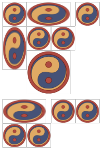
可以看到上面的例子使用的是grid-row: auto; grid-column: auto;,因为默认每个网格元素一样大。但是如果每个网格元素的尺寸不一(并且大于网格区域的大小),再这样写就不合适了,必须给尺寸过大的网格元素添加跨度。
<html>
  <head>
    <style>
      #grid {display: grid;
          grid-template-rows: repeat(4, 50px);
          grid-template-columns: repeat(4, 50px);
          grid-auto-rows: 50px;
          grid-auto-columns: 50px;
      }
      img {grid-row: auto; grid-column: auto;}
      img {width: 50px; height; 50px; border: 1px solid silver; box-sizing: border-box;}
      img.wide {width: 90px; height: 50px;}
      img.tall {width: 50px; height: 90px;}
      img.big {width: 90px; height: 90px;}
      img.wide {grid-column: auto / span 2;}
      img.tall {grid-row: auto / span 2;}
      img.big {grid-row: auto / span 2; grid-column: auto / span 2;}
    </style>
  </head>
  <body>
    <div id="grid">
      <img src="./yinyang.png" alt="" class="" />
      <img src="./yinyang.png" alt="" class="wide" />
      <img src="./yinyang.png" alt="" class="" />
      <img src="./yinyang.png" alt="" class="tall" />
      <img src="./yinyang.png" alt="" class="" />
      <img src="./yinyang.png" alt="" class="" />
      <img src="./yinyang.png" alt="" class="big" />
      <img src="./yinyang.png" alt="" class="wide" />
      <img src="./yinyang.png" alt="" class="" />
      <img src="./yinyang.png" alt="" class="" />
      <img src="./yinyang.png" alt="" class="" />
      <img src="./yinyang.png" alt="" class="" />
    </div>
  </body>
</html>
2
3
4
5
6
7
8
9
10
11
12
13
14
15
16
17
18
19
20
21
22
23
24
25
26
27
28
29
30
31
32
33
34
35
36
以上代码效果图:
# 5.2 网格流和浮动的区别
你会发现上面的例子上留出了很多间隙,原因是留出的空间放不下后面紧接着的元素了,就算能放下也不能超出前面元素的顶边。是不是觉得网格流和浮动有些像,但是浮动要比网格流规则更复杂。情况稍有不同,可以看下面例子中的 13 号元素的位置,想一想为什么。
<html>
  <head>
    <style>
      span {
        box-sizing: border-box;
      }

      .float {
        display: inline-block;
        width: 320px;
        height: 320px;
      }
      .float span {
        float: left;
        width: 80px;
        height: 80px;
      }
      .float span.wide {
        width: 160px;
      }
      .float span.tall {
        height: 160px;
      }

      .grid {
        display: inline-grid;
        grid-template-columns: repeat(4, 80px);
        grid-template-rows: repeat(4, 80px);
        grid-auto-columns: 80px;
        grid-auto-rows: 80px;
        vertical-align: top;
        margin-left: 200px;
      }
      .grid {
        grid-auto-flow: row;
      }
      .grid span {
        align-items: start;
        padding-top: 0.25em;
      }
      .grid span.wide {
        grid-column: auto / span 2;
      }
      .grid span.tall {
        grid-row: auto / span 2;
      }

      span[class*="box"] {
        font-size: 1.5em;
        border: 5px solid;
      }
      *[class*="01"] {
        color: hsl(0, 67%, 50%);
        background: hsla(0, 67%, 50%, 0.2);
        border-color: skyblue;
      }
      *[class*="02"] {
        color: hsl(24, 67%, 50%);
        background: hsla(24, 67%, 50%, 0.2);
        border-color: salmon;
      }
      *[class*="03"] {
        color: hsl(48, 67%, 50%);
        background: hsla(48, 67%, 50%, 0.2);
        border-color: hotPink;
      }
      *[class*="04"] {
        color: hsl(72, 67%, 50%);
        background: hsla(72, 67%, 50%, 0.2);
        border-color: lawnGreen;
      }
      *[class*="05"] {
        color: hsl(96, 67%, 50%);
        background: hsla(96, 67%, 50%, 0.2);
        border-color: blueViolet;
      }
      *[class*="06"] {
        color: hsl(120, 67%, 50%);
        background: hsla(120, 67%, 50%, 0.2);
        border-color: burlyWood;
      }
      *[class*="07"] {
        color: hsl(144, 67%, 50%);
        background: hsla(144, 67%, 50%, 0.2);
        border-color: chartreuse;
      }
      *[class*="08"] {
        color: hsl(168, 67%, 50%);
        background: hsla(168, 67%, 50%, 0.2);
        border-color: chocolate;
      }
      *[class*="09"] {
        color: hsl(192, 67%, 50%);
        background: hsla(192, 67%, 50%, 0.2);
        border-color: cornflowerBlue;
      }
      *[class*="10"] {
        color: hsl(216, 67%, 50%);
        background: hsla(216, 67%, 50%, 0.2);
        border-color: cyan;
      }
      *[class*="11"] {
        color: hsl(240, 67%, 50%);
        background: hsla(240, 67%, 50%, 0.2);
        border-color: darkGoldenRod;
      }
      *[class*="12"] {
        color: hsl(264, 67%, 50%);
        background: hsla(264, 67%, 50%, 0.2);
        border-color: darkMagenta;
      }
      *[class*="13"] {
        color: hsl(288, 67%, 50%);
        background: hsla(288, 67%, 50%, 0.2);
        border-color: darkorange;
      }
      *[class*="14"] {
        color: hsl(312, 67%, 50%);
        background: hsla(312, 67%, 50%, 0.2);
        border-color: darkOrchid;
      }
      *[class*="15"] {
        color: hsl(336, 67%, 50%);
        background: hsla(336, 67%, 50%, 0.2);
        border-color: darkSalmon;
      }
      *[class*="16"] {
        color: hsl(360, 67%, 50%);
        background: hsla(360, 67%, 50%, 0.2);
        border-color: feldspar;
      }
    </style>
  </head>
  <body>
    <div class="float">
      <span class="box01">1</span><span class="box02 wide">2</span><span class="box03">3</span>
      <span class="box04">4</span><span class="box05">5</span><span class="box06">6</span> <span class="box07">7</span
      ><span class="box08 tall">8</span><span class="box09">9</span> <span class="box10">10</span
      ><span class="box11 wide tall">11</span><span class="box12">12</span> <span class="box13">13</span
      ><span class="box14">14</span><span class="box15">15</span>
      <span class="box16">16</span>
    </div>
    <div class="grid">
      <span class="box01">1</span><span class="box02 wide">2</span><span class="box03">3</span>
      <span class="box04">4</span><span class="box05">5</span><span class="box06">6</span> <span class="box07">7</span
      ><span class="box08 tall">8</span><span class="box09">9</span> <span class="box10">10</span
      ><span class="box11 wide tall">11</span><span class="box12">12</span> <span class="box13">13</span
      ><span class="box14">14</span><span class="box15">15</span>
      <span class="box16">16</span>
    </div>
  </body>
</html>
2
3
4
5
6
7
8
9
10
11
12
13
14
15
16
17
18
19
20
21
22
23
24
25
26
27
28
29
30
31
32
33
34
35
36
37
38
39
40
41
42
43
44
45
46
47
48
49
50
51
52
53
54
55
56
57
58
59
60
61
62
63
64
65
66
67
68
69
70
71
72
73
74
75
76
77
78
79
80
81
82
83
84
85
86
87
88
89
90
91
92
93
94
95
96
97
98
99
100
101
102
103
104
105
106
107
108
109
110
111
112
113
114
115
116
117
118
119
120
121
122
123
124
125
126
127
128
129
130
131
132
133
134
135
136
137
138
139
140
141
142
143
144
145
146
147
148
149
150
151
152
以上代码效果图:
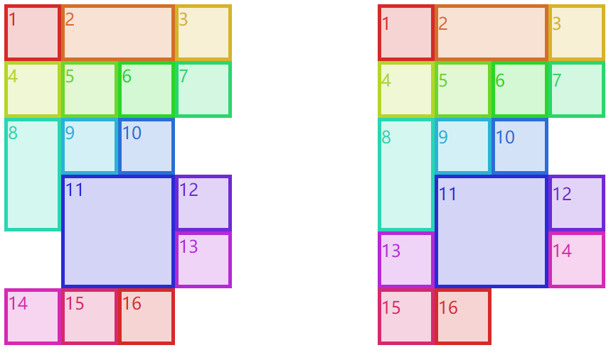
浮动规则中有一条“如果前面元素左浮动,那么后面浮动元素的左边界必定处于前面元素右边界的右侧,除非后面浮动元素的顶边在前面浮动元素的下边”。11 和 12 所在行没有 13 的位置了,11 的左右都有 13 所需要的空间,但是由于前面这条规则,13 只能放在 11 的右侧了。你可能想为什么不与 14、15 和 16 放在一行呢?因为浮动规则中还有一条“满足其他条件后,浮动元素要尽可能上移”,所以 13 只能放在 12 的下面且 11 的右侧了。而网格流并没有这样的限制,它只需要保证“不超出前面元素顶边”就可以了(上面例子的右边这部分里的 13 就可以放在 11 的左侧了,但 12 仍旧和浮动场景一样,不能超过前面元素的顶边)。
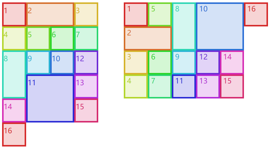
# 5.3 密集流
“不超出前面元素顶边”是为了保证元素编号的不错乱,其实有一种密集流可以让网格元素紧靠着不用管什么编号顺序了,grid-auto-flow: row dense;是行优先的密集流,grid-auto-flow: column dense;是列优先的密集流。下面这个例子左边的 12 才不管前面的顶边在哪,会直接占据上面的空位;同样右边的 11 才不会管前面的左边界在哪,会直接占据左边的空位。
<html>
  <head>
    <style>
      span {
        box-sizing: border-box;
      }

      .grid {
        display: inline-grid;
        grid-template-columns: repeat(4, 80px);
        grid-template-rows: repeat(4, 80px);
        grid-auto-columns: 80px;
        grid-auto-rows: 80px;
        vertical-align: top;
        margin-right: 5em;
      }
      #g1 {
        grid-auto-flow: row dense;
      }
      #g2 {
        grid-auto-flow: column dense;
      }

      #g1 span {
        align-items: start;
        padding-top: 0.25em;
      }
      #g2 span {
        justify-content: flex-start;
        padding-left: 0.25em;
      }

      .wide {
        grid-column: auto / span 2;
      }
      .tall {
        grid-row: auto / span 2;
      }

      span[class*="box"] {
        font-size: 1.5em;
        border: 5px solid;
      }
      *[class*="01"] {
        color: hsl(0, 67%, 50%);
        background: hsla(0, 67%, 50%, 0.2);
        border-color: skyblue;
      }
      *[class*="02"] {
        color: hsl(24, 67%, 50%);
        background: hsla(24, 67%, 50%, 0.2);
        border-color: salmon;
      }
      *[class*="03"] {
        color: hsl(48, 67%, 50%);
        background: hsla(48, 67%, 50%, 0.2);
        border-color: hotPink;
      }
      *[class*="04"] {
        color: hsl(72, 67%, 50%);
        background: hsla(72, 67%, 50%, 0.2);
        border-color: lawnGreen;
      }
      *[class*="05"] {
        color: hsl(96, 67%, 50%);
        background: hsla(96, 67%, 50%, 0.2);
        border-color: blueViolet;
      }
      *[class*="06"] {
        color: hsl(120, 67%, 50%);
        background: hsla(120, 67%, 50%, 0.2);
        border-color: burlyWood;
      }
      *[class*="07"] {
        color: hsl(144, 67%, 50%);
        background: hsla(144, 67%, 50%, 0.2);
        border-color: chartreuse;
      }
      *[class*="08"] {
        color: hsl(168, 67%, 50%);
        background: hsla(168, 67%, 50%, 0.2);
        border-color: chocolate;
      }
      *[class*="09"] {
        color: hsl(192, 67%, 50%);
        background: hsla(192, 67%, 50%, 0.2);
        border-color: cornflowerBlue;
      }
      *[class*="10"] {
        color: hsl(216, 67%, 50%);
        background: hsla(216, 67%, 50%, 0.2);
        border-color: cyan;
      }
      *[class*="11"] {
        color: hsl(240, 67%, 50%);
        background: hsla(240, 67%, 50%, 0.2);
        border-color: darkGoldenRod;
      }
      *[class*="12"] {
        color: hsl(264, 67%, 50%);
        background: hsla(264, 67%, 50%, 0.2);
        border-color: darkMagenta;
      }
      *[class*="13"] {
        color: hsl(288, 67%, 50%);
        background: hsla(288, 67%, 50%, 0.2);
        border-color: darkorange;
      }
      *[class*="14"] {
        color: hsl(312, 67%, 50%);
        background: hsla(312, 67%, 50%, 0.2);
        border-color: darkOrchid;
      }
      *[class*="15"] {
        color: hsl(336, 67%, 50%);
        background: hsla(336, 67%, 50%, 0.2);
        border-color: darkSalmon;
      }
      *[class*="16"] {
        color: hsl(360, 67%, 50%);
        background: hsla(360, 67%, 50%, 0.2);
        border-color: feldspar;
      }
    </style>
  </head>
  <body>
    <div class="grid" id="g1">
      <span class="box01">1</span><span class="box02 wide">2</span><span class="box03">3</span>
      <span class="box04">4</span><span class="box05">5</span><span class="box06">6</span> <span class="box07">7</span
      ><span class="box08 tall">8</span><span class="box09">9</span> <span class="box10">10</span
      ><span class="box11 wide tall">11</span><span class="box12">12</span> <span class="box13">13</span
      ><span class="box14">14</span><span class="box15">15</span>
      <span class="box16">16</span>
    </div>
    <div class="grid" id="g2">
      <span class="box01">1</span><span class="box02 wide">2</span><span class="box03">3</span>
      <span class="box04">4</span><span class="box05">5</span><span class="box06">6</span> <span class="box07">7</span
      ><span class="box08 tall">8</span><span class="box09">9</span> <span class="box10 wide tall">10</span
      ><span class="box11">11</span><span class="box12">12</span> <span class="box13">13</span
      ><span class="box14">14</span><span class="box15">15</span>
      <span class="box16">16</span>
    </div>
  </body>
</html>
2
3
4
5
6
7
8
9
10
11
12
13
14
15
16
17
18
19
20
21
22
23
24
25
26
27
28
29
30
31
32
33
34
35
36
37
38
39
40
41
42
43
44
45
46
47
48
49
50
51
52
53
54
55
56
57
58
59
60
61
62
63
64
65
66
67
68
69
70
71
72
73
74
75
76
77
78
79
80
81
82
83
84
85
86
87
88
89
90
91
92
93
94
95
96
97
98
99
100
101
102
103
104
105
106
107
108
109
110
111
112
113
114
115
116
117
118
119
120
121
122
123
124
125
126
127
128
129
130
131
132
133
134
135
136
137
138
139
140
141
142
143
144
以上代码效果图:
# 六、元素在网格空间中的布局
# 6.1 栏距
栏距就是两个网格轨道之间的距离,给网格单元之间添加间隔,与表格布局中的border-spacing很像。具体使用的是grid-row-gap和grid-column-gap,不能取百分比也不能使用fr,只能使用常用的距离单位px、rem等。当然,栏距有简写属性grid-gap: xxx xxx,第一个值就是行间距,第二个字就是列间距。
<html>
  <head>
    <style>
      .grid {
        display: grid;
        width: 500px;
        height: 500px;
        border: 1px solid;
        grid-template-rows: 150px 1fr 150px;
        grid-template-columns: 15% 1fr 1fr;
        grid-column-gap: 1em;
        grid-row-gap: 25px;
      }
      span[class*="box"] {
        font-size: 1.5em;
        border: 5px solid;
      }
      *[class*="01"] {
        color: hsl(0, 67%, 50%);
        background: hsla(0, 67%, 50%, 0.2);
        border-color: skyblue;
      }
      *[class*="02"] {
        color: hsl(24, 67%, 50%);
        background: hsla(24, 67%, 50%, 0.2);
        border-color: salmon;
      }
      *[class*="03"] {
        color: hsl(48, 67%, 50%);
        background: hsla(48, 67%, 50%, 0.2);
        border-color: hotPink;
      }
      *[class*="04"] {
        color: hsl(72, 67%, 50%);
        background: hsla(72, 67%, 50%, 0.2);
        border-color: lawnGreen;
      }
      *[class*="05"] {
        color: hsl(96, 67%, 50%);
        background: hsla(96, 67%, 50%, 0.2);
        border-color: blueViolet;
      }
      *[class*="06"] {
        color: hsl(120, 67%, 50%);
        background: hsla(120, 67%, 50%, 0.2);
        border-color: burlyWood;
      }
      *[class*="07"] {
        color: hsl(144, 67%, 50%);
        background: hsla(144, 67%, 50%, 0.2);
        border-color: chartreuse;
      }
      *[class*="08"] {
        color: hsl(168, 67%, 50%);
        background: hsla(168, 67%, 50%, 0.2);
        border-color: chocolate;
      }
      *[class*="09"] {
        color: hsl(192, 67%, 50%);
        background: hsla(192, 67%, 50%, 0.2);
        border-color: cornflowerBlue;
      }
    </style>
  </head>
  <body>
    <div class="grid boxed gridlines" id="g1">
      <span class="box01">1</span><span class="box02">2</span><span class="box03">3</span> <span class="box04">4</span
      ><span class="box05">5</span><span class="box06">6</span> <span class="box05">7</span><span class="box03">8</span
      ><span class="box01">9</span>
    </div>
  </body>
</html>
2
3
4
5
6
7
8
9
10
11
12
13
14
15
16
17
18
19
20
21
22
23
24
25
26
27
28
29
30
31
32
33
34
35
36
37
38
39
40
41
42
43
44
45
46
47
48
49
50
51
52
53
54
55
56
57
58
59
60
61
62
63
64
65
66
67
68
69
70
71
72
以上代码效果图:

# 6.2 网格元素的盒模型
在添加网格元素这节里,我们确定了添加网格元素后它所在区域的空间大小,也就是我们这节所说的网格空间。网格空间可以跨好几个网格单元,网格单元之间由于栏距还可以有间隔,这都是网格空间本身的性质。
网格元素在网格空间里布局时,可能因为网格元素本身的盒模型而让网格元素显示的效果而不同(但不会影响网格空间)。其实可以把它看作是一种父子元素的布局,如果子元素(网格元素)是块级元素,那完全可以使用块级元素的隐藏等式,也就是margin-left + border-left-width + padding-left + width + padding-right + border-right-width + margin-right = the width of the parent element
<html>
  <head>
    <style>
      .grid {
        display: grid;
        height: 200px;
        width: 400px;
        border: 1px solid;
        grid-template-rows: repeat(2, 100px);
        grid-template-columns: repeat(2, 200px);
      }
      .box02 {
        margin: 25px;
      }
      .box03 {
        margin: -25px 0;
      }
      span[class*="box"] {
        font-size: 1.5em;
        border: 5px solid;
      }
      *[class*="01"] {
        color: hsl(0, 67%, 50%);
        border-color: skyblue;
      }
      *[class*="02"] {
        color: hsl(24, 67%, 50%);
        border-color: salmon;
      }
      *[class*="03"] {
        color: hsl(48, 67%, 50%);
        border-color: hotPink;
      }
      *[class*="04"] {
        color: hsl(72, 67%, 50%);
        border-color: lawnGreen;
      }
    </style>
  </head>
  <body>
    <div class="grid boxed gridlines" id="g1">
      <span class="box01">1</span><span class="box02">2</span> <span class="box03">3</span><span class="box04">4</span>
    </div>
  </body>
</html>
2
3
4
5
6
7
8
9
10
11
12
13
14
15
16
17
18
19
20
21
22
23
24
25
26
27
28
29
30
31
32
33
34
35
36
37
38
39
40
41
42
43
44
45
以上代码效果图:

可以看到上面这个例子,4 个盒子的宽高都是auto,如果都没有内外边距,那么他们都是刚好占满网格空间,box1 和 box4 都是如此。而 box2 和 box3 是带了外边距的,box2 是正值的外边距,又由于网格空间的宽度始终不变,那么 box2 的宽度会往内部缩小;box3 是负值的外边距,又由于网格空间的宽度始终不变,那么 box3 的宽度会往外部增大。宽度也是可以这么解释的。
在块级元素的隐藏等式下,如果宽度固定,左右的外边距会根据具体的情况进行变化。比如,左右外边距都设置了值,按照书写模式一般会舍弃右外边距;如果右外边距设置的是固定值,左外边距设置的是auto,那么左外边距会自动变化;如果左外边距设置的是固定值,右外边距设置的是auto,那么右外边距会自动变化。这些都是盒模型布局中常见的知识了。
# 6.3 网格元素的绝对定位
其实与块级元素一样,网格元素使用定位时也有一个定位元素的隐藏等式。即使宽高是固定值,“舍弃”以及“auto”与上一节虽然类似但还是比较复杂的,具体可以参考absolute 绝对定位。
<html>
  <head>
    <style>
      #grid {
        display: grid;
        width: 500px;
        grid-template-rows: repeat(3, 100px);
        grid-template-columns: repeat(5, 100px);
      }
      span {
        border: 1px dotted red;
      }
      .exel {
        grid-row: 2 / 4;
        grid-column: 2 / 5;
        position: relative;
      }
      .exel i {
        border: 5px solid skyblue;
      }
      .exel i {
        position: absolute;
        top: 10px;
        bottom: 20px;
        left: 30px;
        right: 40px;
      }
    </style>
  </head>
  <body>
    <div class="grid boxed lines" id="grid">
      <span class="gridlines"></span><span class="gridlines"></span> <span class="gridlines"></span
      ><span class="gridlines"></span> <span class="gridlines"></span><span class="gridlines"></span>
      <span class="gridlines"></span><span class="gridlines"></span>
      <span class="gridlines"></span>
      <span class="exel"><i class="box01">exel</i></span>
    </div>
  </body>
</html>
2
3
4
5
6
7
8
9
10
11
12
13
14
15
16
17
18
19
20
21
22
23
24
25
26
27
28
29
30
31
32
33
34
35
36
37
38
39
以上代码效果图:

grid-row-end: auto和grid-column-end: auto,这两个对网格元素盒模型和绝对定位是有影响的,情况不好确定,先留在这里等后面有时间再来研究了。
# 七、网格的对齐方式
网格布局的对齐方式与弹性盒布局的对齐方式十分相像,可以看下表。
| 属性 | 对齐目标 | 适用于 |
|---|---|---|
| justify-self | 行内方向(横向)上的单个网格元素 | 网格元素 |
| justify-items | 行内方向(横向)上的全部网格元素 | 网格容器 |
| justify-content | 行内方向(横向)上的整个网格 | 网格容器 |
| align-self | 块级方向(纵向)上的单个网格元素 | 网格元素 |
| align-items | 块级方向(纵向)上的全部网格元素 | 网格容器 |
| align-content | 块级方向(纵向)上的整个网格 | 网格容器 |
# 7.1 xxx-self
justify-self(横向)和align-self(纵向)是针对某个网格元素来说的,也就是说它设置在网格元素上的。它们共同拥有 6 个值:
start:让网格元素向网格空间的起边对齐。不受网格空间的direction: xxx;影响,但受到网格容器的direction: xxx;影响。end:让网格元素向网格空间的终边对齐。不受网格空间的direction: xxx;影响,但受到网格容器的direction: xxx;影响。center:在对齐轴上居中对齐。self-start:让网格元素向网格空间的书写模式的起边对齐。只受网格空间本身的direction: xxx;影响。self-end:让网格元素向网格空间的书写模式的终边对齐。只受网格空间本身的direction: xxx;影响。stretch:拉伸,但必须保证网格元素对应的宽或高是auto不然不会进行拉伸。
justify-self独有的 2 个值:
left:横向上就是居左对齐,不受任何direction: xxx;影响。right:横向上就是居右对齐,不受任何direction: xxx;影响。
align-self独有的 1 个值:
baseline:让当前网格元素与同一轨道中最低的那个网格元素的 baseline 进行对齐。
<html>
  <head>
    <style>
      body {
        width: auto;
      }
      .grid {
        display: grid;
        padding: 0.5em;
        margin: 0.25em 0 2em;
        grid-gap: 0.75em 0.5em;
      }
      #g1 {
        grid-template-rows: 6em;
        grid-template-columns: repeat(10, 9em);
      }
      #g2 {
        grid-template-rows: 6em;
        grid-template-columns: repeat(10, 9em);
      }

      h1 {
        grid-row: span 1 / 1;
        grid-column: 1 / span 8;
        background: rgba(0, 0, 0, 0.15);
        padding: 0.5em 0 0.25em;
        text-align: center;
        font: 1.33em Helvetica, sans-serif;
        margin: 0;
      }
      h1 code {
        font: 1.1em monospace, serif;
      }

      #g1 [class*="box"] {
        height: auto;
        align-self: center;
      }
      #g2 [class*="box"] {
        width: auto;
        justify-self: center;
      }

      #g1 .box01 {
        justify-self: start;
      }
      #g1 .box02 {
        justify-self: end;
      }
      #g1 .box03 {
        justify-self: center;
      }
      #g1 .box04 {
        justify-self: self-start;
        direction: rtl;
      }
      #g1 .box05 {
        justify-self: self-end;
        direction: rtl;
      }
      #g1 .box06 {
        justify-self: stretch;
      }
      #g1 .box07 {
        justify-self: left;
      }
      #g1 .box08 {
        justify-self: right;
      }

      #g2 .box01 {
        align-self: start;
      }
      #g2 .box02 {
        align-self: end;
      }
      #g2 .box03 {
        align-self: center;
      }
      #g2 .box04 {
        align-self: self-start;
      }
      #g2 .box05 {
        align-self: self-end;
      }
      #g2 .box06 {
        align-self: stretch;
      }
      #g2 .box07 {
        align-self: baseline;
      }

      div[id] span[class*="box"] {
        box-sizing: border-box;
        border: 2px solid;
        background: transparent;
      }

      span[class*="01"] {
        grid-row: 1;
        grid-column: 1;
      }
      span[class*="02"] {
        grid-row: 1;
        grid-column: 2;
      }
      span[class*="03"] {
        grid-row: 1;
        grid-column: 3;
      }
      span[class*="04"] {
        grid-row: 1;
        grid-column: 4;
      }
      span[class*="05"] {
        grid-row: 1;
        grid-column: 5;
      }
      span[class*="06"] {
        grid-row: 1;
        grid-column: 6;
      }
      span[class*="07"] {
        grid-row: 1;
        grid-column: 7;
      }
      span[class*="08"] {
        grid-row: 1;
        grid-column: 8;
      }
      span[class*="gridline"] {
        color: blue;
        border: 1px dashed;
        margin: -1px 0 0 -1px;
      }
    </style>
  </head>
  <body>
    <div class="grid small" id="g1">
      <h1><code>justify-self</code> values <em>(inline-axis alignment)</em></h1>
      <span class="box01">start</span><span class="box02">end</span> <span class="box03">center</span
      ><span class="box04">self-start (RTL)</span> <span class="box05">self-end (RTL)</span
      ><span class="box06">stretch</span> <span class="box07">left</span><span class="box08">right</span>
      <span class="gridline01"></span><span class="gridline02"></span> <span class="gridline03"></span
      ><span class="gridline04"></span> <span class="gridline05"></span><span class="gridline06"></span>
      <span class="gridline07"></span><span class="gridline08"></span>
    </div>
    <div class="grid small" id="g2">
      <h1><code>align-self</code> values<em>(block-axis alignment)</em></h1>
      <span class="box01">start</span><span class="box02">end</span> <span class="box03">center</span
      ><span class="box04">self-start (RTL)</span> <span class="box05">self-end (RTL)</span
      ><span class="box06">stretch</span>
      <span class="box07">baseline</span>
      <span class="gridline01"></span><span class="gridline02"></span> <span class="gridline03"></span
      ><span class="gridline04"></span> <span class="gridline05"></span><span class="gridline06"> </span
      ><span class="gridline07">Xx</span>
    </div>
  </body>
</html>
2
3
4
5
6
7
8
9
10
11
12
13
14
15
16
17
18
19
20
21
22
23
24
25
26
27
28
29
30
31
32
33
34
35
36
37
38
39
40
41
42
43
44
45
46
47
48
49
50
51
52
53
54
55
56
57
58
59
60
61
62
63
64
65
66
67
68
69
70
71
72
73
74
75
76
77
78
79
80
81
82
83
84
85
86
87
88
89
90
91
92
93
94
95
96
97
98
99
100
101
102
103
104
105
106
107
108
109
110
111
112
113
114
115
116
117
118
119
120
121
122
123
124
125
126
127
128
129
130
131
132
133
134
135
136
137
138
139
140
141
142
143
144
145
146
147
148
149
150
151
152
153
154
155
156
157
158
159
以上代码效果图:
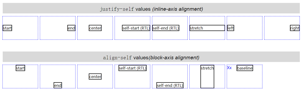
# 7.2 xxx-items
justify-items(横向)和align-items(纵向)是针对网格容器中所有网格元素而言的(但是设置在网格容器上),可以使用xxx-self进行单个覆盖,也就是说xxx-self的取值也适用于xxx-items。
# 7.3 xxx-content
justify-content(横向)和align-content(纵向)是针对网格容器中所有网格单元而言的,一般用于网格单元总空间小于网格容器时(剩余空间)。它们共同拥有 6 个值:
start:默认值,让所有网格单元按照横轴的起边对齐,也就是让剩余空间全部放到横轴的终边。受到网格容器的direction: xxx;影响end:让所有网格单元按照横轴的终边对齐,也就是让剩余空间全部放到横轴的起边。受到网格容器的direction: xxx;影响center:让所有网格单元在横轴中间对齐,也就是让剩余空间放到横轴两边,网格单元之间不留空隙。space-between:网格单元之间的空间会相同,第一个网格单元与 start 之间不留空隙,最后一个网格单元与 end 之间不留空隙。space-around:网格单元之间的空间会相同,第一个网格单元与 start 有空隙而其数值是网格单元之间空隙的一半,最后一个网格单元与 end 有空隙而其数值是网格单元之间空隙的一半。space-evenly:网格单元之间的空间会相同,第一个网格单元与 start 有空隙而其数值就等于网格单元之间的空隙,最后一个网格单元与 end 有空隙而其数值就等于网格单元之间的空隙。
justify-content(横向)独有left和right属性(align-content没有这两个值),不受到网格容器的direction: xxx;影响。
<html>
  <head>
    <style>
      body {
        width: auto;
      }
      .grid {
        display: grid;
        border: 1px solid;
        grid-template-rows: 45px;
        grid-template-columns: repeat(5, 96px);
      }

      h1 {
        margin: 13px 0 0 2px;
        padding: 0;
        text-align: center;
      }
      h1 code {
        font: 16px monospace, serif;
      }

      #g1 {
        justify-content: start;
        direction: rtl;
      }
      #g2 {
        justify-content: end;
        direction: rtl;
      }
      #g3 {
        justify-content: center;
      }
      #g4 {
        justify-content: space-between;
      }
      #g5 {
        justify-content: space-around;
      }
      #g6 {
        justify-content: space-evenly;
      }
      #g7 {
        justify-content: right;
        direction: rtl;
      }
      #g8 {
        justify-content: left;
        direction: rtl;
      }

      span {
        border: 1px dashed;
      }
      div[id] span[class*="box"] {
        box-sizing: border-box;
        background: hsla(117, 50%, 50%, 0.25);
      }

      span[class*="01"] {
        grid-row: 1;
        grid-column: 1;
      }
      span[class*="02"] {
        grid-row: 1;
        grid-column: 2;
      }
      span[class*="03"] {
        grid-row: 1;
        grid-column: 3;
      }
      span[class*="04"] {
        grid-row: 1;
        grid-column: 4;
      }
      span[class*="05"] {
        grid-row: 1;
        grid-column: 5;
      }
    </style>
  </head>
  <body>
    <h1><code>justify-content: start</code></h1>
    <div class="grid small" id="g1">
      <span class="box01"></span><span class="box02"></span> <span class="box03"></span><span class="box04"></span>
      <span class="box05"></span>
    </div>
    <h1><code>justify-content: end</code></h1>
    <div class="grid small" id="g2">
      <span class="box01"></span><span class="box02"></span> <span class="box03"></span><span class="box04"></span>
      <span class="box05"></span>
    </div>
    <h1><code>justify-content: center</code></h1>
    <div class="grid small" id="g3">
      <span class="box01"></span><span class="box02"></span> <span class="box03"></span><span class="box04"></span>
      <span class="box05"></span>
    </div>
    <h1><code>justify-content: space-between</code></h1>
    <div class="grid small" id="g4">
      <span class="box01"></span><span class="box02"></span> <span class="box03"></span><span class="box04"></span>
      <span class="box05"></span>
    </div>
    <h1><code>justify-content: space-around</code></h1>
    <div class="grid small" id="g5">
      <span class="box01"></span><span class="box02"></span> <span class="box03"></span><span class="box04"></span>
      <span class="box05"></span>
    </div>
    <h1><code>justify-content: space-evenly</code></h1>
    <div class="grid small" id="g6">
      <span class="box01"></span><span class="box02"></span> <span class="box03"></span><span class="box04"></span>
      <span class="box05"></span>
    </div>
    <h1><code>justify-content: right</code></h1>
    <div class="grid small" id="g7">
      <span class="box01"></span><span class="box02"></span> <span class="box03"></span><span class="box04"></span>
      <span class="box05"></span>
    </div>
    <h1><code>justify-content: left</code></h1>
    <div class="grid small" id="g8">
      <span class="box01"></span><span class="box02"></span> <span class="box03"></span><span class="box04"></span>
      <span class="box05"></span>
    </div>
  </body>
</html>
2
3
4
5
6
7
8
9
10
11
12
13
14
15
16
17
18
19
20
21
22
23
24
25
26
27
28
29
30
31
32
33
34
35
36
37
38
39
40
41
42
43
44
45
46
47
48
49
50
51
52
53
54
55
56
57
58
59
60
61
62
63
64
65
66
67
68
69
70
71
72
73
74
75
76
77
78
79
80
81
82
83
84
85
86
87
88
89
90
91
92
93
94
95
96
97
98
99
100
101
102
103
104
105
106
107
108
109
110
111
112
113
114
115
116
117
118
119
120
121
122
123
124
以上代码效果图:
# 八、分层和排序
在4.4 元素重叠以及异常处理就出现了元素重叠的现象,它们的重叠顺序是根据网格元素原码顺序而来的,是可以通过传统的z-index进行更改,也可以通过order进行网格元素顺序的更改以达到改变重叠顺序的目的。
order属性设置在网格元素上,用于更改网格元素的顺序,但是如果使用grid-row或grid-column等进行强制的网格元素添加,order会失效。也就是说order一般用于网格流上。
默认情况下,所有网格元素被分配为“0”的顺序。网格元素的order为负值时,将会显示在默认值“0”之前;网格元素的order为正值时,将会显示在默认值“0”之后。如果一些网格元素的order相同,则按照源顺序显示。
<html>
  <head>
    <style>
      #grid {
        display: grid;
        width: 80%;
        height: 9em;
        border: 1px solid;
        grid-auto-flow: column;
        grid-columns: repeat(5, 1fr);
      }
      span {
        border: 1px dotted red;
        margin: 3px;
      }
      span[class*="box"]::before {
        content: attr(class);
      }
      .box02 {
        order: -1;
      }
      .box03 {
        order: -2;
      }
      .box04 {
        order: 1;
      }
    </style>
  </head>
  <body>
    <div class="grid boxed lines" id="grid">
      <span class="box01"></span>
      <span class="box02"></span>
      <span class="box03"></span>
      <span class="box04"></span>
      <span class="box05"></span>
    </div>
  </body>
</html>
2
3
4
5
6
7
8
9
10
11
12
13
14
15
16
17
18
19
20
21
22
23
24
25
26
27
28
29
30
31
32
33
34
35
36
37
38
39
以上代码效果图:
